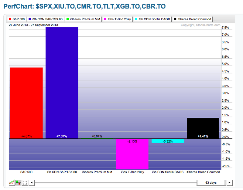
The performance charting tool called the perf chart compares the performance in percentage terms of different ticker symbols.
Canada's underperformance seems to be improving as we have outperformed the $SPX over the last three months. The Money market, US bonds, and Canadian bonds have all had negative returns. The broad commodities have tracked slgithly worse the the $SPX or $TSX but a welcome respite from the previous underperformance.
Secondly,
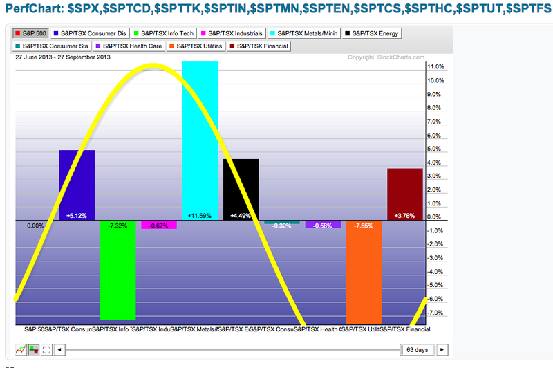
In terms of sector performance, we have the last hurrah of Blackberry's comeback coming up short.
So the ticker symbols above the chart reflect the order of the bars. Again, the left side is considered growth and the right side is considered defense. If we start our analysis jsut after the black bar, we can see the three defensive sectors have all underperformed compared to the $SPX. I have greyed out the $SPX so eveything is compared to the $SPX as the zero line. Having consumer staples, Healthcare and Utilities under performing is very bullish to be growth oriented. The Canadian Banks in burgundy far right, are still outperforming. If we switch to full growth mode, this sector may switch to underperforming or market perform. We can see the consumer discretionary which contains Magna is outperforming. The green information sector is underperforming, which I would attribute some to Blackberry. Constellation software has been on a roll. The Industrials shown as slightly underperforming is a surprise to me. We can see the metals and the energy sector doing well even though Natural gas is having trouble breaking above the 40 WMA.
I am looking for a very strong fourth quarter for the Canadian market. We'll see if that shows up.
Good Trading,
Greg Schnell, CMT


