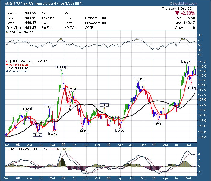
In response to my short blog about the 30 year Bond, I received lots of questions and comments. This is a long detailed blog about the $USB complete with closeups on momentum lows.
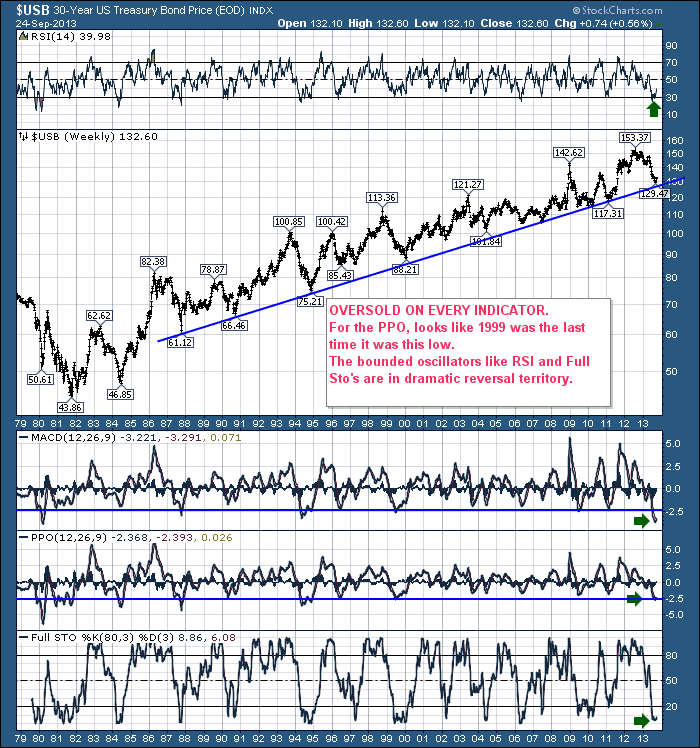
Here is the chart I showed yesterday. The findings from the detailed review are pretty interesting.
While this may be the momentum low with another final low in price to follow, it may also be that the final low is in. What clues can we use?
In the article yesterday , I was pointing out how extreme the sentiment had gotten, and it might be time to trade it with an upside bias. See the 2009 and 2011 levels. By looking at the summary table, you can see the sentiment lows of the MACD marked the lows in the bond market. Many had retests at similar levels. But price did not make a lower low. I have also noted how equities responded to a rising bond market.
Summary:
Here are my observations of the most recent market examples from the $USB chart just by picking sentiment extremes on the MACD. SOmetimes, when the MACD makes a momentum low, price may still move lower. In this review, I looked to see what happened to price after each major momentum low.
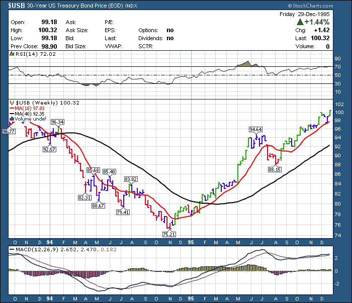
1994, lower bond prices to follow the MACD extreme sentiment lows. Then both equities and bond prices accelerated together. A superb rally.
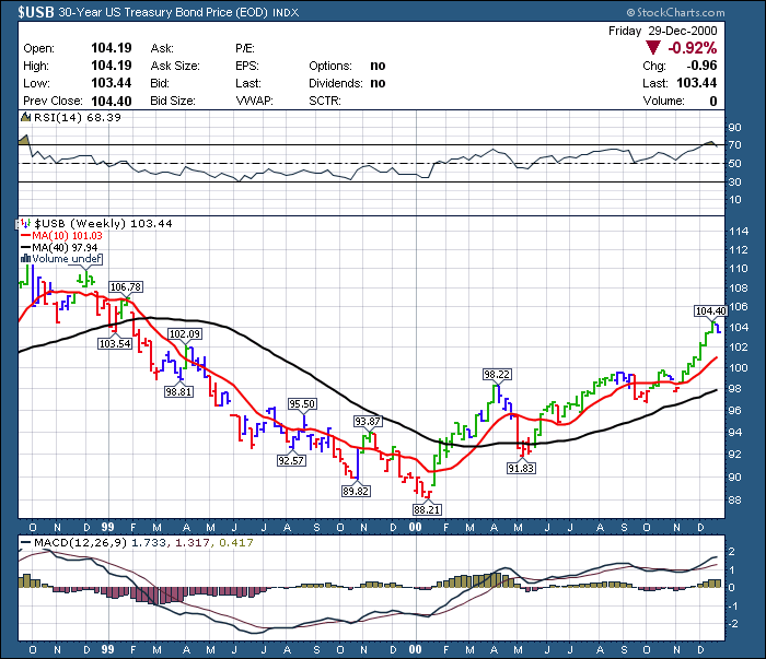
1999, lower bond prices to follow the MACD extreme sentiment lows. Then equities reversed in a major rollover (2000) as bond prices rose. Opposite price behaviour.
2006, higher bond prices to follow the MACD extreme sentiment lows. Then both equities and bond prices accelerated together. A superb rally.
2007, higher bond prices to follow the MACD extreme sentiment lows. Then equities reversed in a major rollover (2007) as bond prices rose. Opposite price behaviour.
2009, higher* bond prices to follow the MACD extreme sentiment lows. Then equities reversed in a major rollover (2010) as bond prices rose. Opposite price behaviour. (*= sideways to higher).
2011, higher bond prices to follow the MACD extreme sentiment lows. Then equities reversed in a major rollover (2011) as bond prices rose. Opposite price behaviour.
2013, ?
In order of events, a more detailed discussion follows.
A look back from 1994 is shown below.
Link here for USB 1994. The final low in bond price occurred after the Momentum low of the MACD. Not uncommon. Note both the bond market price and the equities market accelerated together starting Jan 1 1995 for an unbelievable rally. The equity market did not top in this case.
Looking at this chart of 1999.
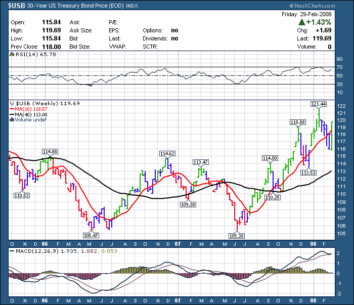
Price made a lower low, MACD a higher low, and the stock market topped soon after the bond market went back above the 40 WMA. Note the price direction of the bond market price was inverse to the stock market in this period. While 2006 and 2007 did not offer major momentum extremes, here is the chart just because of the ensuing market panic of 2008. 2006 2007 $USB Link.
Again, I am only analyzing this chart because of hindsight and the crash that ensued after 2007. The sentiment extreme was not there. The only other reason to analyze this was that bonds had come down to test the long term trend line in June 2007. Both lows are visible on this chart and we'll cover off the data from this chart.
The bond chart of 2006 is interesting in that it made a relatively low MACD reading of -2. Prices did not continue lower after the low momentum reading. The rally and subsequent retest started a series of higher highs and higher lows. The MACD low in 2007 where bond price was almost equal, was not nearly as low in momentum compared to 2006. This is a positive divergence for bond prices compared to the MACD.
While bond prices retraced to the May 2007 low, equities were rallying. Bond prices and equity prices both dipped and rallied from June to December. The equities push higher from July 2006 continued into July 2007. However, the bond market pulled back into the June/ July low while the $SPX made a high into July. The equities ultimately topped in October 2007 and the bond market continued to rally before and after the final market top. Interesting to note. When the bond prices crossed above the 40 WMA in August 2006, it had no ill effect on the equities. In 2007, shortly after the equities July high, the bond market moved back above the 40 WMA. The equities pulled back as a mirror image of the bonds moving higher. Then the final rally into the October high in equities had the bond market pull back but stay above the 40 WMA. The Equities topped out just as bonds retested the 40 WMA from the top side (October).
The next 2 examples are in the chart below. Here is the 2008-2011 link.
The MACD moved to extreme low in late 2009, retesting it in 2010. $USB didn't take out the previous low in 2010 on price or momentum. The bond price moved sideways but did not make a lower low. The equity market rose during this sideways bond market and equities stayed bullish until the bond market moved above the 40 WMA. It also marked a major pullback of 17% in equities when the equities markets did rollover. Lastly, before the 21% correction in the stock market in the spring/summer of 2011, the bond market also made an extreme momentum low.
The bond price rose after the momentum low, never making another price low. When bond prices rose above the 40 week, it was meaningful to equities. The equities market topped coincident with the bond market moving above and holding above a downward sloping 40 WMA. After a brief retest below the 40 WMA, equity markets exploded to the downside, while bond prices soared.
A flight to safety as I would expect during equity market turmoil. In 2 out of 4 cases in the last 20 years, the equity prices made lower lows after the momentum reached such an extreme lower level.
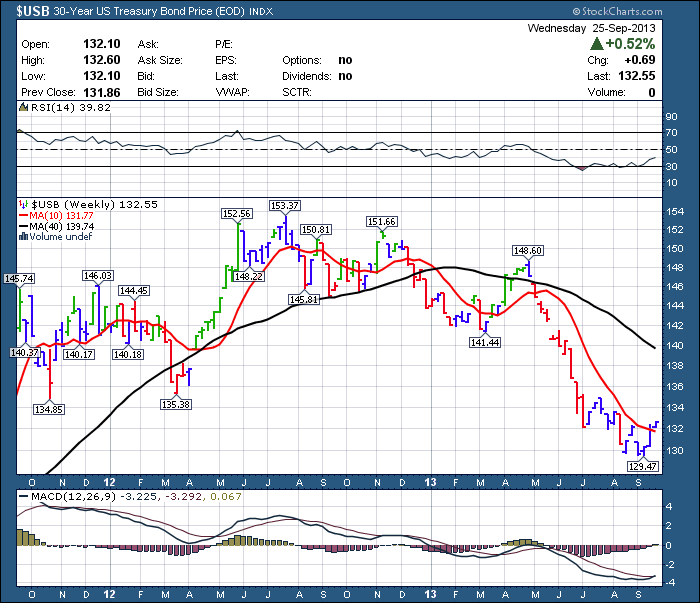
Below is a chart of the $USB in the current market environment. Sept 2013.
The MACD is making a positive cross this week. A move to a higher high in price above early July would be big time bullish bond prices, especially with the next low.
The move this week to test above the 10 WMA and make 6 week highs is a big start. If prices stay above the 10 WMA and break out of the trading range, it is an interesting trade. I would expect one test of the lows. Ultimately, a $USB price greater than 135, would suggest the start of a trend reversal with a higher high. Using the above analysis as a guide, it would also suggest the equity markets have room to run until the bond market closes multiple weeks above the 40 WMA.
To conclude, the last 2 plunges did not offer a lower low. So a reversion to the momentum mean is a possibility without a lower low. In my eye, the current basing pattern on the $USB looks very similar to year end 2010, spring of 2011. I think the real question will be when the price moves above the 40 week. Then what happens? 1995 or 1999 / 2009 / 2011? The other important thing to watch will be positive divergence on the weekly. When price ultimately comes back to test the lows and makes a MACD divergence over several months or even a year, then we have more to worry about in my analysis.

