In this global economy, we are constantly made aware of issues happening around the world. With all the discussion of the US situation currently, there has been less discussion on how the rest of the world is doing.
I found a Japanese chart that is a little worrisome. The $NIKK seems to have bumped its head on resistance. Since I blogged about the international charts breaking above resistance, we have seen global markets pullback in concert with the USA. A couple of markets are more worrying. Japan is one of them.
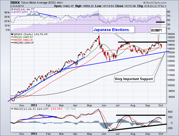
Below is the $NIKK.
There are a few trouble spots on this chart. First of all, the failed breakout at the July highs. That is a problem, especially after a the parabolic run up in the spring. The blue support line is very important now because of the parabolic move. Japans long term chart has a history of these parabolic moves that crash soon after. The MACD was lower on the recent push suggesting less momentum. It is still an uptrend till the August low is broken, but we pushed down pretty hard Wednesday to lose the support of the 20 DMA. Now we are testing support at the 50 DMA. If the 50 doesn't hold, the blue trend line and the 200 DMA sit directly below. The Nikkei has found the 20 DMA to be support or resistance, so getting back above soon is an important deal.
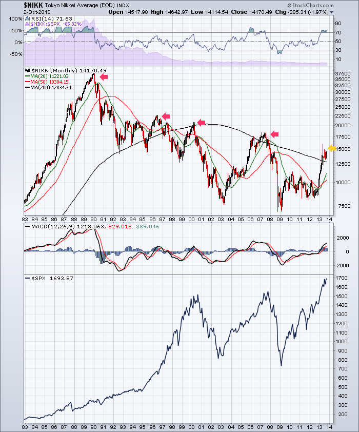
Here is the $NIKK monthly going back 30 years.
We can see the very, very, very long term average of the 200 MMA is sloping down. As well, the $NIKK is at a level where it has failed before relative to the long term average. You can also see the 4 parabolic moves on the $NIKK chart have not ended well, so this rejection at previous highs is worrisome. You will also notice they coincided with tops in the $SPX with the exception of 1996. We really need the $NIKK to accelerate from here. The bottoms have also been at similar times as well. The sideways movement in the $NIKK from 2010-2012 was out of step with the $SPX, but it still warrants watching.
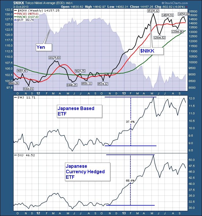
While traders using the EWJ needed to hedge the move in the Yen to enjoy more of the profits from the $NIKK parabolic move, a move the other way ($NIKK falling) may also indicate the currency is rising. DXJ is a hedged product that removes some of the currency risk. below is a chart showing the 4 different tickers. The Yen, The $NIKK, The unhedged EWJ, and the hedged DXJ.
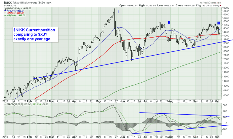
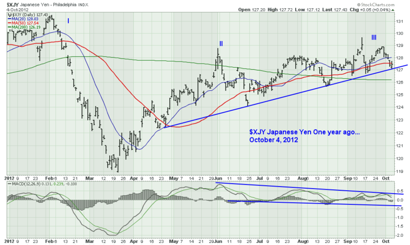
With the $NIKK rise so tightly correlated to the $XJY fall, large swings can be very profitable if the currency is hedged out. It was one year ago today that the Yen broke down. The current setup for the $NIKK looks very similar to the $XJY one year ago.
We can see the time frame on the $NIKK is shorter than the time frame on the $XJY currency chart. What transpired in 8 months on the $XJY has transpired in 5 months on the $NIKK. So what I see when I read the chart is a new high on the left, marked by a 'I.' After a steep retracement, the Yen bounced up about 75%. The $NIKK bounced up about 70%. Let's mark that 'II' on the chart. Then the currency spent almost a month trying to break through to new highs at the end of July and rolled over. It broke out in early September to a new high and couldn't hold. A retest at the end of the month failed at the same level as the May highs. From there, it was a long downhill. Currently on the $NIKK, we spent a month trying to break through the July highs. Will we pull down to support and then make one more breakout attempt? If so, the map gets very similar. The one thing different is the location of the 200 DMA is still up sloping. In the currency, it had rolled over for a while and had a solid downward slope.
We'll have to watch this one closely to see if it produces a major reversal. This could be a canary for us.
Good trading,
Greg Schnell, CMT.

