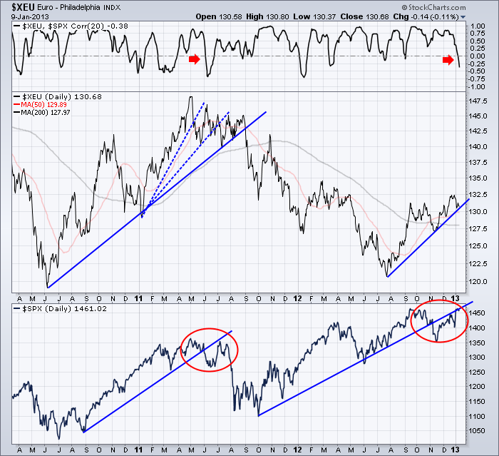
Lets work through the chart.
1) Up at the top is the Correlation. For the most part, the Euro and the SPX are positively correlated.
2) You can see that the break in the Euro in Early 2011 ended up falling hard. The major fall actually happened first on the $SPX and the Euro followed.
I am a little concerned that the $SPX setup in red is similar to the 2011 top. Notice how the price action moved below the line, backtested the bottom of the line and then broke down. Its an interesting similarity.
3) One thing that was interesting on the Euro break was that there were three different trend line slopes. The major fall happened when it broke the long trendline with a lower slope. The current trendline is on a very similar slope to the main blue trendline of 2011.
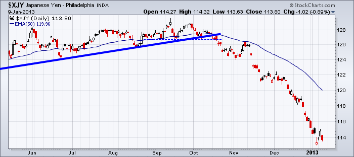
It's worth watching. Here is what happened when the Yen broke.
The Yen broke down around the 15th of October. The US market made its final attempt at a top on the 18th of October before starting a sharp fall for a month. Did the Yen cause the US market to fall? We don't know but there was a similar response within days of each other.
Currently - the following currencies are testing their trendlines including the $XEU above.
$CDW
$XBP
$XSF
Be aware, they all make up part of the $USD index. I'll stay focussed on these as the next move in the market will probably get confirmation in the same direction from the currencies.
Final registration is approaching for the Calgary seminar. Calgary
Good Trading,
Greg Schnell, CMT


