Market Recap for Wednesday, November 7, 2018
The Dow Jones surged 545 points, or 2.13%, yesterday and that index of conglomerates was a laggard. NASDAQ stocks exploded nearly 200 points higher, or 2.64%, to extend what's been a very impressive rally after October's massacre. I look for several signals to suggest a correction is over (or at least has printed what I believe is a bottom), but none is more important than price action. Downtrends typically consist of failed 20 period EMA tests and we've seen some of those in recent weeks. But not yesterday. So many areas busted through key resistance that's impossible for me to illustrate them all. I'll start, however, with the NASDAQ 100 ($NDX):
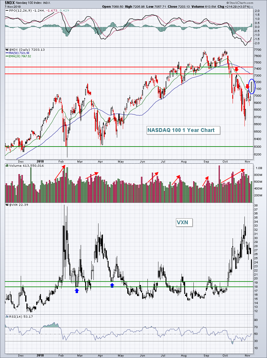 The NDX gapped above its 20 day EMA yesterday and never looked back. In 2018, major NDX price bottoms have been accompanied by a Volatility Index ($VXN) reading in the mid-30s. At the latest NDX low, the VXN was 35. It's hard emotionally to buy when it seems like the market is falling apart, but the best returns occur when you do exactly that. The last two times we saw panicked selling kick in and the VXN hit the mid-30s, the NDX rallied until the VXN returned below 20. We're currently at 22.39 and I expect volatility will continue to settle down. A return in the VXN to the 18-19 area would likely suggest a bit more caution as I'd expect another mini-meltdown.
Technology (XLK, +2.94%) and healthcare (XLV, +2.94%) both surged through key moving averages to lead Wednesday's rally. The latter was able to clear both its 20 day EMA and 50 day SMA:
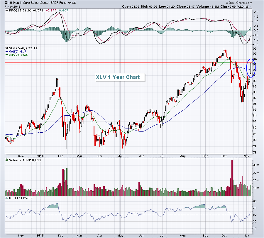 There's overhead price resistance awaiting at 93.50 for the XLV. A move through that price resistance would only add to the bullishness of this advance.
Software ($DJUSSW, +4.03%) exploded higher and one technical development that you might find quite surprising is on the next chart:
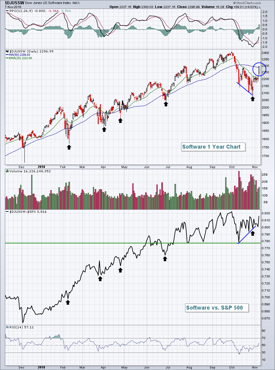 Software, on a relative basis, has held up very well vs. the S&P 500. Those black arrows show that at each major DJUSSW price low, their relative price lows continued rising. In other words, as the S&P 500 (and software stocks) sold off, money rotated towards software. I'll be watching to see if this relative ratio breaks out. If it does, I believe that would be a very important bullish signal for the stock market. If the stock market looks ahead and an aggressive group like software is leading, it makes zero sense that we'd be heading into a bear market. The performance of software stocks, to me, was the most impressive of all.
Pre-Market Action
Tokyo's Nikkei ($NIKK) climbed more than 400 points last night, or 1.82%, to close above its 20 day EMA for the first time since the October swoon began. Other Asian markets were mixed overnight. There's also mixed action in Europe this morning with the German DAX ($DAX) fractionally lower after it closed above its 20 day EMA for the first time since early October.
Dow Jones futures are currently lower by 52 points as traders assess Wednesday's major rally. Also, traders might be a little anxious as they collectively wait to hear from the Fed at 2pm EST today.
Current Outlook
Don't let lighter volume on the move higher detract from yesterday's impressive rally. Yes, I'm a volume fan and I look to volume to confirm rallies. But history will prove one point over and over and over again. Volume to the downside during panicked (high VIX) periods of selling will always be heavier than volume during bounces. ALWAYS. Traders panic during rapidly declining price action. There is no panic or rush to buy when the market rallies. Everyone sits back and says "I'll buy on the next pullback". Go back and look at that earlier NDX chart in the Market Recap section above. Check out the volume during pullbacks vs. the volume during subsequent advances. The volume always is lower during rallies. That's the way the market works. I'm much more concerned about volume on individual stocks, not the overall market volume.
Perhaps the worst period during this 10 year bull market was from mid-2015 to mid-2016 where it appeared we were breaking down. Take a look:
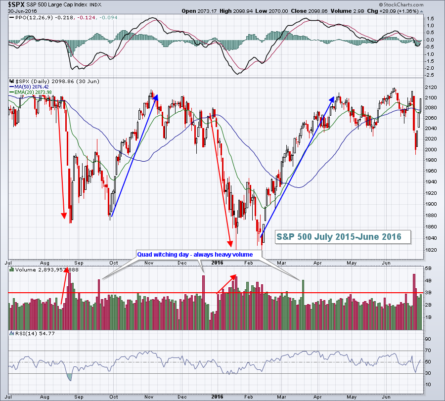 Note the heavy capitulatory panicked selling that took place in both August 2015 and again in January 2016, well above that 3 billion share level where I've drawn a horizontal line. But during major subsequent rallies, volume hardly ever moved back above 3 billion shares. So to draw a conclusion strictly based on overall market volume would have been a big, big mistake. I'd suggest you avoid major conclusions based on overall volume alone.
Sector/Industry Watch
During volatile periods like the one we've just been through, it's nice to take a deep breath and look at long-term relative strength charts of key sectors. This helps to give us much more perspective on how the stock market looks underneath the surface. I certainly could provide additional relative charts, but let's focus today on four key areas for relative strength/weakness - technology (XLK), consumer discretionary (XLY), consumer staples (XLP) and utilities (XLU):
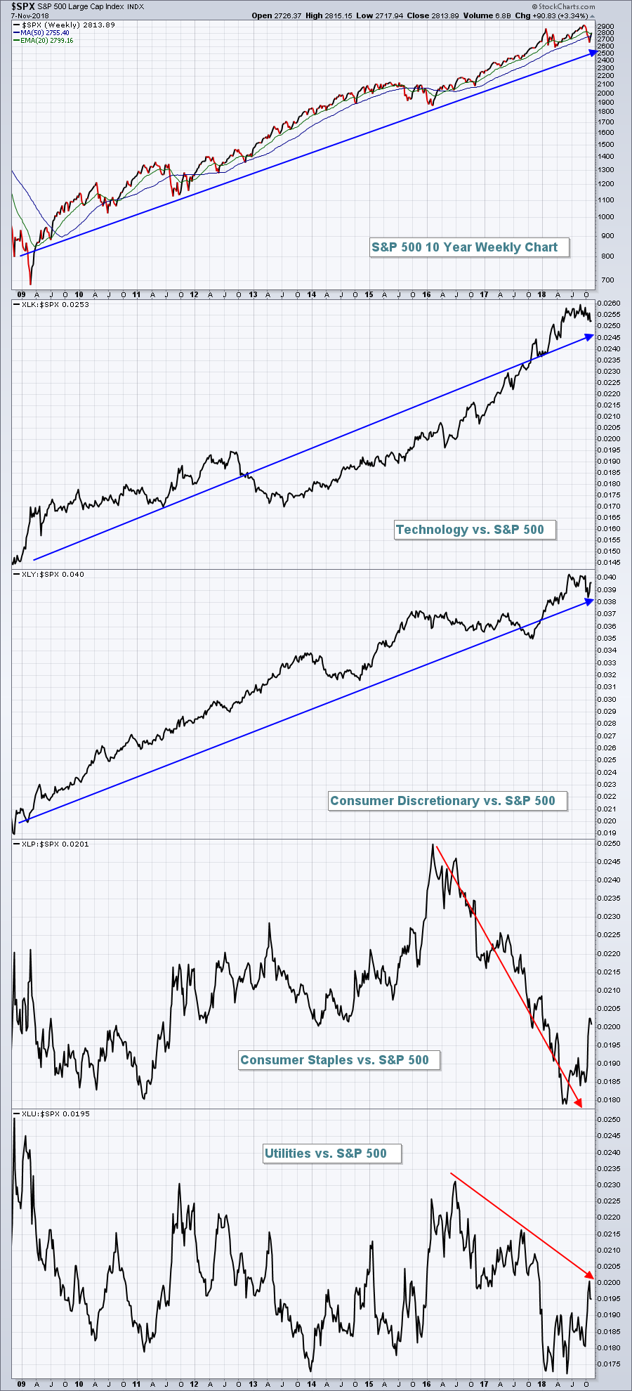 There are going to be periods of relative strength/weakness for every sector. But I believe the above chart depicts the underlying strength of the current bull market. Yes, we've seen relative strength over the past few months from consumer staples and utilities. But it's actually quite typical to see that from June through September. It extended this year into October as the S&P 500 corrected. It's also quite typical to see defensive sectors lead during corrections. We should be most concerned about defensive groups leading during significant rallies. That has not been the case. In fact, looking at the XLK:$SPX and XLY:$SPX ratios above, I'd say that the market's "risk-on" mentality - that's so important to fueling a bull market - is alive and kicking.
Historical Tendencies
Here is the relative performance of utilities (XLU) vs. the S&P 500 over the past 20 years by calendar month:
January: -0.1%
February: -0.5%
March: +0.3%
April: +0.9%
May: +0.4%
June: +0.9%
July: -0.7%
August: +0.4%
September: +1.3%
October: -0.4%
November: -1.0%
December: -0.1%
October through February represents a five consecutive month period where utilities have historically underperformed the S&P 500. Utilities strongest relative strength occurs during August and September. The reason? U.S. stocks have a history of struggling during those two calendar months so it makes sense that there's a rotation to safety.
Key Earnings Reports
(actual vs. estimate):
AZN: .33 - estimate, awaiting results
CAH: 1.29 vs 1.06
CNP: .39 vs .41
DHI: 1.22 vs 1.23
DISCA: .52 vs .62
HII: 5.29 vs 4.14
JCI: .93 vs .93
LNG: .26 vs .27
MGA: 1.56 vs 1.49
NCLH: 2.27 vs 2.21
NRG: .94 vs 1.12
PRGO: 1.09 vs 1.05
TU: .57 vs .54
WP: 1.05 vs 1.03
(reports after close):
ATVI: .51
CTL: .27
DIS: 1.31
MTD: 4.99
SWKS: 1.91
Key Economic Reports
Initial jobless claims released at 8:30am EST: 214,000 (actual) vs. 213,000 (estimate)
FOMC meeting announcement at 2:00pm EST
Happy trading!
Tom
