With the US jobs report coming in this morning, bond yields rallied while banks and insurance companies popped out of the funk they have been in. The bank ETF is a good example.
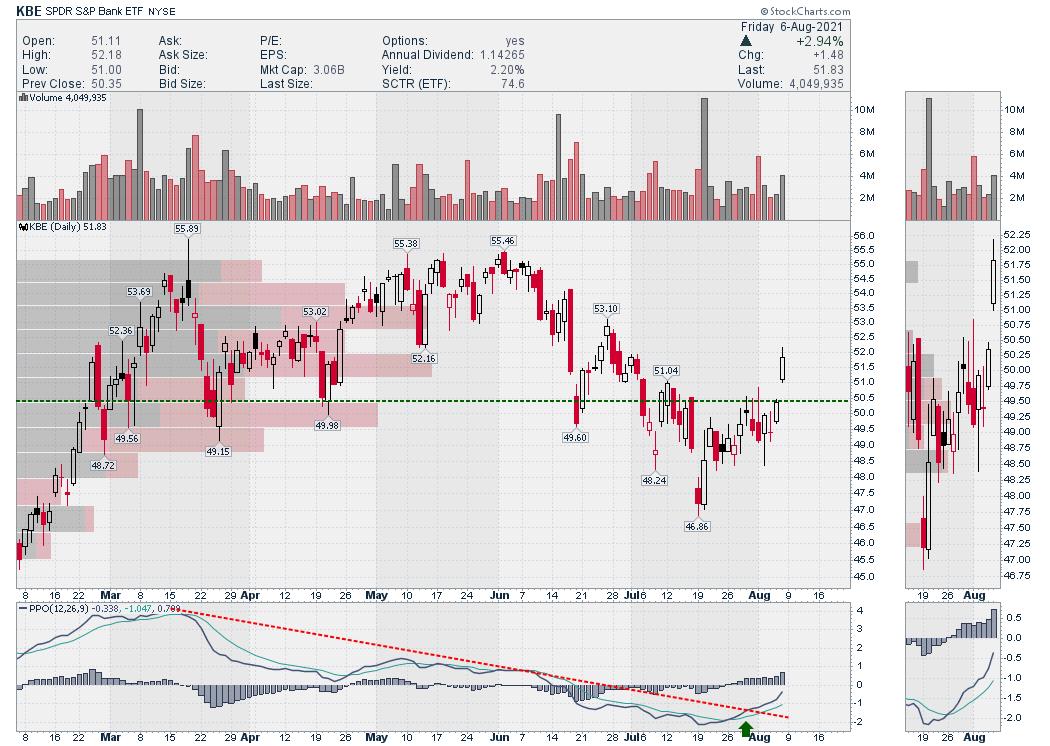
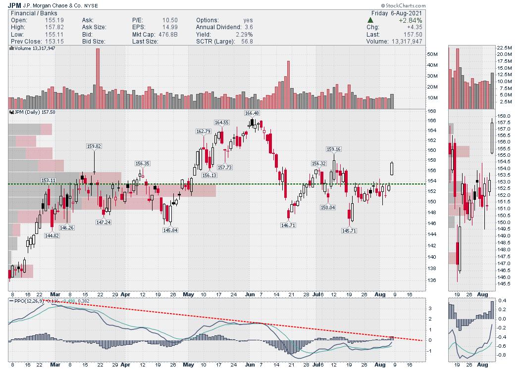
Streaming through the various charts within the financial sector, this same chart shape is manifesting widely. JPM is breaking out above the large volume-by-price bar and breaking the down trend from the June high.
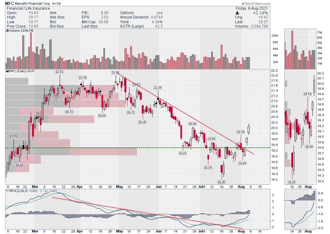
Manulife (MFC) is a good size insurance company. The chart shape is similar to the KBE.
Travelers is a Dow Component. It too looks the same. Some have broken the downtrend in price, but some have not; however the chart shapes across the financial sector are similar and they all look to be turning up.
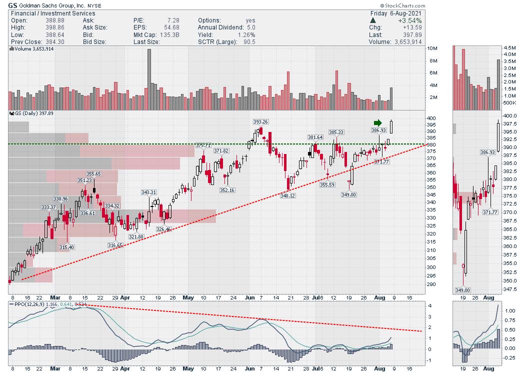
Lastly is Goldman Sachs (GS). Goldman and Morgan Stanley both made fresh new highs today. They didn't pull back as much as the banks and insurance companies, but these companies are moving higher now with the same tail wind as the banks.
Based on the price action across the financial space, it looks like the financials are suggesting the lows are in for the bond yields.
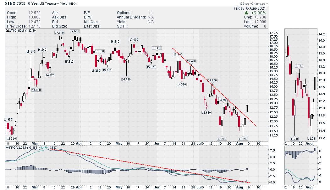
The break in the downtrend line in price and the PPO momentum line on the bottom of the chart suggest to me we are moving into a yield uptrend. One day doesn't make a trend, but one day can be the start of a new trend!
Good trading,
Greg Schnell, CMT, MFTA
Senior Technical Analyst, StockCharts.com
Author, Stock Charts For Dummies
Want to stay on top of the market's latest intermarket signals?
– Follow @SchnellInvestor on Twitter
– Connect with Greg on LinkedIn
– Subscribe to The Canadian Technician
– Email at info@gregschnell.com
