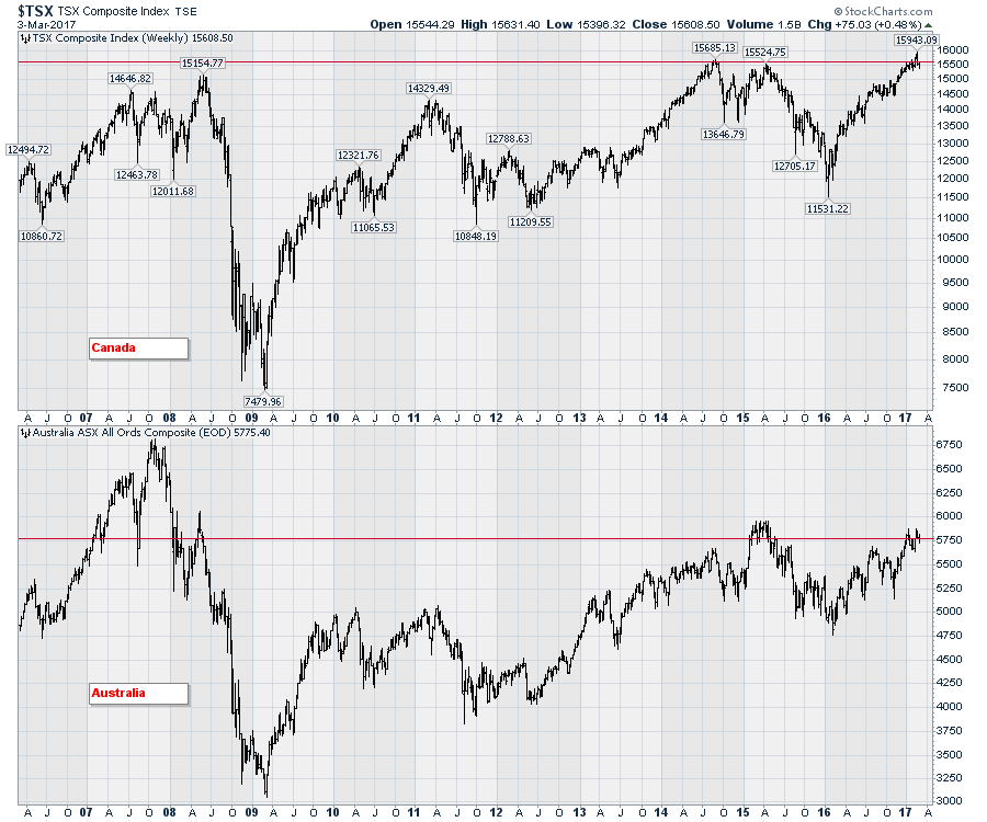
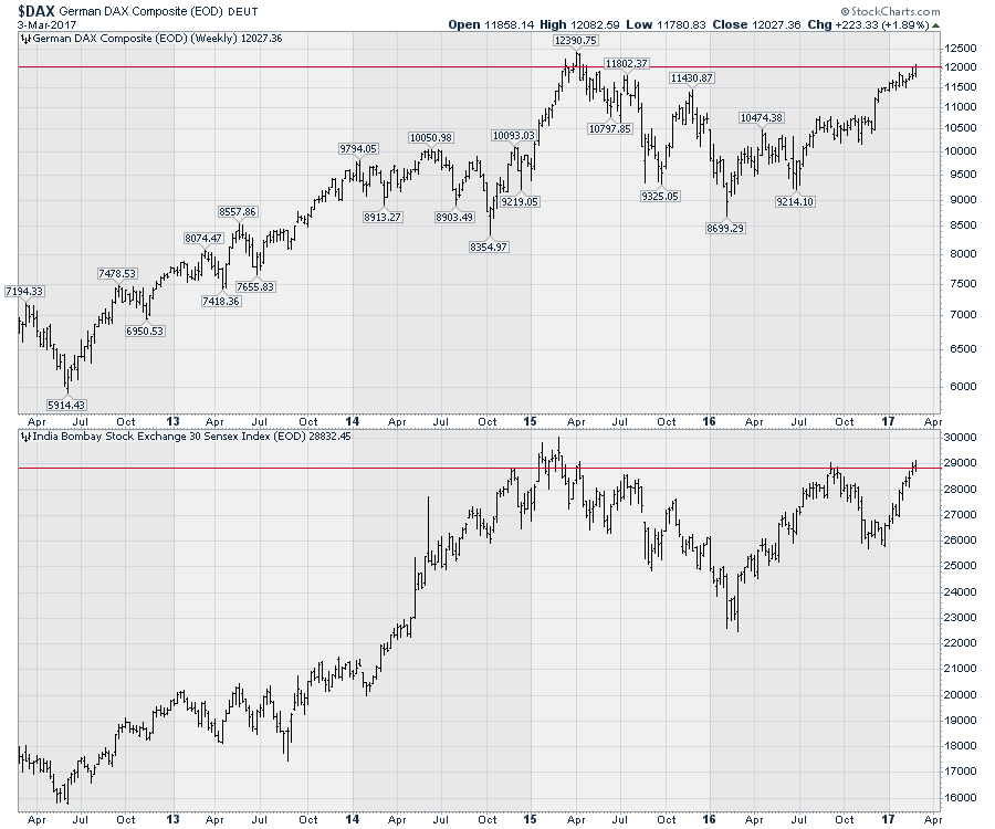
The USA has been a bit of an island in terms of the global markets. It continues to push above previous all-time-highs and usually leads global markets higher. This week is an interesting week as Germany, India, Canada, and Australia are all trying to break through to new highs. Notice the spike in the German market on the last high in 2015. It rolled over the next week and it has taken two years to get back there. India in the lower panel is trying to close at new 52-week highs. India is about a 1100 points from all time highs.
I like to follow Australia and Canada as two important commodity exporters to the global market. Canada recently broke out to new highs and fell back which is the same sort of price action Germany made back in 2014. The close for this week (red line) is slightly below the 2014 highs. For Australia in the lower panel, it continues to work toward the 6000 level.
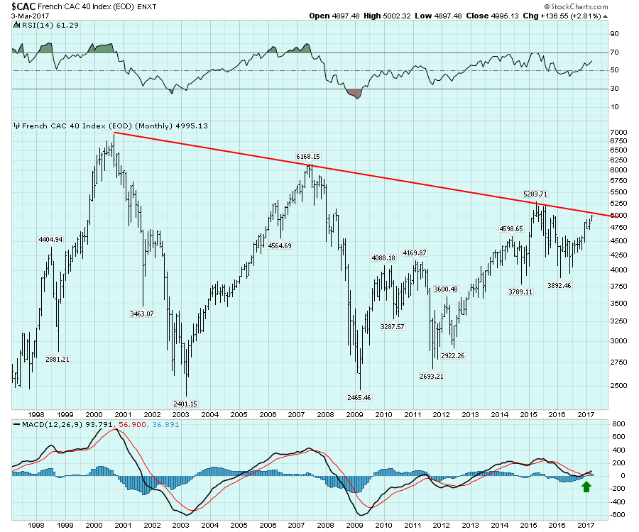
 One chart that came to light looking at monthly closes was France which is interesting on a longer timeline. The monthly chart below shows France approaching a 17-year trendline across the highs. Both the RSI and MACD are moving higher which is very positive. On the chart below, this is the first time the MACD has turned up around zero after coming down from higher levels.
 I find it odd that so many global charts have been unable to take out the previous years highs while the US continues to push higher. I like to watch the global markets to see if they can confirm the bullish posture of the US markets. In this global environment, the world is one big trading partner. Watching other markets take out the 2014 or 2015 or 2016 highs would finally confirm the bulls on Wall Street. Arthur Hill wrote an article recently about the changes inside an index that make the previous data a different kettle of fish. The $SPX changes the components due to mergers and companies outperform so they move in and push out weaker performers.
While that is all true, seeing a market like France with lower highs for 17 years or the Japanese market with lower highs for 25 years still suggests a weak market. Breakouts on indexes to new 52-week highs or all time highs is a bullish sign. In Canada's case, the market has stalled in this 14500 - 15700 range ten times. Follow this link to see a zoomed in view highlighting the last three years. The breakout in February above the previous highs was very bullish, but the market rolled over the next week and fell back below the previous highs. When a commodity, a currency, a bond price, a yield or an index stalls at previous highs, it is an important level for technicians to be aware of.
With all these important markets poised to push through meaningful levels on their respective charts, its reasonable to suggest if they all stall here, that is concerning. If they push through, this will give investors a good reason to consider investing in these markets and diversifying. Time to watch! You can click on these charts at any time in the future for live updates relative to the lines I have drawn.
It is going to be a busy week for live webinars. I will be hosting Martin Pring for his Market Roundup Live which is only once a month in our new webinar format. Market Roundup Live Webinar 2017-03-07. I'll try to get Martin to show his $VIX indicator!
I will also be hosting a special live webinar for members only with Arthur Hill on Saturday March 11, 2017 at 11 AM ET. Members can find the link on the home page in the webinar section early next week. With Arthur and I moving to prerecorded videos rather than live webinars, this will be an exclusive for members to listen live.
If you are not a member and would like to get access to the webinars, click here to sign up for a free one-month trial that will also give you access to ALL our member only content. Thank you for choosing us as your technical commentary team!
Good trading,
Greg Schnell, CMT, MFTA.

