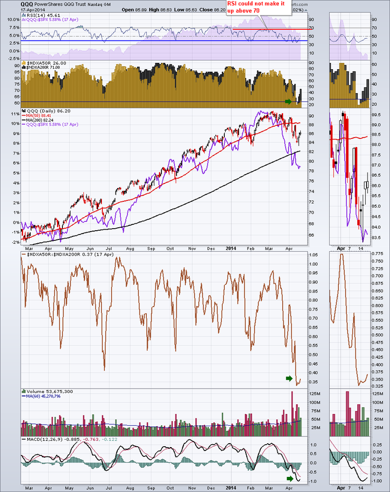
The QQQ is the tracking ETF for the Nasdaq 100. It has lots of messages this week. Other indicators also exist for the Nasdaq 100. The $NDXA50R is a sweet indicator. Its even better paired with its mate the $NDXA200R. When the are used together they produce the gold/black plot pane below in Chart 1. The gold area represents the number of stocks above the 50 DMA in %. The Black represents the number of stocks above the 200 DMA on the left scale in %. So the dark gold is where the black is shadowing behind the gold histograms. Here is how I like to use it.
When the Gold is nice and high you are in a bull market. What is harder to see here, is the scales adjust for the 200 DMA and the bottom of the range for black is 55.We can see recently that the % of Nasdaq 100 stocks above the 200 DMA dipped to about 58 using the left scale. That is the first time it has been weak in a while. I will cover off more about how that helps us on the next chart. But first, I left the $NDXA50R:$NDXA200R ratio shown farther down in brown on this chart. When it reaches extreme lows, it can be a timely buy signal. You can see it would have helped in June and February as well.
Two other things to notice on Chart 1. The acceleration of volume recently and the very low MACD. The volume is turning up the average for over 3 months. Low MACD's are usually indicative of a trend change, especially when the symbol has had a high MACD for months.
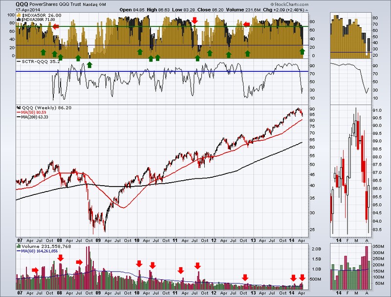
Here on Chart 2 is a long term weekly view of the $NDXA50R and the $NDXA200R.
Because 2007 was so devastating, almost every stock in the market went below its 200 DMA. That helps us so the scales stay at 0-100 on both sides. You can see where the bright gold is, the stocks are rising above the 50 DMA and not yet above the 200 DMA. Then the market normalizes with lots of stocks above both. The stocks bounce above and below the 50 DMA but stay above the 200 DMA. For this condition you see spike lows in the gold and then you can see the black of the 200 DMA %'s clearly. When the black stays nice and high, it's just a garden variety pull back. When the stocks above the 50 DMA really start to drop hard, say down to 25 or 30% that is a change in trend. As well, when the black drops below 70%, there is a possibility of significant market deterioration.
What we have now is both of those test conditions have been met. The ability of the market to rebound here is very important. Once the black is below 70%, we have usually had a significant correction. It may bounce and wobble, but the next few months are important and potentially serving notice of a larger pullback. ( In the zoom box on the right, it only rescaled the gold not the black.) The red arrows are some (not all) examples where the black was getting weaker and then the market bounced back up. One thing I notice is the first pullback is a shot across the bow saying something is changing. 2010 wasn't that nice. In 2007/2008, in 2011 and 2012, we got second opportunities to sell before the market made a bigger correction.
In the SCTR plot on chart 2 we have some other information. You can see when the QQQ is not in the top 75%, the market is more likely to be in a correction. Once it starts to rise, it may be bullish even if it is not above 75%. You can see in 2007 and 2008 and most of 2009 it stayed below 75. In 2011 and 2012 the warnings were pretty good. I think it helps in concert with other indicators.
I just wanted to mention volume. There are many volume studies out there, but recently in 2014, the volume has been above average for months. Rising volume at the end of a long rally usually means something is changing. It is not a light switch indicator, on or off, but it is an indicator that helps.
The bottom line to me is we are probably heading for a summer with much weaker markets. Following the strongest etf's will be important to protect the account. How high and for how long the bounce off these lows goes is critical. It also means a world of whipsaws and short term signals will work better than long term ones.
Good trading,
Greg Schnell, CMT
We try to keep our articles informative and entertaining. Make sure you check out the other blog writer articles in Mailbag, Chartwatchers, Traders Journal, Decision Point and The Canadian Technician. All of these articles are free to subscribe to. The subscriber button is top right on most articles. One of the little known secrets of StockCharts is our Blog or Articles section. The Blog tab will bring up a view of some of the most recent articles. StockCharts.com Subscribers have two additional daily feature articles.
Lastly, Chartcon 2014 in Seattle is rapidly booking up. Click here for more information.


