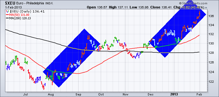
Starting in the summer, some of the global stock markets started to move higher. Once Mario Draghi suggested he would do whatever it takes to save the euro, the European markets have been on a tear higher.
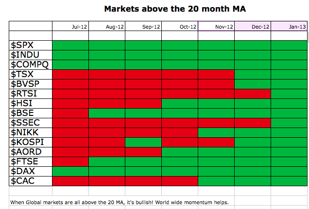
This is the first monthly close that all 18 global markets I track are above the 20 Month MA. Why is that level significant? Because when the entire world got above the 20 Month MA in 2003 it confirmed the global push higher and lasted 4 years. In 2009 it did it again but it only lasted into 2010 when the Shanghai started weakening. Here we sit in 2013 with all the global markets pushing higher. Here is what it looks like simplified.
When the entire world is trying to rally together, it can be very supportive. Both exports and internal confidence grows which can be very complimentary.
So we have to maintain a bullish approach to the markets. Why fight this trend?
As regular readers of The Canadian Technician blog are aware, the commodities have not broken out yet, but are very close.
While I want to see that happen for obvious reasons, I have one interesting hurdle the markets have to overcome.
This is the chart of the 4 major commodity supply countries charts for the last 15 years. (Commodity Countries)
Now we could debate exactly where to draw each line. These lines reflect a range that has significant support and resistance in each market.
Brazil actually rose above the line in January and has since pulled back under.
A renewed interest in commodities would probably confirm the new bull market. If it was to all unwind after a giant final rally that stalled at resistance on both the commodity and equity markets, this would be the time. I see very little negative divergence on the major indices so that is positive. The $USD is testing the lower boundary of its trading range. The Euro is pretty stretched here with gapping 1 cent moves a couple of times a week. Feels like an exhaustion move to me and based on the blue boxes below it looks like this run has been at least as long as the previous bull run into the September high.
So just when everybody shouts the all clear, I see some major similarities in these charts that might take time to work through.
Maybe the bulldozer provided by central banks worldwide will break down the barriers and this will all breakout to the upside shortly.
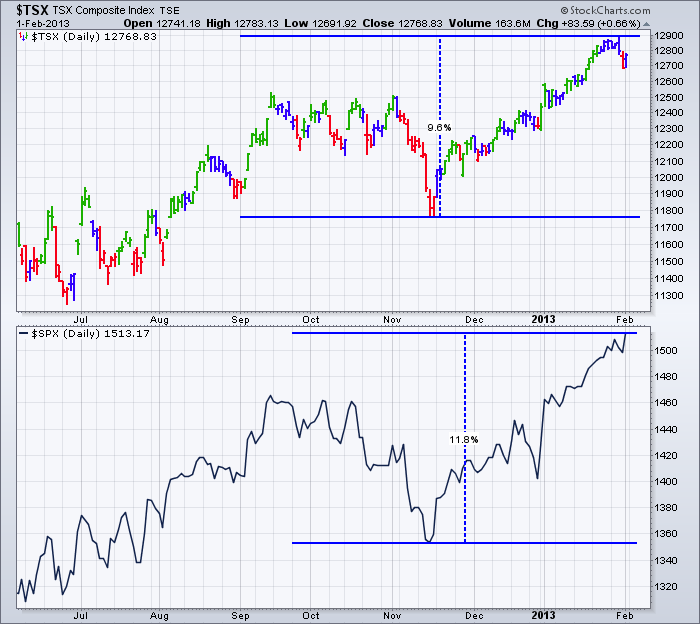
I'm Bullish and have been for months but the charts usually stair step up at a rate slower than 50% a year gains.
After a 10% move off the November lows, it might be time to expect a step. $TSX
Good Trading,
Greg Schnell, CMT


