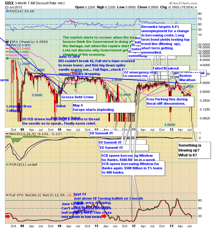
I want to bring the $IRX chart up today. When working through chartlists, the charts that show you something out of sync is usually more valuable.
As an example, when the Municipal Bond $MYI chart broke back in March, just before the yields soared on everything else, something was amiss. The chart perplexing me lately is my worry wall chart. The $IRX weekly. On this chart, I try to write down major events. I don't think the 3 month T-Bill went to almost zero yesterday on Kate and Williams news of a baby boy. So while this chart in condensed view isn't very helpful, I encourage you to click on the chart to see the wider version. The T-Bill is very sensitive to issues and when the yield plummets (prices rise as people are willing to pay more for safety) someone is looking for a safe place to park money for 90 days.
I don't have the answer, but this creates the question. Why are short term yields collapsing as the $SPX strikes new highs? Something is a miss in the Muni market - Detroit - but that is not news. Detroit was on a plan to get here a long time ago. We saw this coming in March as you can see on the chart below.
Is all I know, my chart senses are tingling. With the Muni chart in trouble, the short term yield chart in trouble, its pay attention time. Here is the current Muni Chart.
Good Trading,
Greg Schnell, CMT


