One of the greatest feats of technical analysis is not its simple execution of reading a single chart. That is the basic building block. The real beauty of Technical Analysis is reading hundreds of charts and building a story that meshes together across them. In blogs, this art is difficult as you get a few pieces in each blog but not a great macro story.
Recently I blogged about the equity markets on a short term 60 minute basis. Occasionally I go on about the macro markets on a monthly basis. Before that was the symmetry across the currencies. Before that was the symmetry across the commodities. So while I try to add them all together to make a distinctive story, the reader may not be able to parse them together in a panorama like my mind is constantly working at.
So let me summarize my main thesis as taught by John Murphy and Martin Pring in their intermarket analysis work. Some of their teachings along with my own learnings make up the following paragraph.
Long bull markets in equities are global. Bear markets are also global. Trends in commodity industries filter across the globe. Trends in bond markets filter across the globe. Trends in currencies filter across the globe. While we can have a brief rest from the global view, eventually either the world starts doing better or everything starts to slow down. If you agree with that then lets review a few things.
1) The BRIC countries have weak equity charts.
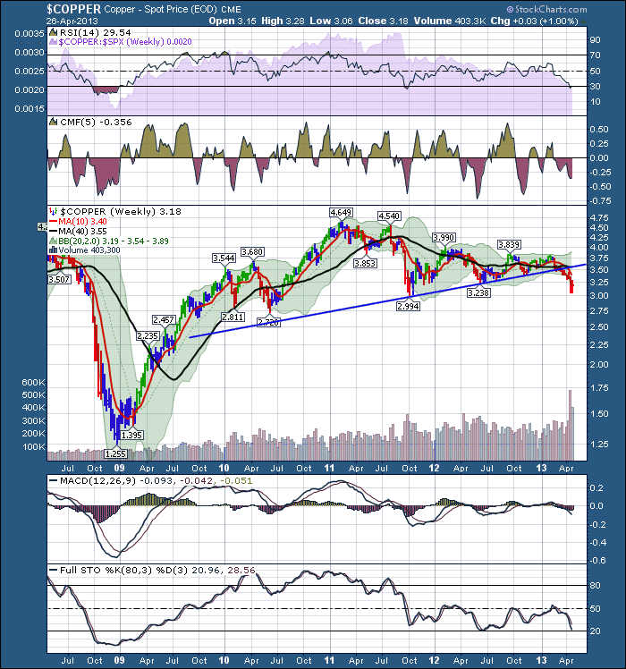
2) The commodity prices are all snapping major 4 year trendlines. Is Oil next?
3) The commodity countries made their equities highs in 2011.
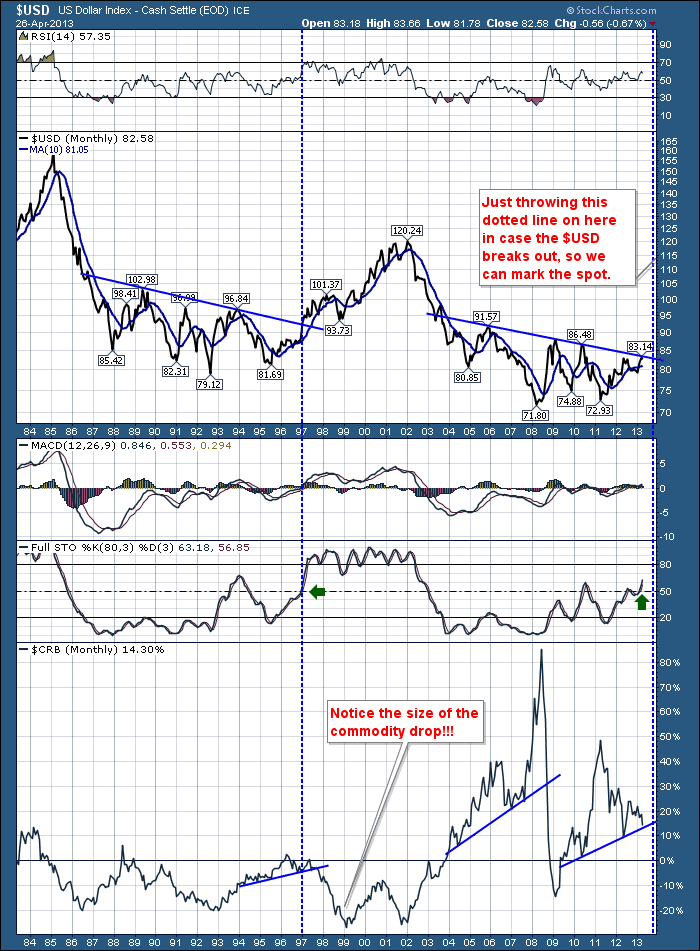
4) The US currency looks like it is about to break up and out of a 4 year downtrend. This is bearish for commodities.
5) The US market continues to outperform the world in stock market equity performance.
6) Recently Japan has surged onto the scene. This wouldn't be the first attempt by Japan to break out of the demographic headwind they have in their country.
7) Timing is everything. Not only do you have to have the direction right, but you need to have the timing right.
So lets review the story so far. In late November, it appeared as though everything was breaking out into a new bull market globally. I used the title the new bull market on 12/12/2012. In February, the global trend started to soften. We saw the large miners fall 30 and 40% off the highs. We continued to see gold weaken. Copper broke a trend line almost 8 weeks ago. The Elder candles have been red for 12 weeks. This week saw a 1% bounce up from 12 weeks of selling.
So here is the 30 year view of the $USD.
The $USD has not broken out yet. The recent move in $COPPER to the downside, instead of breaking to the upside in 2013 is a huge concern. This does not bode well for global growth. The pennant formation on the $COPPER chart of 2012 was saying indecision. Now, after 12 weeks of decisive direction (selling )we get a bounce. Copper is a great indicator. Things can deviate for a while, including copper, but this has been unabated. I am sure even the copper market has heard about the new US housing boom, but it hasn't dented the selling of Copper at lower levels every week.
The macro view to me, is that commodities in general are going to continue taking a big gigantic pullback if, I repeat IF, this line breaks on the $USD. You can see the broad commodity market dropped 20% in two years while the world loved internet darlings back in 1997.
Let me switch to bonds. The Swiss 10 year bond sells at .6% interest. The US is slightly above 1.5%. If you were a foreigner looking to invest money, you would make more than double in a US 10 Year than a Swiss 10 year.As money moves to safety in America, the investor may also get currency appreciation if their home currency falls. This really helps the return. These bond yields are near the lows we have seen in them, but Japan dropped to .6% multiple times on their 10 year bond. Can the US go there? Nobody thinks so, but that doesn't mean it won't happen. So investors could continue to buy US treasuries rather than Swiss. This would suggest investors want to remain in a safety trade, not risk on.
Globally, the broader equity markets are getting weaker. Canada, Brazil and Russia look terrible. Australia looks a little better. If we switch to currencies, the currency chart of Australia broke the blue trendline back in February and is now testing the green line. $XAD on this chart below.
A breakdown in the Aussie Dollar and the Canadian Dollar would probably confirm a $USD breakout.
Let me get back to equity markets. So with the global central banks all injecting QE into the world when we were at a market top back in September, it seemed odd. Funnily enough, the market (collective brains of investors) reacted the same way (thought it was odd) and sold off until the November low. Now, after the seasonal rally, we continue to shoot for the moon. Everybody is bullish, because every Central Banker in the world is doing more and more QE. But the charts don't agree. The US and Japan charts look good. Most of the European charts made four month lows during April and then rallied when broad economic indicators for Europe were worse than expected. Somebody made money as everyone wanted to get short on the news. Now that the short squeeze is over, we'll see how they continue to perform.
The day to day swings mentally wear out retail traders. Continually looking at the big picture can help us see some things.
To review, Bond prices are rallying which means investors are seeking safety again. Money is moving to the $USD and it has not broken out yet, but we should be ready if this is going to happen. Global equity markets look weaker than America and the commodity countries are breaking down, with the exception of Australia, which made three month lows but has since rallied back up. It is in line with the market close of February. The Commodities are suggesting down not up.
Let me digress. I have never bought Ned Davis Research but I am aware he is an outstanding technician of the markets. He recently did an interview. I wholeheartedly support his analysis style based on listening in and until I listened to the interview this morning, I did not know that I had so many beliefs in common with him. The first half of the interview warms him up, and the last half gets into nuggets of wisdom earned over 40 years. If you have not heard it, I would strongly recommend an hour spent listening to Ned who rarely does interviews. Ned Davis.
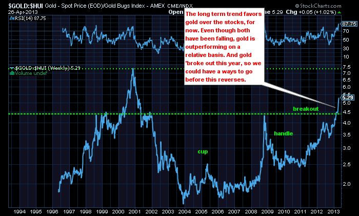
Lastly, I received a great chart this morning from Dominick Graziano. He always presents me with great gold charts to look at. This is straight from Dominicks work.
So this chart represents the price of gold compared to the 'miners of gold' stocks. Usually the stocks outperform the metal in a bull trend for both. Currently, the metal is outperforming the miners which is bearish. When the miners finally start to outperform the metal, it will probably represent a long term change in the trend back to the bull side. Great Work Dominick!
There are pivot points in time and the central banks are doing everything to keep inflationary forces alive. This is one of those points in time. As everyone is firmly aware, only 40% of US companies reporting have beat revenue expectations by the street analysts. That is not compared to year ago, that is just compared to current analyst expectations. There is a lot of share buybacks that are improving the earnings per share numbers even if the companies are just standing still. I continue to believe in the confluence of all of these charts. Should the world fix itself and get going, I'll be happy to join the bull parade. Currently, it looks like Goldilocks is serving the three bears in the room breakfast. Stay sharp, the next month may magically reverse all of the trends or just the US trend.
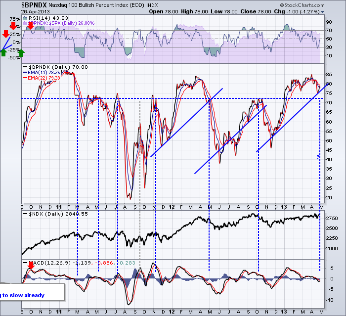
So I don't see the global collaborative bull market setting up yet. I see Bonds and commodities as headwinds. I see the global investment community seeking safety in America, but declining revenues in equities will be difficult to hold for 'safety'. Slower sales globally eventually means lower profits. Maybe not lower in earnings per share terms if you reduce the number of shares, but that is another story. I am now expecting a seasonal pullback into June and we'll see what happens next. My USA indicators are teetering on levels they normally break down from. The Bullish Percent indexes are holding just above breakdown levels, eg. ($BPNDX is still above 70%),where other charts (crossovers) have already been surpassed into the market pullback zone. When it does pullback from these levels, most participants are surprised how far. Things just need a little more time to get into sync for a new bull market in my opinion.
Don't forget to listen to Ned's rare April 18th interview! Ned Davis at NDR.COM
Lastly, feel free to shoot a note back if I wrote anything confusing or even if you agree or don't agree. That is what makes a market. Always nice to hear back.
Good Trading,
Greg Schnell, CMT.


