I want to comment about reading the markets. It is challenging to look through indicators. It is not for the glance and go style. We get a variety of signals every day that are confirming, contradicting, whipsaws, breakouts, breakdowns, channeling, or outright paradoxical. The work of the technician is to find reliable inter market signals that help confirm tops or bottoms in the market.
Stepping out to weekly and monthly can help us see the major trends, but usually subtle changes start new moves and show up on the weekly and daily charts.
The title of the blog above is an oxymoron as all the data goes into the charts. Is it price data, economic data, fundamental analysis data? It's all valuable. It may take time for the markets to either price it in or realize the changing scene.
Let's use Dr. Copper today to discuss this. Here is a link to a blog in January. $COPPER - A Penny for our thoughts?
Copper appeared poised to breakout.
Two weeks later, Copper had turned up. So I wrote this blog.
Would You Be Ready For A Bull Move?
Copper finally moved above the trendline, Yahoo! Well, not so fast. The Mining Resource stocks did not follow. Teck Resources actually ignored the breakout and proceeded lower. The emerging market stocks stayed in their 4 week downtrend. Gold continued to weaken. Japanese Yen and the British Pound both fell quickly and the Euro started to have wild swinging moves of a penny a day. There were big changes happening but the commodities were behaving differently.
Yesterday, $COPPER failed to stay above the downsloping trendline and it broke the upsloping trendline across the lows since early November. Two important trendlines, both broken on the same day. But the broader markets went on to new highs. So if $COPPER failed on its breakout, the miners continued to move lower, the precious metals are breaking down, the $USD is breaking out through its trendline, what is changing? Is this all just noise? The market is going on to new highs every day.
Well, sometimes we have to go deeper to see it while it may be in its infancy.
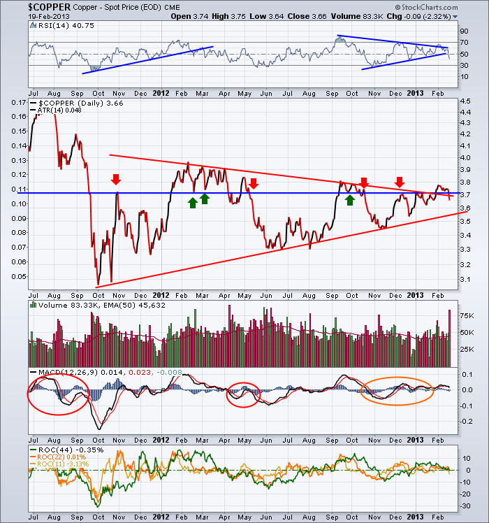
Lets go look. Here is the $COPPER chart with the failed breakout. One other thing that is particularly alarming to me on this chart, is that Copper broke down through the horizontal support line that has also been important. The RSI cracked down through its trendline. Is that a big deal? Well, it was in February of 2012. We will compare these timeframes with the indexes on another chart. If you draw a trendline from the August to October period, an RSI trendline break there was also important. Today, we have a new trendline break. The volume absolutely soared, the MACD rolled over and the ROC indicators at the bottom are having trouble staying above zero. Remember that the pennant we see in Copper prices is building while the $SPX wedge is also building over similar multi year time frames.
OK, Lets mark up this chart differently.
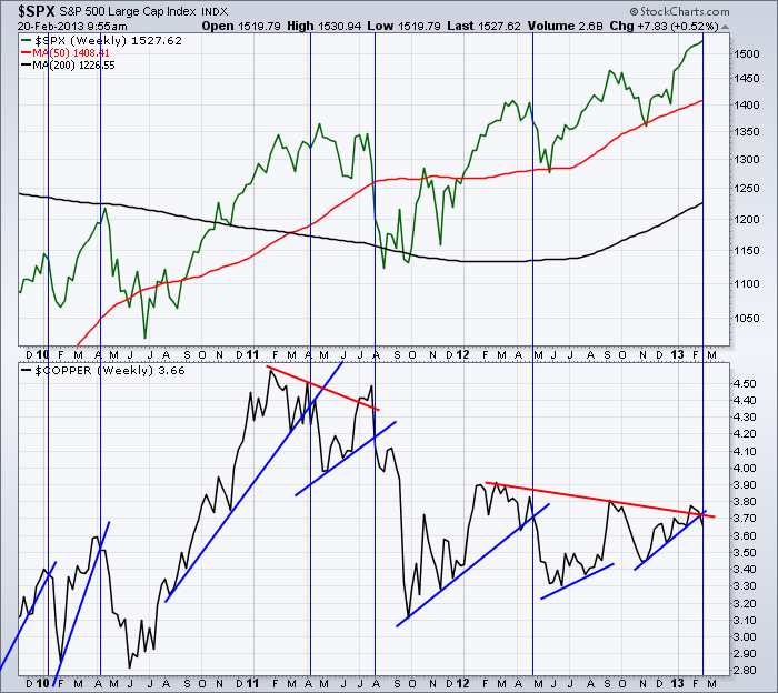
So here we have the blue trend lines on $COPPER making the rising bottoms. The Vertical lines are when $COPPER breaks those trendlines. In 5 of 5 over the last 3 years, when $COPPER breaks the trendline, the $SPX follows soon after or in concert with the Copper move. That is why it has the nickname of Dr. Copper. The second set of trendlines on Copper are the Red Trendlines. In 2011, $Copper tried to break out through the top of the red trendline. It went above and failed. It also marked a significant top on the $SPX. I would say that the Copper break was coincident with the $SPX, but it still showed a failed breakout above the red line.
The September 2012 Peak in $Copper did not allow a real trendline to be drawn under the price action on this chart. Maybe on a close up in the daily charts it would have been a more obvious place to draw a trendline. That said, $Copper broke down a week before the October price failure on the $SPX.
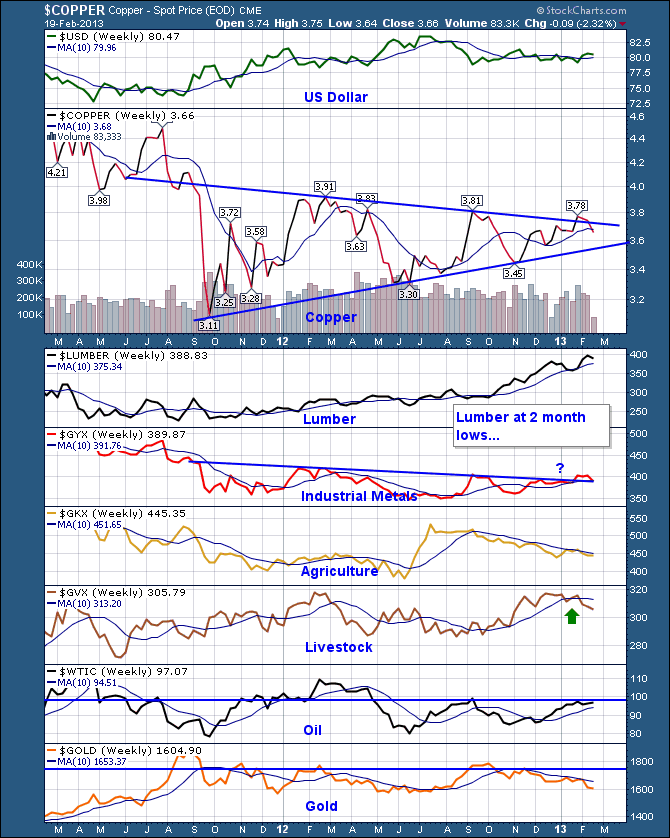
Let's update the commodity chart I posted a few weeks ago with the other commodities.
Almost every chart item has turned down recently. The Lumber chart has negative divergence on it(not shown), but it is still making higher highs. The 10 week MA on the chart is probably a good guage of that market breaking if it does. Oil is sideways at resistance here. At this point, I don't expect oil to keep rising until proven wrong! I don't have any trades in that sector currently so that is just an observation.
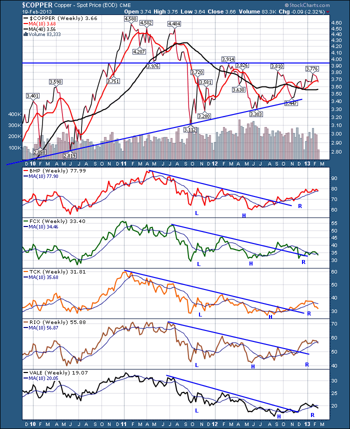
We have many other ways of comparing the market. Let's try looking at the major miners.
Now, I have drawn the 'R" for the right shoulder on these charts thinking it would happen. It does not appear yet. Maybe we need one more try. BHP and RIO are both major Aussie miners, but they are flat at best recently while the Australia Stock Index $AORD, has been pointing skyward.
4 of 5 are below the 10 week and BHP is testing the 10 week line today.
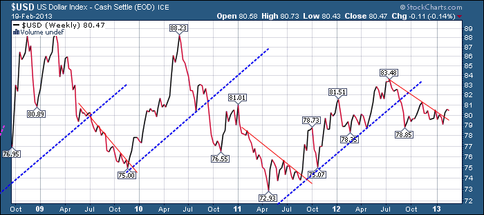
Here is the $USD.
The $USD has broken out topside from a major conjestion zone. It is still struggling to break horizontal resistance in the 80.5 - 81 range. A move above that area would be very difficult for the markets to ignore. It would appear to me that Copper has broken down and this is a major event. It may also be a whipsaw. If so, we should find out quickly.
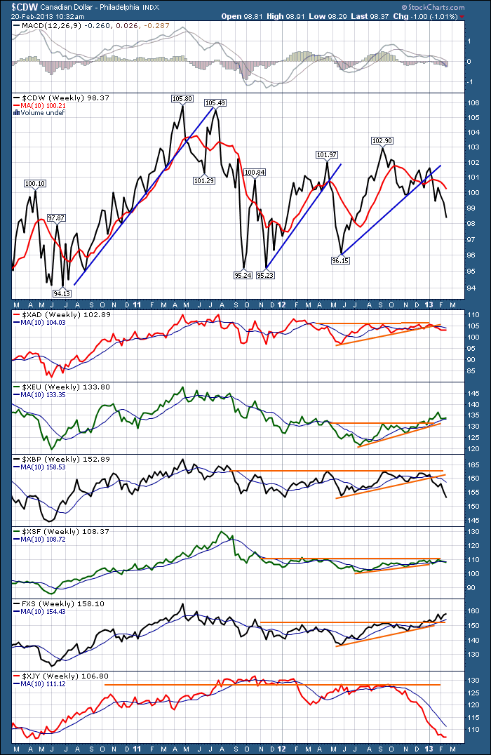
What about the Canadian Dollar? It is a pretty good indicator of $SPX tops.
Almost all the currencies are below their 10 week lines with the exception of the Swedish Krona which is in the Dollar Index.
We could write a book at this point in the market about the interesting charts appearing. The constant moving parts is what keeps it so compelling for the observer.
So this blog is a long blog about using intermarket analysis. Comparing Copper to the $SPX, to the miners. to the other commodities.Checking it against the $USD is an obvious one, that I left for the end. We can continue to go deeper on this but copper is a very good indicator. However, it is not the only one. I could go on about Consumer staples (defence), the weakness in tech stocks like AMZN, FB, AAPL, IBM, MSFT not confirming the new highs. The $WTIC/$XJY relationship, the Commodity Country Indexes stuck at resistance (Aussie exception!), and the non comfirmation of the energy majors to name a few.
My intermarket work suggests this rolls over pretty darn quick. We don't need to focus on Sequesters, or the TV cheerleaders. If you want to short the market, this is not a ticket. This is saying there are weak sectors that tell us we are near a market top. It might be better to be more selective than trying to short a market with a financial stocks component absorbing $85 billion a month coming in from one of many central banks. Remember the coordinated easing in September where all of the central banks added more liquidity? Who knows when the final top is occuring. The number of stocks above the 50 DMA has been falling the last few weeks so the market is going higher on fewer and fewer names. It still makes it hard to short a liquidity injection. The bottom line, your account is probably having trouble reaching new highs as more and more stocks fall below the 50 DMA.
Check out the SCU link on the homepage of stockcharts.com. There is no upsell attached to the course. It really is about helping you use the site better. You can find all the events here. Events!
Good Trading,
Greg Schnell, CMT

