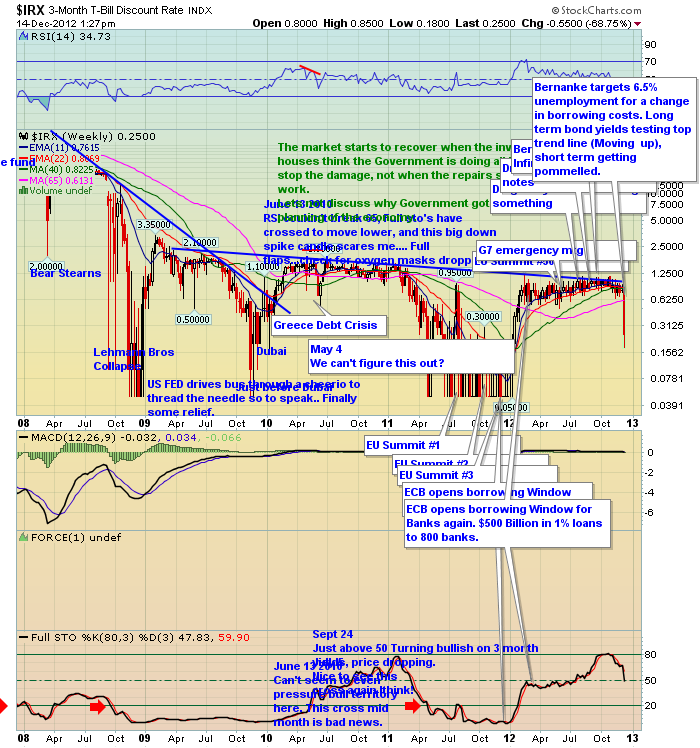
I like this chart when it is going up. Today scares me a bit.
This is my wall of worry chart. As you can tell, it is my comment or mood board. Let's call it overannotated. I try not to delete stuff even if I'm wrong. Today thats a good thing.
One of my comments when this chart broke down before was full of caution and the blip ended up being for a couple of weeks. Lets hope this is the same. But hope is nota, repeat nota, trading strategy.
Keep your eyes on the bond/ T-Bill market. This looks distressing.
I recognize you can't read it at this level. SO click on the chart and go to the original to read my notes. I thought of just wiping the slate and sending you this chart with one annotation. I think the historical document is way more valuable so you will have to click through for clarity.
I really want the action to turn back up and get support right away.
You'll notice in 2011, the $SPX rallied till the end of April. This chart was already in plunge mode for months.
Yucch!
The reason for my title? I wrote three bullish blogs this week. Look at what happened this week on this chart! Looks like a funeral.
On a positive note, the 5,10,30 bond yields rose this week and are testing topside breakouts. That should be bullish for stocks. It should tell a story one way or the other. If all the charts pointed the same way, there would be no indecision.
Good Trading,
Greg Schnell, CMT.

