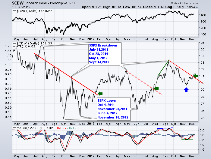
The chart below is not of the $SPX. It is not Gold or Crude Oil, or a Bank ETF. What is it?
Look at all the confirmation points. Let's go through them.
First, all the major highs were within days of the $SPX tops. This chart usually made final thrust moves and rapidly failed even though the $SPX tops were not as sensational. So that is a nice clue to look for timing an intermediate top perhaps.
Look at the major bottoms. All four of the lows were within a day of the $SPX lows. Another nice clue but sometimes you need to look back to see them.
Look at the red trendlines. They all have the same slope. What is interesting is when the trendline was violated, it was within a few days of the start of a major market rally. The Early January Breakout, The July Oscillations finally stopped and the $SPX soared in mid July. But look at the clue it is leaving on the chart now. It is telling us the trendline is broken and we are starting a new breakout. We may want to use this chart to verify our position on the $SPX as a breakout from this level. Had it stalled here and turned down it might have been a clue for the other direction.
While we need to await the final breakout by the $SPX, this would suggest a short position at this time might be fighting the trend. Bears, consider yourself warned?
What was this magic chart?
The Loonie. The Canadian Dollar.
Don't forget to register for the Stockcharts University classes. Also tonight in Calgary is the monthly CSTA chapter meeting. A special night with a guest speaker on trading psychology and 12 ways to find winning trades for 2013.
Good Trading,
Greg Schnell, CMT

