I am not a banker. I rarely write about the USA bank sector. Today is a new day! Here is a view into the Financial Sector in the USA.
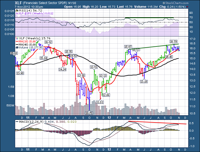
I don't think we should change the ticker to CLIFF just yet, but this appears to be breaking down.
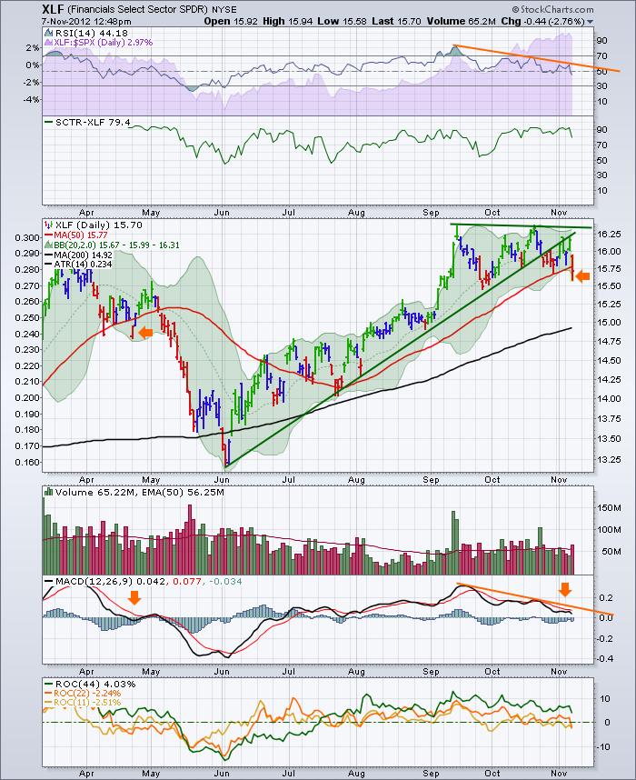
This daily chart has lots of negative divergence.
My main concern here is all of the blogs recently have played out as an intermarket package.
The major tech stocks have broken down. The Dollar is gaining strength, the commodities analysis as an economic indicator is working. Copper was not able to hold its MA as discussed. Financials leaving the party is one of the final nails in the coffin.
At some point I expect a bounce, but I feel like this is a major top and having this financial group confirm it is troubling. If we can't find yield in the bond market and we have slowing global growth, it leaves very few places to park. That's troubling.
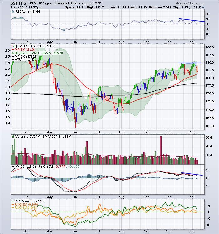
Here is a look at the Canadian financial sector.
The small negative divergence on the right edge of this chart is normally not a big deal. But if the overall global market swoons here, these stocks will as well. Following the XLF over makes it a big deal.
I expect the Canadian banking sector to roll over with the US sector. I am specifically concerned about the Canadian Governments efforts to drop Canadian housing speculation and becoming a little too successful! This sounds like the Chinese banking story after slowing real estate 2 years ago.
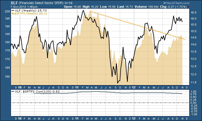
Here is a chart of the XLF with the Canadian Financial Sector overlaid. You can see the Canadian Based Financial sector is underperforming the broad XLF.
At the bottom is a 6 month correlation. Doesn't get much tighter than that.
STOCKCHARTS.COM SCU - STOCK CHARTS UNIVERSITY!!!!!!
Lastly, I spent some time this week working on the presentation of the SCU 101 class. The course material is quite compelling even for active users. Some of it might be a repeat, but many of the attendees have found considerable value in attending.
As an example, John Murphy's market analysis tools have been hardcoded to simple clicks. Finding the best stocks in the market technically is so easy with many of the tools. Being aware of some simple power strokes for sector analysis can save days of study. The program covers off in a day what would take months of discovery. The Site has been improved so many times over the years, that many of the multi year members are learning lots of major time saving tips. These classes are designed to speed up your analysis dramatically so you can focus on making more money in the market! Cut through the chaff coming off the TV or fundamental analysis data. I will do a blog on RIMM to help explain the power of TA before a market goes into a major decline. The financial analysis community or fundamental community does not usually see it coming because their models don't have the same information. All that to say, The course value is immense. You will have a great appreciation for many of the value added buttons on the site.
Look for this link on the right on the stockcharts.com home page and get registered.
Don't delay. The earlybird pricing helps us know how many are coming. The big benefit for you is you save a lot of money. The next benefit is using the tools effectively so you can focus on making money after attending by finding,following and interpreting some of the powerstrokes on the website.
Find me @schnellinvestor on twitter.
Good Trading,
Greg Schnell, CMT

