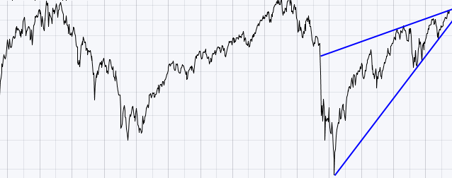
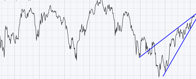
Here are two stocks. One above the other.
Do these charts appear similar to you? Both charts have a runup to a top, a big pullback, a runup that just eeked above the old highs, a plunge down to below the previous lows, and a multi year push into a final wedge shaped high that is currently reaching major, major resistance.
They are both weekly charts. One is over a 8 year period, the other 13 years.
Can you name the top chart?
Can you name the bottom chart?
As my chart yesterday was spooky, I thought I'd turn this into a mystery. Well, the top one is the market we have been living through since 1998. The $SPX.
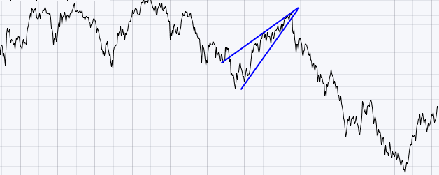
Here is how the bottom one resolved itself.
The bottom one first chart is found here . Mystery stock.
The final result is found here. Mystery stock resolved.
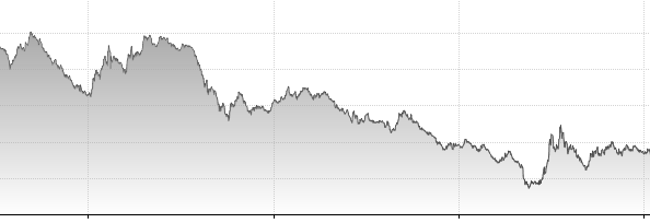
Here is a chart of another major market indicator at the time.
For the USA
Here is how it resolved after the mystery stock broke down out of the bearish wedge.
The above three charts were 10 Year Bond charts of USA and Japan courtesy of the tradingeconomics.com site. So things can go lower from right here. Believe it or not, interest rates and stock prices can go lower from here. It has happened in a major economic superpower before while the rest of the world pulled back. This isn't to raise 'sky is falling' alarm bells. It is to say it has happened before. If technology is truly out of favour for 3 years could this happen again? Yes, anything is possible. It could shoot right past old lows. It can break down right here from a rising bearish wedge at major, major resistance. It can also go on an unbelievable inflation run the other direction. We need to be aware. This chart action above is what the Fed is trying to avoid. You too can see interest rates stayed even lower for another 3 years which is what Ben is trying to do currently. Hold rates low.
The major stock of the time that topped out in Japan was Sony. Sony Corporation topped out in 2000 even though it was not part of the MSFT, AMZN internet boom that topped in 2000. It was walkmans and TV's. Why did the Internet boom knock Sony out of the Number 1 spot? It didn't. The iPod did. 10 years later the iPod is almost a dimple on Apple's earnings. Could Samsung knock Apple off its perch like Apple did to Sony? Apple may rise to new highs and the market continues on to new highs. Is it coincidence that both superpowers had a comsumer electronics company at the top of major 12 year market intervals? It is important to note, that historically most final bull runs in great stocks terminate with a major overall market downturn and the leader of the previous rally does not usually lead the next rally. Apple was an exception once already leading in both 2007 and 2012.
Speaking of 12 year market intervals, you may magically remember a long winded blog titled
Tina Turner - you better be good to me.
Well, deep at the bottom of that blog, it goes on to talk about another 12 year cycle that finished with a lower low than the previous two. I'll leave it to you to look that example up again by clicking on the title.
we all know that technical analysis is about pattern recognition. What we know is we have seen this pattern before in a world superpower index and if you read the Tina Turner, we've seen it in our own super power index but before most of us were trading. We look and we also see the same pattern in the bond index. Was the same pattern in the real estate index? I don't know. But good TA is about intermarket analysis and we need to watch to see if it is happening again. If the world surges higher, commodities will be the place to be in my mind. If the world surges lower, cash might be the best place to be. Here we sit at the peak of resistance, just watching. On that note, - Just asking, but do fundamentalists know how strategic or critical this place and time are?
I haven't mentioned this for a while, but you can follow me on twitter @schnellinvestor, you can follow stockcharts.com on facebook, or by clicking the blogs tab, then on the right - The Canadian Technicians Tab - then subscribe via RSS or email, Google + etc.
It will look like this on the blog site. As a matter of fact, if you click on this little picture below, it will take you right there.
Thanks for reading and responding.
Good Trading,
Greg Schnell, CMT


