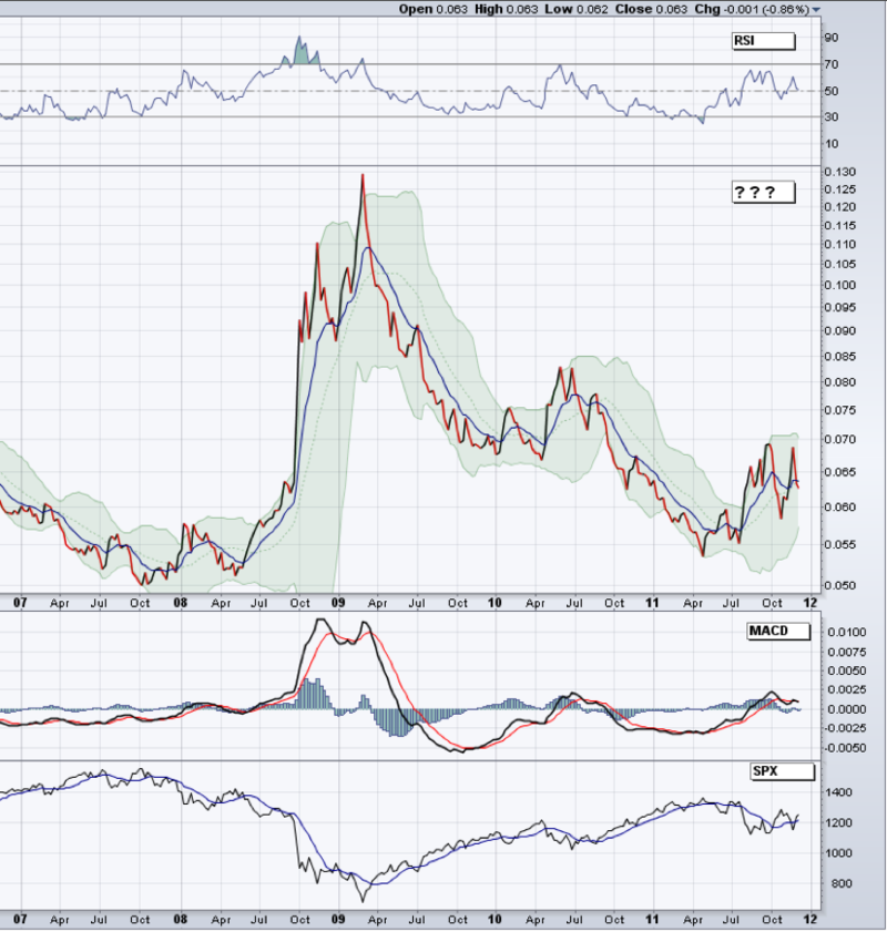
Well in a market that has 2% oscillations for breakfast, sometimes a step back can help.
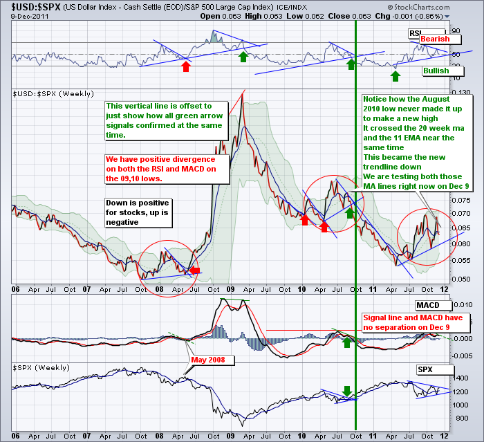
Today I have posted a mystery chart. This chart was given to me on October 4th by one of the CSTA members. What is it a chart of?
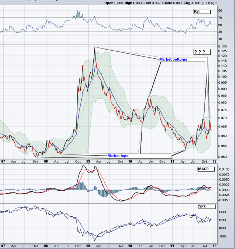
How about a little more detail on the highs and lows.
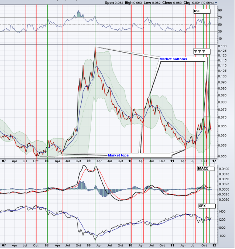
Pretty sweet. Now let's see what other data we can glean off the chart. Let's wipe the high/low data away.
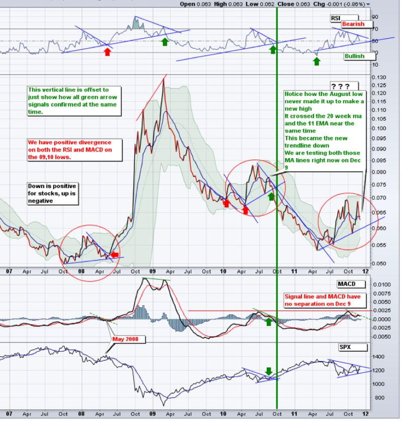
OK. This makes this chart fascinating. You don't think so? Let's start in the price box.First of all, this chart is a ratio. Comparing one market to another and plotting the change in percentage each day.
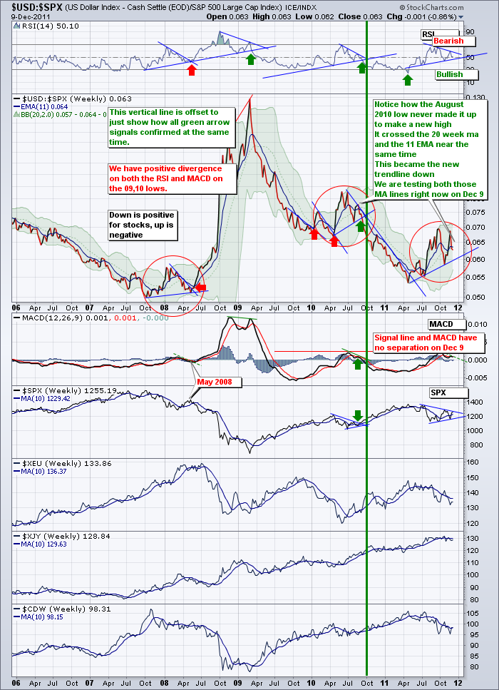
1) look inside the red circle in January 2008. This ratio had built a double top. It continued to make new lows in March and April, everything was fine. Well, look what happened in May 2008 about 8 months after the market had topped in October 2007. It reversed and started to go higher. It broke through the downward trendline and went almost straight up. Breaking the trendline decisively was a good clue.
Let's look at red circle for June 2010.This ratio made a double top. If it started to make new lows, every thing was fine. Well, look what happened in August 2010 about 4 months after the market had topped in April 2010. It reversed and started to go higher but it peaked out quickly and started to fall again. Notice how it made a double top, and started making lower highs and lower lows. When it broke the trendline of higher lows, that was a great signal or a confirmation of the price movement. Breaking the trendline decisively was a good clue.
So where are we now in the red circle in 2011? We have made a double top on the chart after the stock market topped on May 2. Here we are 8 months later, and the chart has also built higher lows. Neither trend has been broken. But when it does, it will be pretty important if the last 2 circles were a clue. Breaking the trendline decisively WILL BE a good clue.
Lets look at the RSI at the top. When those trendlines were broken, it was very significant. They also broke around the 50 line. We sit right there currently. 1/2 way between the trendlines, right on the 50. True indecision.
Let's check the MACD. Wow, interesting comparison again. As the MACD approached from the bottom it flattened out just above the zero line. Then it broke and moved decisively. A move across the signal line either way will be one of our confirmations. As of December 9, we sit right on the signal line. 0.0000 difference between the two lines. Notice how all three had a slightly downsloping MACD before making a decisive final move.
OK. So every signal line has not been crossed. The RSI is at 50. The MACD is at zero with the signal line. All three zones have double tops and rising lower trendlines. Maybe we should reveal this chart name now.
Well, comparing the $USD (US Dollar Index) and the $SPX (S&P 500 ) is pretty important! You'll want to keep your eye on this chart.
So obviously the stock market may go higher or lower tomorrow. What is of equal importance is how the $USD behaves tomorrow. If you come back to this blog, you can click on the last chart for an update. Due to its importance I strongly suggest you have one set up in your chartlist.
Now here is the same chart with some other currencies added on. The Euro ($XEU), the ($XJY)Japanese Yen, and for the direction of commodities, the Canadian Dollar ($CDW). Currently Yen and the Euro compared to the USD are under their 10 week moving averages. If they can get back above, that should be a good push in the direction. We have other currencies that are part of the Index but the Yen and the Euro are dominant. The CDN dollar has turned higher than it's ten week moving average (MA) so that could be an indicator.
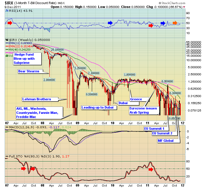
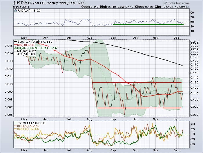
I have one chart I like to guage the success of the bonds very short term. On Good news they bounce up. Unfortunately, both the $IRX and the $UST1Y are sitting on or near their lows. This is a big red warning flag so far.
You can see it closed the week right at the bottom of the chart. If things are getting better, we want to see the short term yields pop up.
Here is the 1 Year. Same drill. It should pop up if things are getting better.
Let's keep watching to see what happens. The thirty year had a bounce but not outside it's trading range Friday. You can see that on the chart $TYX.
Fed Meeting Tuesday, Options expiration Friday.
The CSTA Calgary Chapter meets Tuesday Night at 6:30 for a webinar with Ed Carlson.
www.csta.org to register. Should be a full house so please reserve your seat.
Good Trading,
Greg Schnell, CMT

