Today we want to investigate which sectors are leading and following.
The easiest way to do that is: a dashboard view.
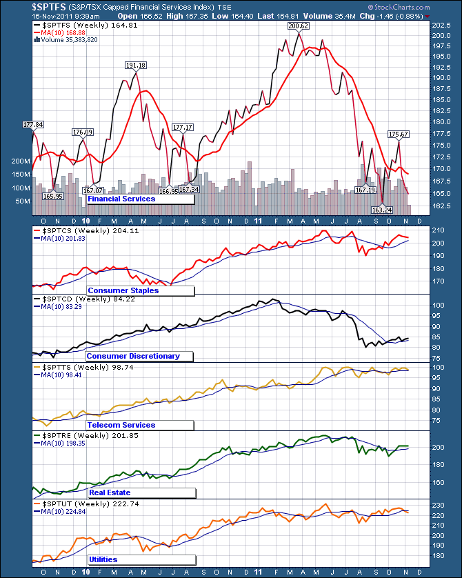
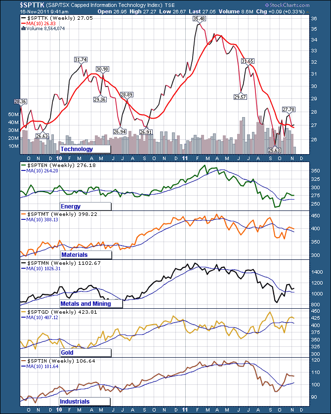
The Canadian Sectors outside of Energy, Finance, Gold and Materials are incredibly thin. Like 10 stocks in each sector, some with even less. I have listed some of the sectors below.
So here are the sector charts.
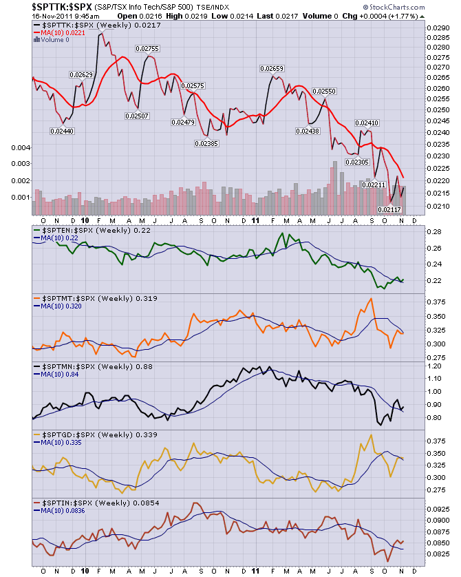
This is interesting, but it doesn't tell us what is outperforming. If you use the charts above with the charts below, you have a better chance of outperforming. Now these charts below, they help us see what is outperforming the $SPX.
Why the SP 500 as a reference? It is one of the widest strongest indexes in the world. We could use the Wilshire 5000 or some other, but the SP500 is a good standard. If you can outperform the SP500, that is great for most fund managers.Remember the SP500 is represented by $SPX here at Stockcharts.com. I use the names interchangeably to explain things.
When I compare something to the SP500 I have nicknamed it the SPURS. SP 500 Relative Strength. I always shade it purple. So these charts have a shaded background, in Purple! They are the relative strength of each sector compared to the SP500.
Only three of these are outperforming their 10 week MA. Energy, Materials and Mining. That does not mean they are going up, they are just better than the SP500 over the last 10 weeks. That's important. If the stock market loses 255 SP 500 points, these just have to lose less on a percentage basis to go higher..
You can see the Consumer staples have outperformed the $SPX and outperformed the consumer discretionary sector as the ratio line (the 'price line' , not referring to the Moving Average) is trending higher over the last while. During the same time frame the $SPTCD is trending lower. Well, that is hindsight.
How can I find an entry point I like? Now look at the slope of the 10 week moving average back in March, April, May. It was changing to a positive slope from a downslope in March, April May. These can be good indicators. It was also changing from a positive to a negative slope in Energy, so that could be a signal to sell. To get a faster signal, draw a trendline under the upslope in Energy and when that trendline is broken, exit or tighten stops.
You can use these relative strength lines against the SP500 then look and compare sectors to sectors quickly and visually. So Staples, Utilities, Telecom and real estate are trending higher since May. Consumer discretionary and financials are trending lower...
Homework alert. Did you notice that currently none of our sectors have a positive slope on the MA? That, my fellow traders, is a problem. What should we rotate into? Currently, nothing is saying pick me. Our next best is to say, what is above the Relative strength moving average lines. A few sectors are. That might be where to look.
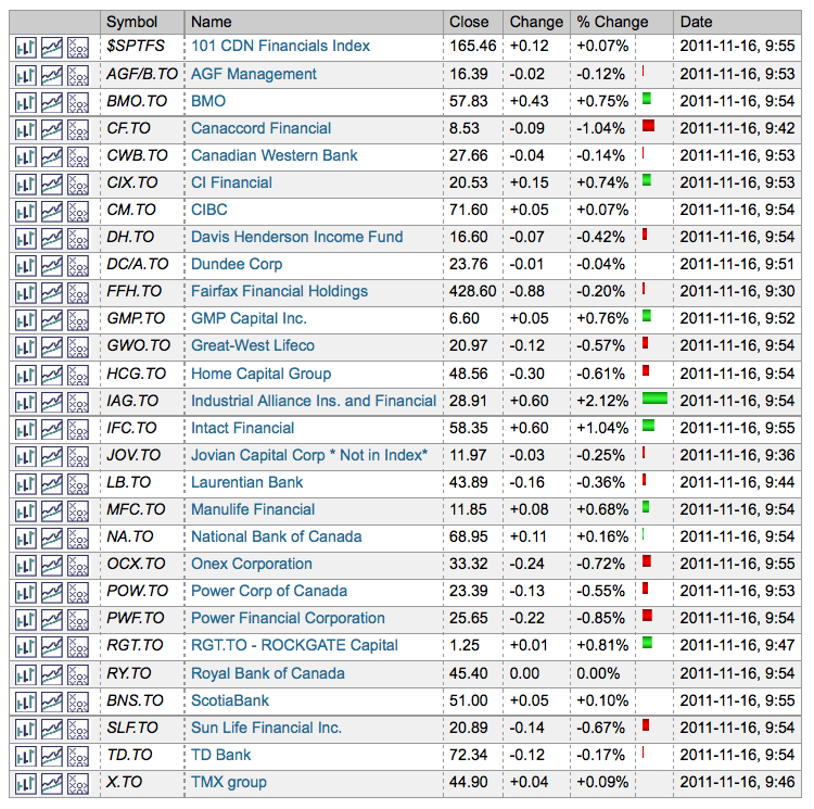
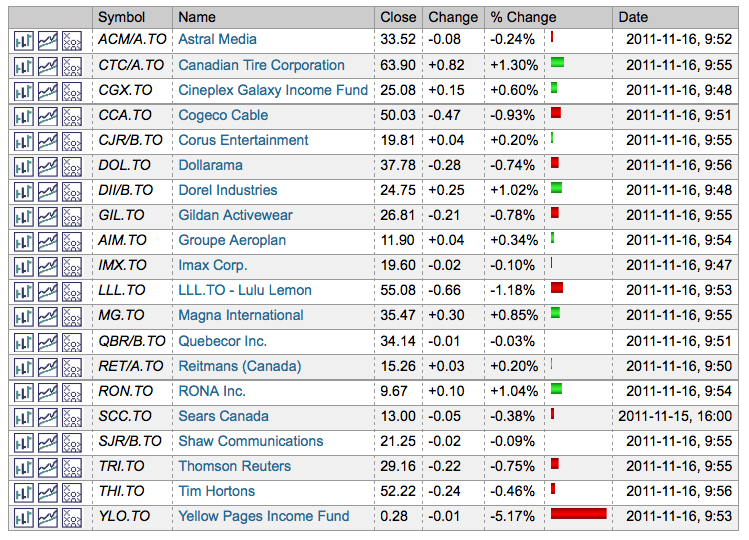
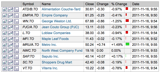
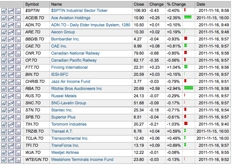
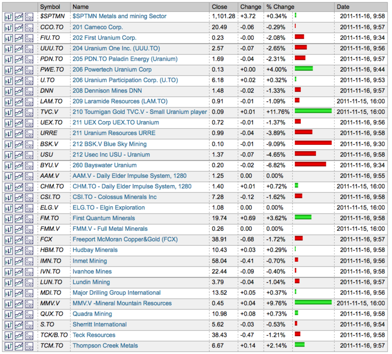
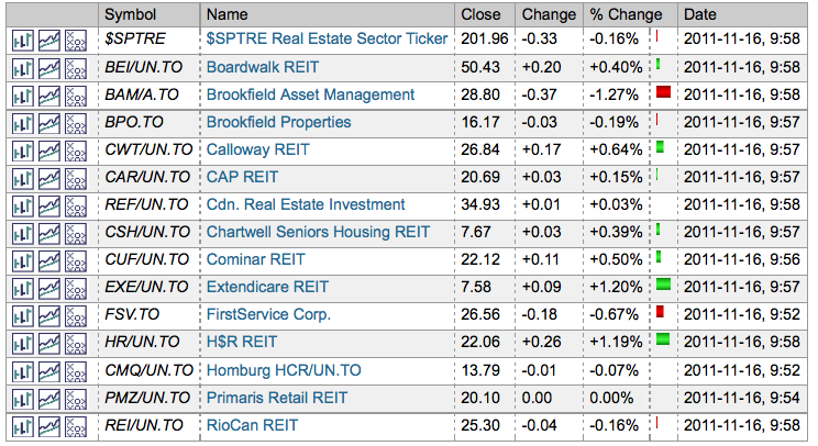
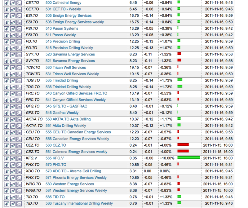
So you can find sector lists on globeinvestor.com or ft.com but you have to get them into chartlists to be effective. Here are some lists of sector stocks as screen shots of my chartlists. These won't link to any stocks as they are screenshots. But it may help you organize your charts. As you can imagine the oil and gold lists are longer so I have not posted them here.
Financials
Consumer Staples
Healthcare
Industrials
Metal and Mining Sector
Materials
Real Estate
Utilities
Technology
Telecom
This is not a formal sector but it is the list of drillers and fracing companies. That fracing word is the real way to spell as it is short for fracturing the rock. Notice no 'k' in fracing.
So there you have it. Almost every sector is trading weaker than the $SPX index looking at the 10 week MA currently. Some traders feel you need to look 180 periods (think daily) back for SPURS depending on your investing timeline. So to do that we could use a different MA line. For daily, 180 divided by 5 would be 38. With holidays maybe 39 weeks. Each trader is different.
That makes it hard for Canadians to outperform when in general all our sectors are currently under performing.
Within each sector, some stocks may outperform. As an example, THI.TO or THI is a strong stock in the Consumer Discretionary.
You can only outperform the market if your stock outperforms the index. So looking at relative strength is very important. So put some SPURS on your stocks and make sure you are buying stocks that outperform!
Let me know if these lists help. I can post the Gold and oil lists if you would like. Notice by using numbers at the front of the stock name, you can control the order they show up on your chartlist. So as an example, all of my drillers and oilfield service companies have a chartname that starts in the 500 level. This groups them together. Same with lumber stocks farther up in a different chartlist.
Tune in tomorrow...I put some nice oil dashboards together for Canadian stocks and will share them here.
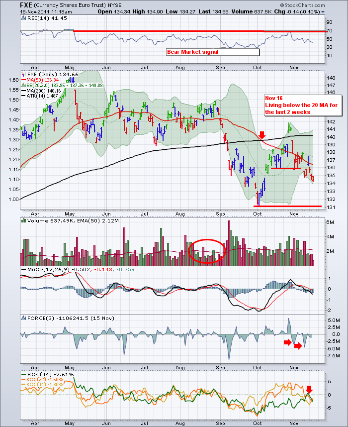
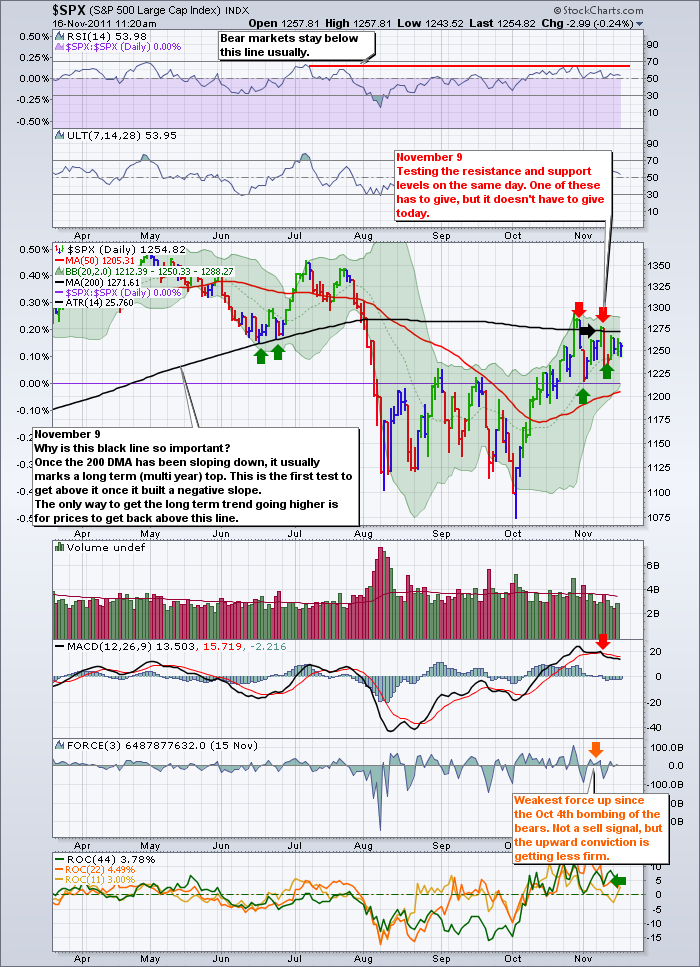
Lastly, I continue to keep watching the FXE. I think the world has both eyes on this chart. Should it get to 131 we need to get support there. IF it does not hold there, it will probably demarcate a major transition point for the market. Cramer suggests it may mark the point where European banks start to fail as they are currently unable to raise capital. The world is trading off the 131 line. On the upside for the markets, we still see the 200 MA on the SPX as a ceiling. If the Euro can get support, we should break through the 200 DMA. Notice how intraday, the FXE opened near its low. As it rallies up, so does the US market. The converse is also true. This is why I feel our Canadian stocks are trading like European bank stocks. The indexes are all tracking this FXE.
Here is the SPX.
To Subscribe to this blog, follow the link and click top right on the page.
Good Trading,
Greg Schnell, CMT

