Using volume to help with your analysis is widely considered as the best tool in Technical Analysis.
Today, let us compare three charts.
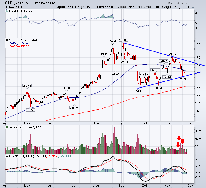
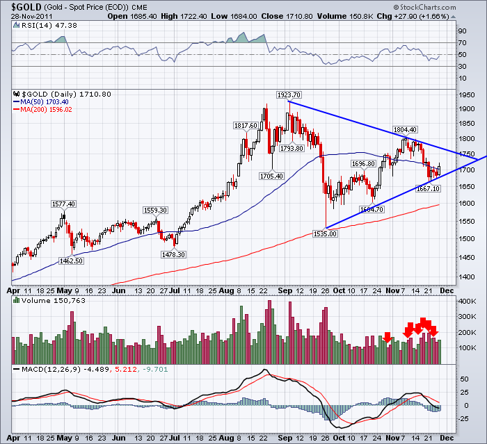
I have marked the distribution days within the last month on the chart. A distribution day is a down day compared to yesterdays closing price, that has higher volume than the previous day. In other words, a distribution day is aggressive selling. Passive selling would be a down day, but people aren't selling aggressively so the volume is lower. 1 distribution day a week or less is ok. But clusters are a major negative!
Now look at the $GOLD chart. Notice how many distribution days in the last month. 7 in the last 20 days.
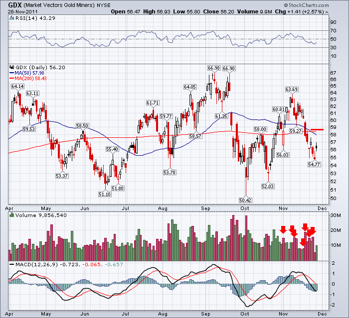
Here is the Gold Miners chart. Before you look, what would you expect? The market has been trending down since the OCT 27th high on the $SPX, so how many distribution days would you expect to have on gold mining stocks?
It could be similar to GLD. They trade during the same hours, unlike $GOLD which takes into account the overnight trading action.
A large grouping of distribution days is normally associated with a top. So both the GDX and the $GOLD have lots of these days. GLD has a lot less.
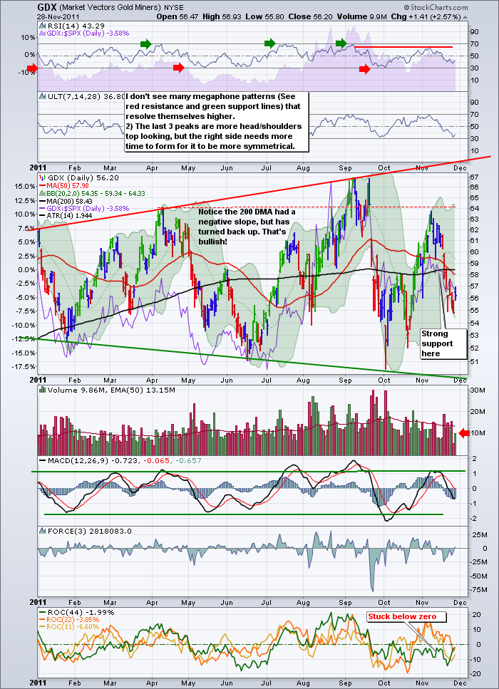
Let me repost the megaphone top chart on the GDX. Same chart as above, with different display variables and annotations from a previous blog. Notice this has average volume on the volume scale. This is also a topping pattern. I've shown it here on the blog before.
Now, lets compare the volume levels of today Monday November 28th.
The GLD has a volume reading less than average (eyeballing it) on a big up day.
The $GOLD has a volume reading higher than Friday, but below Thursday. This trades on the continuous contract so the market was open. I would suggest it is average at best.
The GDX - The Gold miners index - usually outpaces Gold during strong moves up. But the volume on the GDX was anemic. You can eyeball it on the first chart or have an average volume line help you on the bottom chart. It was only 70% of the average volume. Notice you can read and compare the values in the top left of the volume box.
I would expect aggressive buying if everyone thought the bottom was in and gold was surging $30 at the open.
The price of Gold drifted lower throughout the trading day. The volume was not confirming aggressively buying GLD, $GOLD or GDX as an upside breakout. This is how I use volume to help decide if I like the 'price' action. If you go back to the October lows, you had above average volume on the first day, and you closed near the highs. The market then pushed prices higher closing on the highs everyday for a week. The volume got weaker every day as the move advanced, but closing on the highs showed solid support. The clue that this rally was losing support was the quiet volume or well below average volume. As well, this is a rally off a previous high, and the silver sister in precious metals has not traded well. It might have been telling you it is just a trading rally, as the buying got weak quickly.
Now let's look at June. We had a large grouping of above average volumes near the lows. The price was accelerating higher.The average volume line was rising and we traded near the rising average almost every day. The pullback in July was marked by above average volume on the selling but the buying returned with full force. We are not seeing that currently.
The negative slope on the volume line on GDX is not a positive trend. The distribution days on $GOLD and GDX are not a positive development.The lack of volume today on all three charts is not a positive development. The price action today was weak in that the price sold off almost from the open after the premarket price pop. All that leads me to still be cautious on Gold and the miners.
See how frustrating it is when you don't have an average volume line after you have one! To put the volume on your chart with an average volume line, you need to do a few things.
1) In Chart Attributes, set volume to off in the dropdown box.
2) In Chart Attributes, set color volume on with a checkmark to the right of the volume dropdown.
3) Under Indicators, select volume from the drop down menu
4) Put the # of days in this case, in the box immediately to the right. For example 50 for a 50 period average.
Gold is still trending lower and I don't see any positive divergence on the charts to speak of. Technical Analysis is about improving the odds, not proving the odds. It may continue higher from here, but I need to make sure I have a stop just below here if I take a position.
Sometimes the most obvious trades are the ones that hurt us.
For homework, look at the $TYX chart, the $TNX, The FXE and the FXY. None of these enjoyed the rally today which is even more disconcerting. Almost all of the price gains were made in the premarket which is another caution flag. The SPX, the COMPQ and the $TSX all had below average volume. The fact that 8 SPX points were made in the final 5 minutes on a massive volume ramp, probably wasn't bullish. The price profile was lower highs and lower lows all day till the last few minutes. It might have been the high frequency traders taking out all the technician traders stop orders at the end of the day for some easy money. Just saying...
If you are in Calgary on December 13, please come to our CSTA meeting to hear Ed Carlson.
More information and registration can be found at www.csta.org
Good Trading,
Greg Schnell, CMT


