 Relative Rotation Graphs are a great tool to visualize sector rotation and that is probably where you will see them applied most. But they can be used for so many more (rotational) variations of different universes or similar universes in a different way.
In this post, I will show you how we can use Relative Rotation Graphs to visualize rotation in US Equity markets based on growth, value, and size or market capitalization. And eventually, isolate the area of the market that seems to have the best opportunities in the next few weeks.
Summary
- Growth (still) beats value
- Large Cap continues to lead over Mid- and Small-cap
- Value-Large caps beat Value mid- and small-caps
- Growth-Large caps beat Growth mid- and small-caps
Painting the landscape
The equity landscape in the US and any other region or country for that matter can be divided in many ways.
Very often sectors are used to isolate and analyze parts of the market. In the case of sectors, companies that operate in the same field (sector :) ).
Market cap segmentation
Another way of dividing the various companies in an equity market is based on the market capitalization of the various stocks.
The most used size-based layout is Large-, Mid-, and Small-caps.
Sometimes Mega-, Micro-, and even Nano-caps are also used.
The good news is that indexes are maintained to track the performance of (most of) these groups of companies.
These indexes we can then use in charts to analyze them and when they can be plotted on a regular chart we can also use them in a Relative Rotation Graph to compare them against each other and against a benchmark.
More information on the definition of the various market cap segments can be found here.
Growth versus Value segmentation
Another division of the market can be done based on “growth” or “value”.
At the links, you can find more information on what are considered growth stocks and which are considered value stocks.
Choice of index "family"
When slicing and dicing a universe, the choice of indexes has a big impact on your analysis and as these data series will form the base of any analysis, it makes sense to spend some time putting together a proper universe of indexes to achieve what you are looking for.
One of the things I always look for when researching universes and which indexes or ETFs to use are “families” that cover a complete universe.
So in the case of sectors, for example, I will look for sector-indexes that are compiled and calculated by the same index-provider to assure that there are no overlaps or gaps between the various sectors and that all are calculated according to the same standards.
Using a number of sector-indexes from one provider and other sector-indexes from another provider usually isn’t a good idea, very often it’s comparing apples and oranges as all these index providers have their own methodology.
While doing my research for this article I found out that StockCharts.com carries an extensive set of Dow Jones indexes that I can use in Relative Rotation Graphs to paint the picture of current rotations in the various segments of the US equity market.
The BIG index that I am going to use as the benchmark for the whole US market is $DJUS, this index covers around 95% of the total market capitalization in the US.
Growth / Value analysis
In the same $DJxxxx family we find two indexes representing growth- and value stocks. These are $DJUSGR and $DJUSVA.
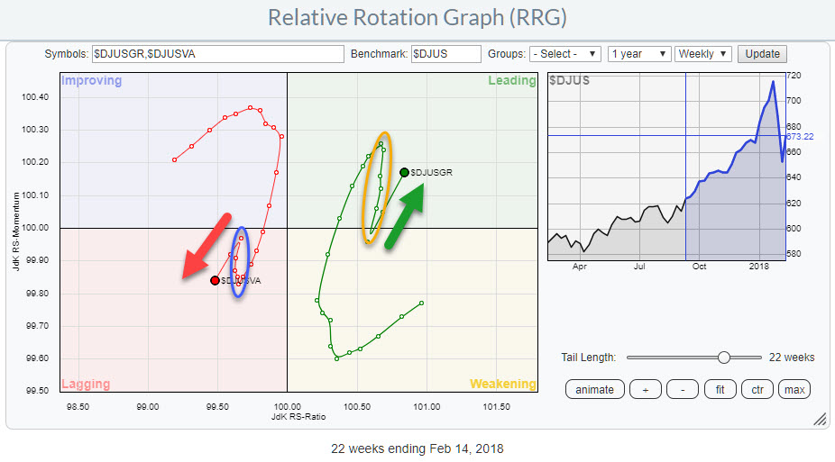
The RRG above shows the rotation of Growth versus Value stocks against $DJUS, using these two indexes, with a 22-week tail.
When there are only a few items on the chart we can work with longer tails and analyze longer-term rotations more easily.
This picture is pretty clear and decisive. Over the course of the last 22 weeks and actually, since March 2017 growth stocks have been positioned at the right side of the RRG inside leading or weakening while value stocks rotated on the left-hand side in lagging or improving.
On the RRG the tail starts mid-September when Growth was in weakening and Value in Improving. For a few weeks, the rotation continued in favor of Value as they approached the leading quadrant and Growth was heading for the lagging area.
Late October 2017 the market started to turn again and the tails coiled upward without ever crossing to the other side of the RRG. This is a characteristic of a strong (relative) trend, in this case in favor of growth.
Mid-January the tails rolled over again and started to head South for growth- and North for Value stocks.
As you can see on the chart (I have circled the periods in blue and orange) these counter-trend moves only lasted for 4-5 weeks.
Over the past two weeks, both indexes continued their primary trends which means favoring growth stocks over value.
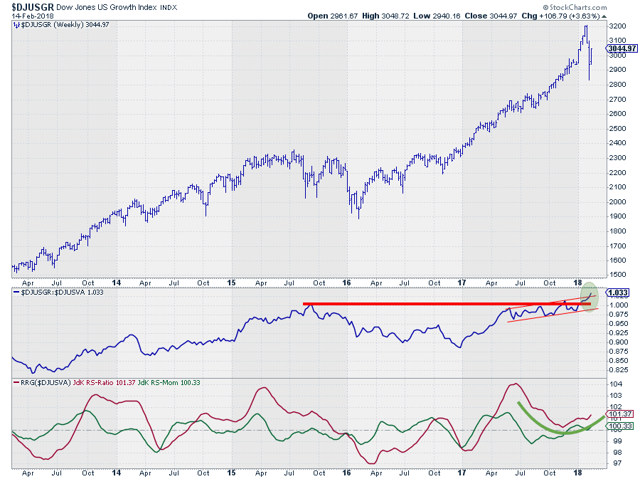
The Chart above shows $DJUSGR with its relative strength against $DJUSVA.
The upward break above horizontal resistance in the raw RS-line in combination with the upward break out of an already rising shorter-term channel suggests that there is more improvement for growth over value to expect.
The RRG-Lines show a turnaround of JdK RS-Ratio above the 100-level while JdK RS-Momentum has turned back above 100, pushing growth further ahead of value.
Size segments analysis
Again searching in the same $DJxxxx family of indexes we find three ticker symbols that can be used to break down $DJUS into large-, mid-, and small-cap segments. Their tickers are:
- $DJUSL : Dow Jones US Large cap
- $DJUSM : Dow Jones US Mid cap
- $DJUSS : Dow Jones US Small cap
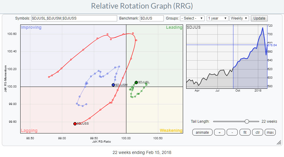
The RRG shows these three market segments plotted against $DJUS as the benchmark.
Again the rotational pattern is sending a pretty clear message. The rotational pattern on the RRG suggests US Large caps to lead over mid- and small-cap stocks.
In this setting, the RRG and the tails on the three indexes show a preference for large caps over mid- and small-caps.
As a side note, this is a good example of differences in tail lengths which can very well be explained by the size segments.
Clearly, large caps make up the largest part of $DJUS so it is expected that $DJUSL remains closer to the center (benchmark) of the chart.
Small-caps, on the other hand, is the smallest part of $DJUS and therefore have a bigger chance or opportunity to deviate much more and move away from the center of the chart. This causes longer tails and it also makes clear that this segment of the market often holds better opportunities for out-performance over the benchmark.
Dow Jones US Large cap - $DJUSL
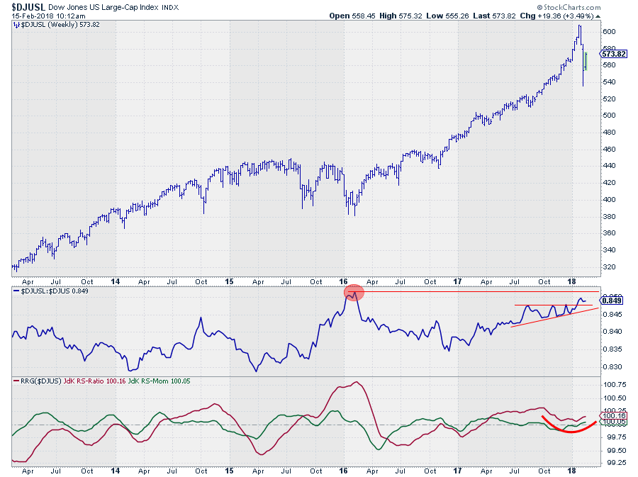
The chart shows the price performance of $DJUSL (US Large cap stocks) with relative strength and RRG-Lines against $DJUS.
From a price perspective, I like that the recent low has come in, for now, at a higher level than the previous low which means that the uptrend is still in play if we stick to the definition of an uptrend being a series of higher highs and higher lows.
Going forward it will be important for this trend that a new rally manages to push above the recent high to keep the momentum going.
From a relative perspective, the recent break out of the ascending triangle on the RS-chart is a positive sign.
The RRG-Lines have bottomed out and are now both back above the 100-level and pushing Large Cap stocks into the leading quadrant again.
The next hurdle to watch is the level of the early 2016 high in relative strength of $DJUSL vs $DJUS
Sized Value breakdown
Digging deeper into the $DJUS master universe we find a set of value-indexes broken down into size segments:
- US Large cap value : $DJUSVL
- US Mid cap value : $DJUSVM
- US Small cap value : $DJUSVS
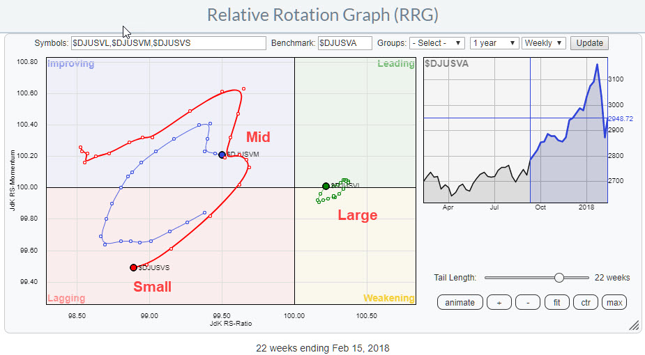
Of course, we can easily put them against $DJUS as the benchmark but we can also put them against the US Value index, $DJUSVA that we have just used to look at the relationship between growth and values stocks.
Basically, we are stepping one level down in the hierarchy.
The Relative Rotation Graph holds these three indexes against $DJUSVA and shows that the large cap segment of value stocks should be preferred over mid- and small-cap
Sized growth breakdown
A similar set of indexes exists for the growth section of the market. These symbols are:
- US Large cap growth : $DJUSGL
- US Mid cap growth : $DJUSGM
- US Small cap growth : $DJUSGS
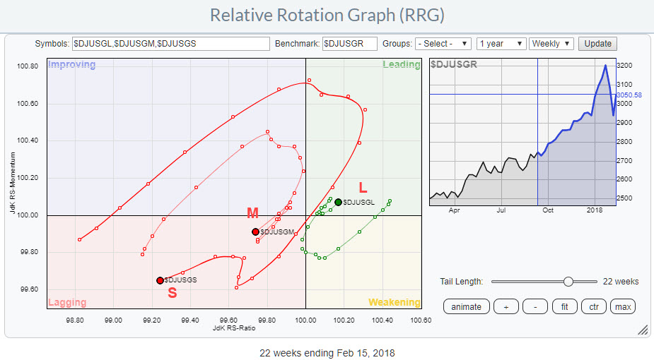
And just like their value counterpart, I like to use the overall growth index, $DJUSGR as the benchmark for this universe.
The RRG above shows these indexes against $DJUSGR as the benchmark.
The RRG for these indexes is shown in the RRG. Again the large-cap segment beats the mid- and small-cap segments just like it did in the value part of the market.
Bringing it all together
In the charts and paragraphs above we segregated parts of the US equity market based on growth or value characteristics. Then we sliced the universe into market capitalization based segments. The next step was to drill down into size-based segments for both the value- and the growth- parts of the market.
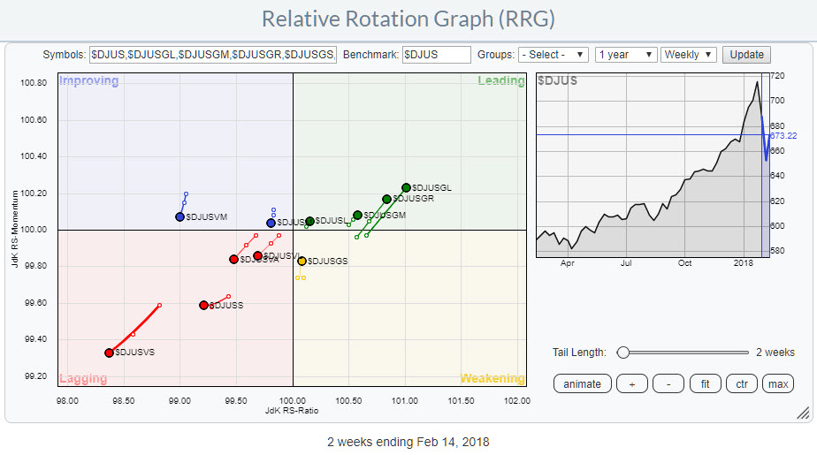
In this final part of the analysis, we will put all these sub-segments on ONE Relative Rotation Graph against $DJUS
This is done in the RRG above. As there are now (many) more indexes visualized on the plot I have shortened the tails to keep the chart more readable.
Recapping, we had the battle between growth and value decided in favor of growth. The size-based segmentation of the market came out in favor of large-cap stocks over mid- and small-caps.
The second level of analysis on the size-based segments within growth and value are confirming the big picture painted by the two higher-level analyses.
In both universes, large caps surfaced as the preferred part of the market but with growth clearly being in the lead over value at the moment the overall winner for US stocks at the moment is Large-cap growth stocks which are found highest on both the JdK RS-Ratio scale and the JdK RS-Momentum scale.
A similar strong signal is sent from the RRG with regard to the weakness of the US Value small-cap stocks. This segment of the market is deep inside the lagging quadrant and has the lowest value on both axes.
Conclusion
In this article, I have shown you a different way of slicing through the US equity landscape using growth versus value and different market capitalizations instead of the more commonly used sector segmentation.
The idea behind this post was to make you aware of the fact the RRG visualization tool can be used in more ways than just looking at “sector rotation”.
Personally, I always get fresh thoughts when looking at things/events through a different lens and from a different angle but I love to hear your thoughts and feedback (also with regard to the MWL show in which I talked about this subject today).
Let me know what you think of this usage of RRG in the comments? If you want to receive a notification when a new article in the RRG blog is published? Simply "Subscribe" and leave your E-mail address.
Julius de Kempenaer | RRG Research
RRG, Relative Rotation Graphs, JdK RS-Ratio, and JdK RS-Momentum are registered TradeMarks ®; of RRG Research
Follow RRG Research on social media:
If you want to discuss RRG with me on SCAN, please use my handle Julius_RRG so that I will get a notification.

