 The rough ride down in the markets last Friday was something that was probably expected by many but still came as a surprise. I am not a big fan of “calling tops”, or troughs for that matter. Mainly because many of these “predictions” have had many failed attempts to “call the top” before.
There are a lot of people who have “called all 10 of the last 3 crashes….”
Instead, I am trying to look at what information the markets are throwing at us, especially in a situation like last Friday which was expectedly unexpected or vice versa. It’s easy to fall in the “focus-trap” and forget or fail to see the bigger picture.
This is why in situations like this I like to take a step back and see what’s going on on a larger scale. Get in the helicopter and take a view from above and do some damage-assessment on the battlefield of the markets.
Summary
- Long-term trend in $SPX has enough room to breathe
- Financials and Industrials seem well positioned to act as a hedge for now
- Health Care is worth watching
A longer-term view
If we just step back a little and away from the day to day noise and focus on the bigger picture for the S&P 500, what exactly are we looking at?
For a long-term view and a big picture analysis, we need a monthly chart, AND a Relative Rotation Graph but we get to that later.
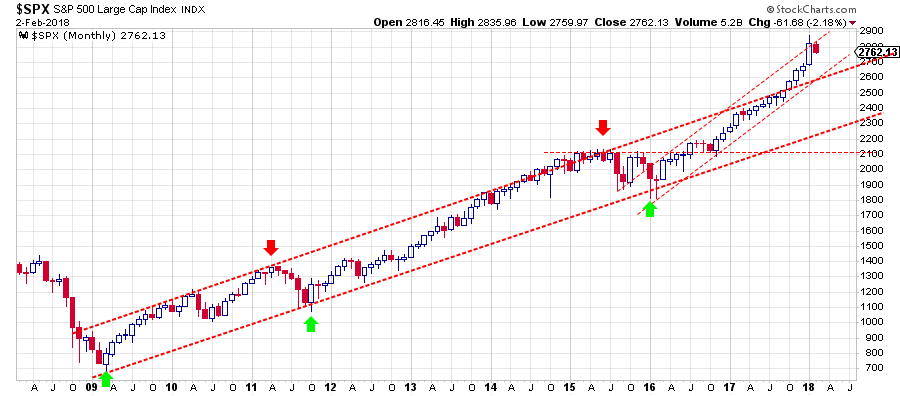
The current move for the US stock market emerged out of the early 2009 low after the 2008 massacre. What followed is a very steady series of major highs and lows each coming in at higher level than the previous high or low. The very basic characteristics for an uptrend. And the good news is, that picture is nowhere near a change.
In the monthly chart for $SPX I have labeled the highs and lows that are (IMHO) important and of the same level. Clearly, there are intermediate and shorter-term highs and lows and trends in play over the course of this move but we’re trying to assess the long-term picture here.
Since the early 2009 low, I have identified three major lows that are connected by the rising trend-line/support line. The level of that support line is now somewhere between 2200-2300 and gradually moving higher.
Only AFTER you have identified a (rising) support line you can start to look for a parallel resistance line to see if a trend channel exists. In the case of the S&P 5, 0 I think it has to be the line that connects the two major highs in 2011 and 2015 labeled with the red down-arrows.
That upper boundary of the rising channel was broken upward towards the end of 2017, basically making an already strong trend even stronger. Such upward breakouts from rising trends usually come at the risk of a blow-off. Problem is you never know when the peak is set, so we’ll have to wait and watch.
What are we watching?
The old adage that old resistance becomes support once broken, surely also goes for rising resistance lines. In this case, that means that the former resistance line can be expected to act as support in case of a decline. That makes the level around 2600 because that is where that line is currently running, an important level to watch now.
Zooming in on the price development over the past two years displays that a shorter, somewhat steeper, channel came into play. The lower boundary is pretty well defined and connects a number of, same-level, lows. The upper boundary is somewhat debatable but I’m happy to work with the way I have penciled it in on the monthly chart above and again on the weekly chart, showing more detail, below.
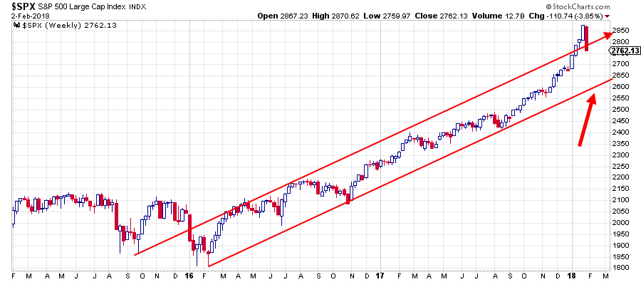
The January candle on the monthly chart seemed to even be breaking out of that steeper channel but come Feb the market negated that break and came back into the channel which is seen in more detail on the weekly chart.
The “rule” I have always learned and try to operate on is that when a market drops back into a former rising channel, chances are high that it will look for the lower boundary of that channel. In this case, that means a drop back to the lower boundary of the shorter channel which is currently running around …. Surprise, surprise… 2600, this makes that level a “double support.” Certainly, something to watch.
The price action that will unfold around that 2600 level will provide us with an important clue about what will happen next.
If 2600 holds and a new low is formed in that area then the steeper channel remains in play and another leg higher within that channel is likely.
When 2600 breaks downward the S&P 500 drops back into its former long-term rising channel and in that case a further drop towards the lower boundary of that channel, currently around 2250 and rising slowly, becomes a real possibility.
Unless the structure of the market (higher highs and lows of the same magnitude) changes, even such a decline will not change the long-term trend. For sure it will hurt in some portfolios but the bigger picture will still be intact.
What about sector rotation?
To track the sector rotation that currently is underway in the S&P 500 we look at the Relative Rotation Graph for the S&P 500 sectors.
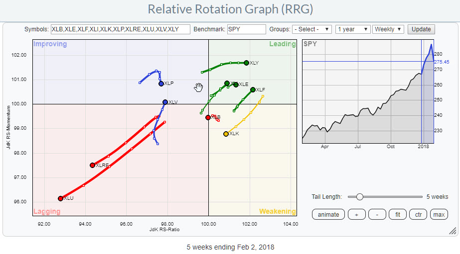
The RRG above shows the relative positions and movement of the 10 S&P sector ETFs against SPY.
The position and inherent weakness for Utilities and Real-Estate were discussed in my previous article.
With markets on the decline and various rotations underway it also makes sense to see where you may find shelter.
In the past, I have tried to match the rotational pattern that became visible on the RRG with the sector-rotation model as it is laid out in the S&P’s Guide to Sector Rotation by Sam Stovall.
However, at the moment it is very difficult to match the position of sectors on the RRG with the position of the same sectors on the SR-model.
Take for example the positions of Financials and Industrials. According to the sector rotation model these two should move in different directions. Industrials is expected to do well in the early stages of a bull market while financials are expected to do well after a market has peaked and is (entering) in a bear market.
Also, Technology and Consumer Discretionary (Cyclicals) are difficult to match. Both sectors are traditionally expected to do well during a recession around market bottoms. But at the moment they are moving in opposite directions. Technology is inside the weakening quadrant and heading for lagging while Consumer Discretionary is inside the leading quadrant at the highest JdK RS-Momentum value of all sectors on the graph and pushing further into the leading quadrant.
Potential hedges against the S&P 500 for the moment are seen in Financials and industrials inside the leading quadrant while Health Care is starting an interesting rotational pattern as it is crossing over from lagging into improving.
Inside the leading quadrant
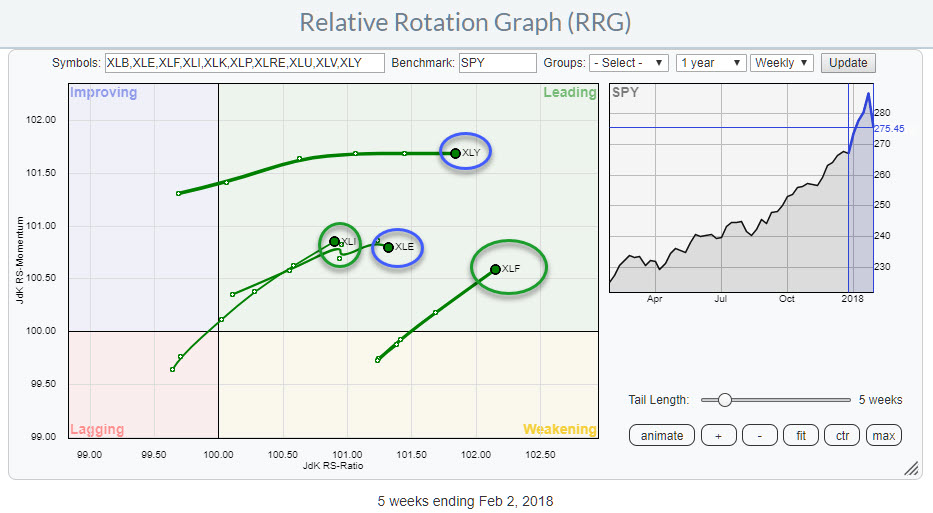
The Relative Rotation Graph above zooms in on the four sectors inside the leading quadrant. These are Consumer Discretionary (XLY), Industrials (XLI), Energy (XLE) and Financials (XLF).
From an RRG point of view, XLY is moving higher on the JdK RS-Ratio scale at a stable level. As long as this trail can be followed it is a sector to remain invested/overweight in. Only when a serious loss of relative momentum starts to show up (tail starting to roll over and bend downward).
Consumer Discretionary - XLY
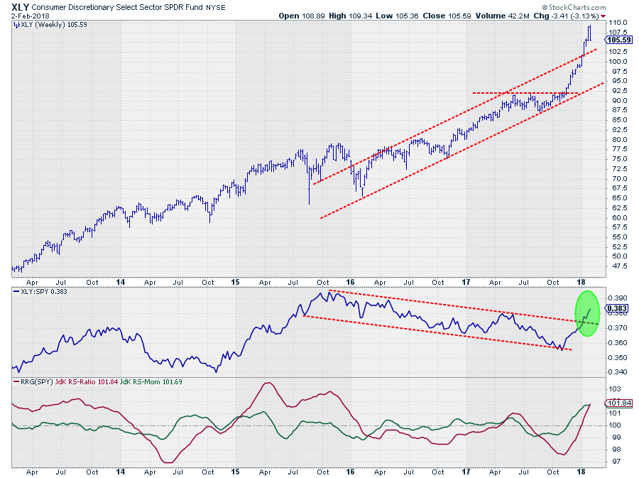
From an RRG point of view XLY is moving higher on the JdK RS-Ratio scale at a stable level. As long as this trail can be followed it is a sector to remain invested/overweight in. Only when a serious loss of relative momentum starts to show up (tail starting to roll over and bend downward).
The price chart in combination with the RRG-Lines supports a positive view for XLY as price is still well above its former rising resistance which we now expect to act as support while at the same time the RS-Line convincingly broke out of its 2-year down-sloping channel.
Industrials - XLI
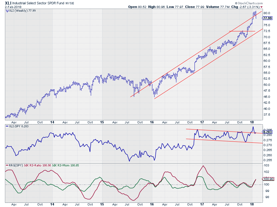
The Industrials sector fell back into its rising channel and is facing a potential correction towards the $ 72.50-75.00 area.
Relative Strength, on the other hand, is looking to test its former resistance as support and based on the tail that is visible on the Relative Rotation Graph and the expected rotational pattern, more relative upside seems to be ahead.
Energy - XLE
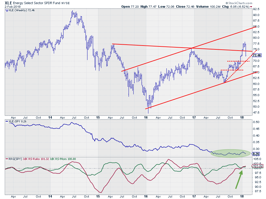
The Energy sector is still at a good heading overall and well inside the leading quadrant but the tail is starting to be a bit jiggly and the week-to-week observations are getting closer to each other (RRG-distance is decreasing). This type of behavior is often seen before the tail starts to turn.
The nasty reversal on the price chart of last week is not very helpful, so out of the four sectors inside leading I am least convinced of Energy at this moment. $ 70 looks to be the support level to watch.
A break lower will very likely cause relative momentum to roll over for the Energy sector and push the tail down towards weakening.
Financials
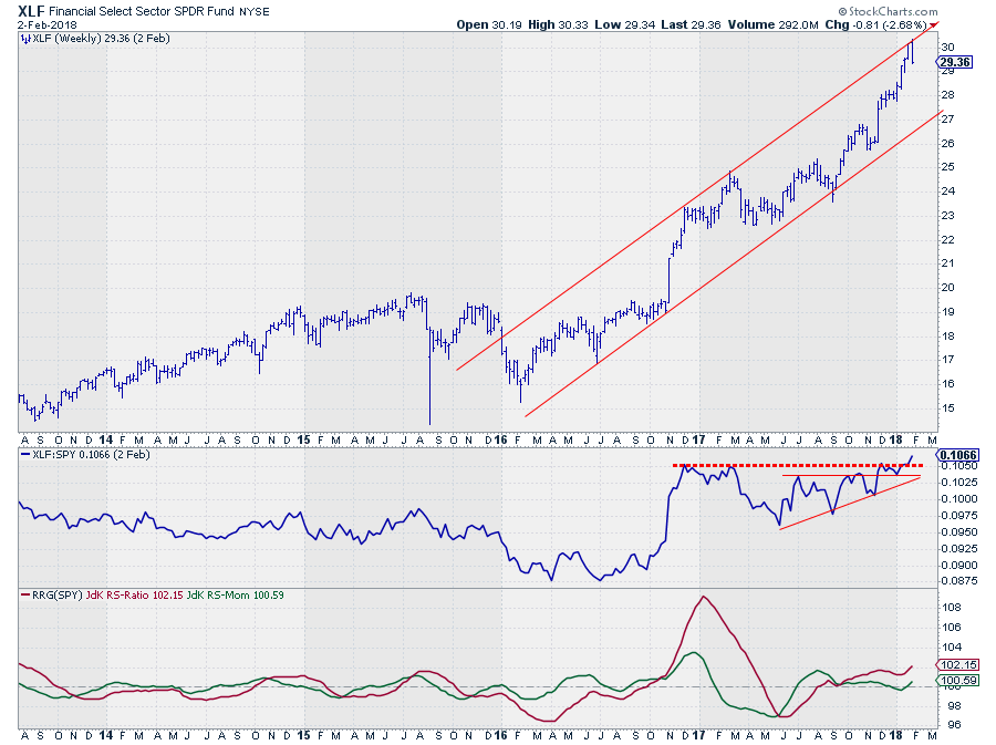
Finally the financials sector. Measured against the JdK RS-Ratio scale this is the strongest sector for the moment and it is moving further into the leading quadrant at a strong RRG-Heading.
Price has just touched the upper boundary of its rising channel and a decline in price has to be taken into account but given the strong uptrend and the channel that is visible, this sector has enough room to correct without harming its uptrend.
More important is the upward break in relative strength that is taking place at the moment. Coming week will be crucial for financials. If this break in RS holds up the sector will be in an even stronger position than it already is.
Conclusion
From a longer-term perspective simply following the series of higher highs and higher lows, the S&P 500 index is still in an uptrend. 2600 is an important level to watch in coming weeks but when the current market structure remains in place, even a drop back to the long-term rising support line around 2250-2300 will not harm this uptrend.
At sector level, the sectors to use as a hedge against a general market decline in order to outperform the S&P 500 seem to be Financials and Industrials while Health Care is worth watching for further improvement.
Let me know what you think of this usage of RRG in the comments? If you want to receive a notification when a new article in the RRG blog is published? Simply "Subscribe" and leave your E-mail address.
Julius de Kempenaer | RRG Research
RRG, Relative Rotation Graphs, JdK RS-Ratio, and JdK RS-Momentum are registered TradeMarks ®; of RRG Research
Follow RRG Research on social media:
If you want to discuss RRG with me on SCAN, please use my handle Julius_RRG so that I will get a notification.

