As (many of) you may know my fellow commentator Arthur Hill lives in Belgium. That makes him, geographically, my closest StockCharts.com colleague.
On Tuesday 8 November, indeed election day, the Amsterdam chapter of the MTA (Market Technicians Association) had Katie Stockton of BTIG over as a guest speaker for a breakfast presentation. Katie is a highly respected technical analyst among institutional investors and an early adapter of Relative Rotation Graphs which are now fully embedded in her workflow.
Arthur made the trip over to Amsterdam to attend the breakfast session, which gave the two of us the opportunity to spend some time together working on blog articles in one of my favorite coffee places in Amsterdam.

The nice thing and added benefit of working together from time to time is that we can discuss markets, the different technical tools that are available on StockCharts.com and how we can use them.
While we were chatting, I explained to Art how some professional investors are using Relative Rotation Graphs to monitor their portfolios. Or better how they use it to monitor the relative performance of their individual holdings within their portfolio against the benchmark that they have to beat.
Their systems allow them to connect their portfolios to RRGs essentially enabling them to call up a Relative Rotation Graph of all their holdings compared to their benchmark. If they perform any buy or sell actions in their portfolio and call the RRG of the portfolio again, all their changes will be reflected on the RRG as well.
If they sold a stock that stock will be displayed anymore while a newly bought position will be shown on the plot.
While having this conversation the idea arose (from Arthur's brain I have to admit) that we could achieve something similar on the StockCharts.com website by using chart lists.
Watch members of a ChartList in RRG
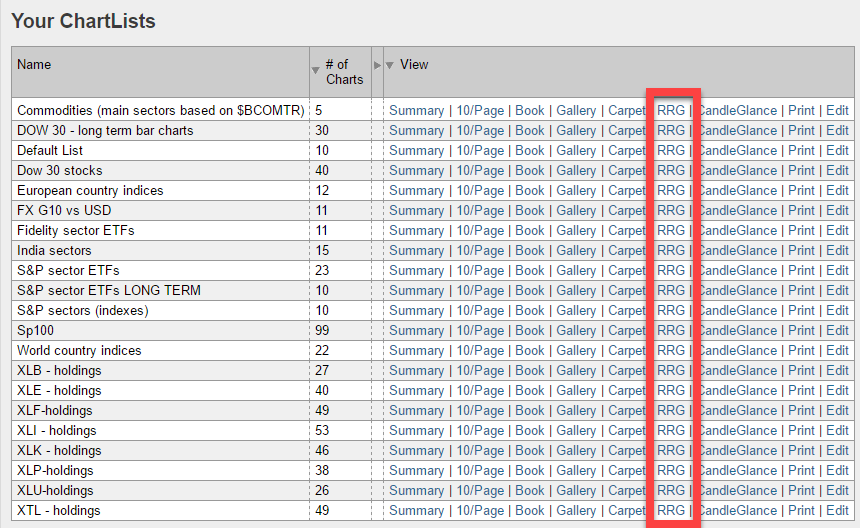
If you set up a chart list holding all the stocks, you own in your portfolio and keep that list aligned with your real portfolio, meaning to add stocks to the list when you buy them in your account and delete them from the list when you sell them. Running an RRG on your portfolio is just one click away.
Below is a screenshot of some lists that I maintain, as you can see, among all the various ways of looking at your lists is a link to RRG.
 The good thing is that this RRG link is "smart" as well. I don't know about you, but I sometimes like to have two different charts for the same symbol on my list. One longer term, one shorter term. Or one chart in combination with my default RRG indicator setup and another one together with traditional indicators like MACD and RSI.
The result is that there will be multiple ticker symbols that show up more than once in this list. However, when you run an RRG of this list, every symbol will only be shown once. So you will not get two or three lines (in the table below the chart) for the same symbol.
Set up portfolio as a ChartList
Setting this up for your portfolio is easy to do.
Create a new list by going to Members>Your ChartLists and then click the "Create a New List" in the top-right corner.
 Then add the ticker symbols of the stocks, ETFs, etc. in your portfolio. If you maintain this list well and keep it aligned with your portfolio, you can very easily keep an eye on the development of the (relative) performance of your portfolio.
The big advantage of monitoring your portfolio on a Relative Rotation Graph is that you will be able to spot the positions that need some love from you on one single chart instead of having to browse through the individual charts for each holding.
Interpretation
Clearly, you would like to see the positions in your portfolio to be inside the leading quadrant and moving higher on both axes. Or inside the improving quadrant but closing in on the leading quadrant while traveling at a heading between 0-90 degrees.
Positions that are inside the weakening quadrant always need attention. When they are still high on the JdK RS-Ratio axis, they may (just) be going through a temporary correction before turning back up again. Following some research that I did, and presented at ChartCon 2016, these type of rotations are very strong and they seem to produce good results following the heading turning into NE direction, so you may want to hold on to these.
The positions inside the weakening quadrant that are closing in on the lagging quadrant and heading between 180-270 degrees are the positions that need more attention as they are at the risk of turning into relative downtrends.
Sample portfolio
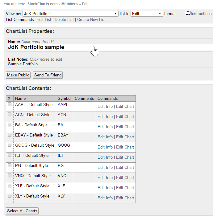
I have created a sample portfolio with holdings as per the table below:
Please note that these positions are completely bogus and put in, not so randomly, for this example ;)
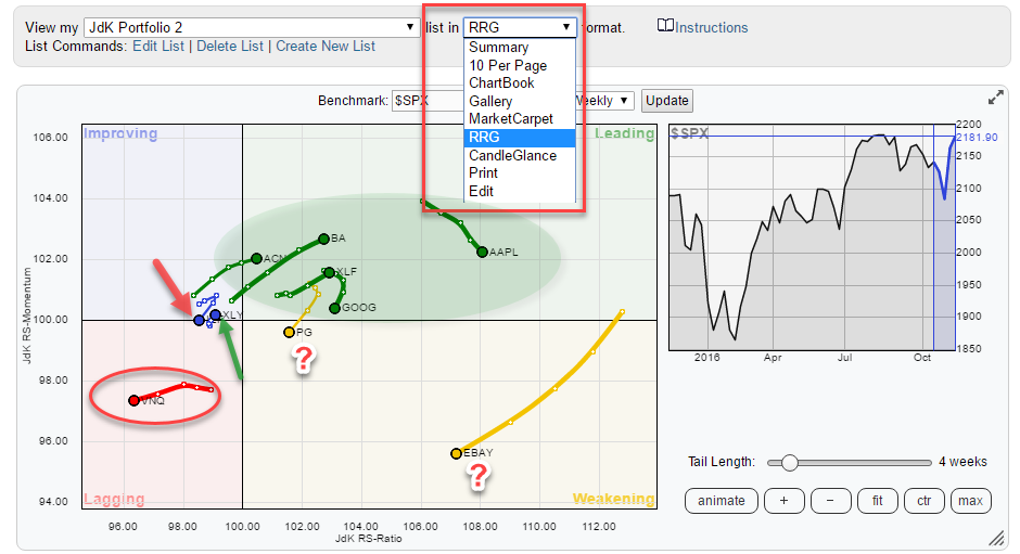
 In the header of the dialogue, there is a drop down box which allows you to view [list name] in [.....] format. Clicking the down arrow opens up the various possibilities. Choose RRG in this case, which will produce the Relative Rotation Graph shown below.
 If this were a real portfolio:
- I would not be worried about the securities inside the green shaded area; these are all doing just fine. GOOG and AAPL are losing a bit of relative momentum but are still inside the leading quadrant and comfortable on the right-hand side of the plot.
- VNQ, inside the red oval, deep inside the lagging quadrant should not be in the portfolio, or at least not for relative performance reasons. A candidate to review for selling.
- PG and EBAY are inside the weakening quadrant and heading in an SW direction (180-270 degrees). These need attention.
- Finally, there are two positions on the edge between lagging and improving with a red and a green arrow pointing to them. These are IEF (red arrow) and XLY (green arrow).
- The XLY position still seems to hold value as it is creeping higher on both axes, albeit at a very slow pace (read from the very short tail).
- The IEF position is worrisome as it has not managed to continue its rotation towards the leading quadrant and sharply turned back over the past two weeks, it should probably go from the portfolio.
Combining scan results and RRG to find replacements
To find potential buying candidates using Relative Rotation Graphs you can use the scan workbenches to find stocks that fulfill the criteria you would like to see in buying candidates.
Once the scan has run, you will have the possibility to save the results into a chart list. This chart list with scan results can then be loaded into a Relative Rotation Graph for further observation.
I hope you will find this way of using Relative Rotation Graphs a useful addition to your analysis toolkit. Looking forward to any comments or remarks and especially love to hear how you are implementing RRG in your own analysis workflow.
If you like to be notified when a new article is posted in the RRG blog, please enter your e-mail address in the box below this article and click "notify me."
Julius de Kempenaer | RRG Research
RRG, Relative Rotation Graphs, JdK RS-Ratio and JdK RS-Momentum are registered TradeMarks by RRG Research
Follow RRG Research on social media:
