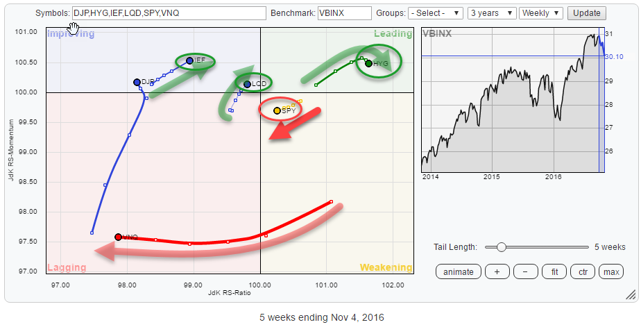
 The Relative Rotation Graph above shows the rotation of various asset classes against VBINX, a balanced index fund holding 60% in equities and 40% in bonds.
The current rotational picture is highlighting a pretty clear rotational picture for various (groups of) asset classes.
The most important observation is that all three fixed income related asset classes are showing a positive rotational picture while, at the same time, their price charts are showing horrible technical pictures. So what's the message that we can get from this?
Quick Scan
As said in the intro paragraph above. Clearly, the most important observation from the current rotational picture on the Relative Rotation Graph for asset classes is the positive rotation for all fixed income related asset classes; IEF (Government bonds), LQD (Corporate Bonds), and HYG (High Yield).
The weakest asset class, by far, at the moment is Real Estate (VNQ) which is found deep inside the lagging quadrant.
Commodities (DJP), despite the recent rise on the JdK RS-Momentum scale, is also still a weak asset class in this universe.
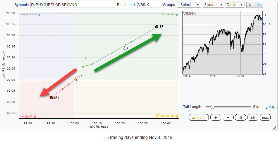
The heavyweight asset class in this Relative Rotation Graph is, of course, equities, represented by SPY. Its rotation has now clearly moved in a negative direction with SPY declining on both axes.
Fixed Income related
Of all three fixed income related asset classes, HYG has had the strongest run over the past few months and has just started to slow down a bit. LQD is closest to the benchmark and rotating towards the improving and leading quadrants. IEF, finally, is still inside the improving quadrant but gradually sloping higher causing a positive heading.
iShares iBoxx $ High Yield Corporate Bond ETF - HYG
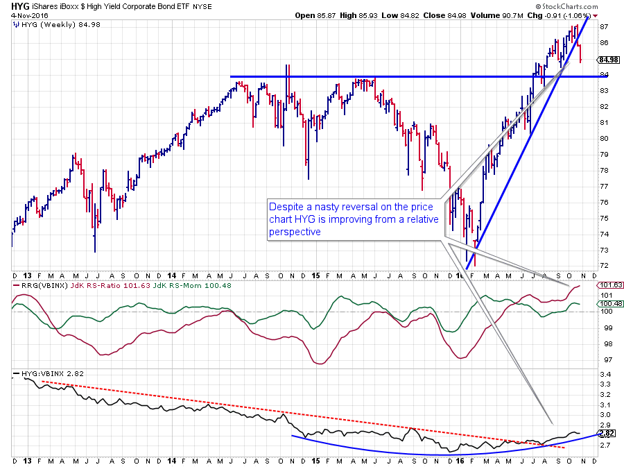 Coming from a low near $ 72 at the beginning of this year, HYG had a great run ending in a peak at $ 87 while, on the way, resistance at $ 84 was taken out.
Very recently, however, HYG shows a nasty price reversal which will, at the minimum cause a short-term setback or pause in the rally. The former resistance level at $ 84 should now be watched as support while upside potential seems limited for now.
Looking at HYG from a relative perspective is showing an entirely different picture. The multi-year downtrend in the relative strength line was broken this summer when the falling trendline was taken out, and a new series of higher highs and higher lows started.
The process, leading to this break started already back in 2015 and can be seen as a large rounding bottom. This looks to be a longer-term event and definitely not a one-day-fly. As HYG is deep in the leading quadrant on the RRG, making it the strongest asset class by that measure.
The recent loss of relative momentum causes the trail to bend downward now, but given the high value of JdK RS-Ratio, this is nothing to worry about yet. From a relative point of view, HYG remains one of the stronger asset classes for the time being.
iShares iBoxx $ Investment Grade Corporate Bond ETF - LQD
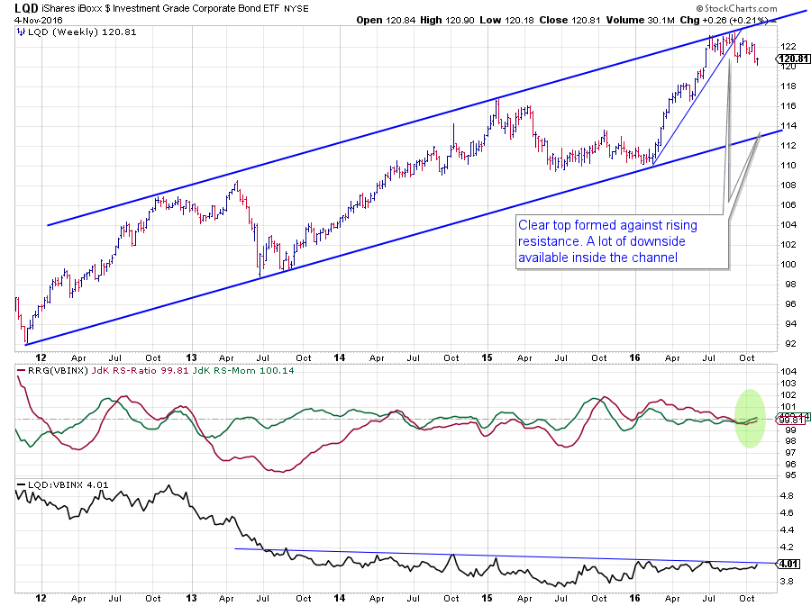 The price chart of LQD shows a very clear long-term channel. After a strong rally out of the low against the rising support line at the beginning f the year, LQD peaked against the rising resistance line near $ 123. The topping process is already ongoing for a few months since July.
The first sign of weakness occurred when the steep rising trendline broke. The final trigger to signal a new down leg (still within the rising channel) will be pulled when the recent low is broken downward.
When that happens, there is plenty of downside potential available to take LQD down in price, eventually towards the bottom of the channel again.
For LQD also, the relative picture is (much) better than the price picture. The raw RS-Line gradually improved out of the 2015 lows and is now challenging the slightly down sloping resistance line. An upward break will likely improve the picture further and possibly cause an acceleration pushing both the RRG-Lines higher and above 100, causing a rotation into the leading quadrant.
iShares 7-10 Year Treasury Bond ETF - IEF
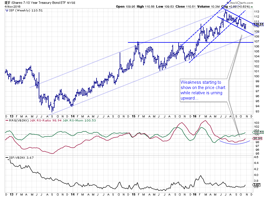 The third fixed income related asset class on this RRG is Government bonds (7-10 year maturity). IEF is positioned furthest to the left making it the weakest of the three and the one with the most relative potential at the same time.
After setting a top around $ 113, IEF started to move lower in a short-term channel while breaking out of the rising channel (dashed lines) which was visible since the beginning of this year.
The next support level to watch for now is the level of the long-term rising support line coming out of the 2013 lows. Currently around $ 108-109.
The JdK RS-Ratio line has formed a shallow low over the past few months with RS-Momentum already pushing above 100 in September. This base in RS-Ratio is tracking a sideways move in the raw RS-Line.
A look at the daily version of the chart shows the recent price and relative action in more detail.
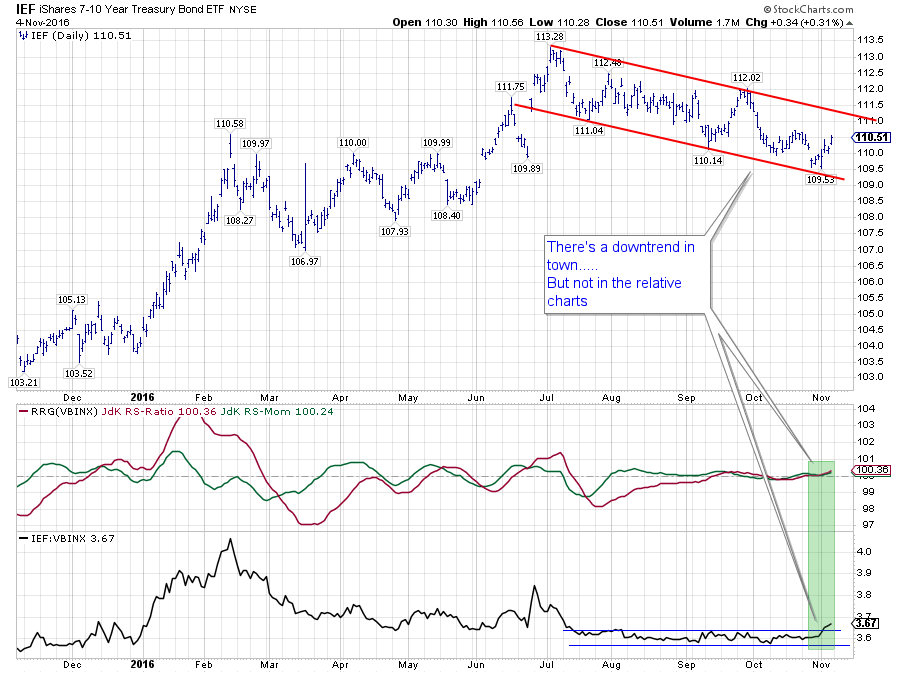 The downtrend on the price chart is well pronounced, and a new, lower, low has just been formed at the lower boundary.
The sideways move in relative strength since August, has resulted in both RRG-Lines to oscillate very close to the 100-level. This situation seems to be coming to an end now with the raw RS-Line breaking upwardly out of the narrow range.
This break is expected to provide the fuel needed to push the rotation for IEF towards the leading quadrant.
Intermediate conclusion
Based on the fact that these fixed income related asset classes are all showing weak to horrible price charts, I would not buy any of those three, but their relatives against VBINX are all rising sends a clear message about equities (60% of VBINX).
If fixed income asset classes, especially IEF are improving against VBINX while their price is going down, it means that equities (SPY) must be going down even more and faster....
SPDR S&P 500 ETF - SPY
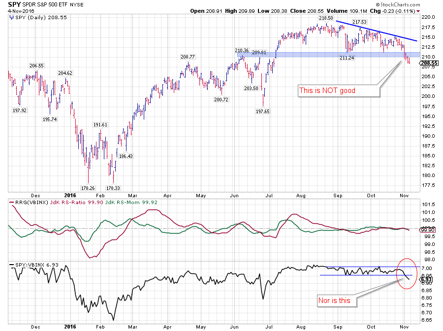 The above chart is a daily chart of SPY in combination with RRG-lines and the raw RS-Line. It shows the recent movements and rotation on the RRG, derived from the RRG-Lines, in more detail.
The lack of relative momentum (JdK RS-Momentum) started to become visible in August, almost immediately after SPY broke to new highs on the price chart. I have pointed out the lack of (relative) momentum since then a number of times, especially in combination with the lack of volume on rallies while volumes spiked on down-days or declines.
The recent drop in price that took SPY back below its former breakout level seems to signal the completion of a stretched top formation. It is definitely a sign of weakness.
The recent price action on the daily charts of IEF and SPY causes them to point almost exactly in opposite directions on the daily Relative Rotation Graph (see below).
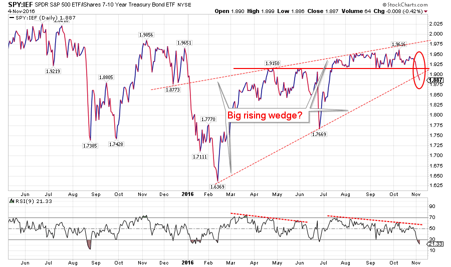
 To study the combination of price action between SPY and IEF, we can also look at the ratio-chart of these two as shown below.
The course of this ratio since the beginning of this year shows two rallies, one from Feb to April/May and one from July to August. Both started off pretty steep and then rapidly began to move sideways causing a stretched negative divergence with the RSI of this ratio which we should at least see as a warning sign.
The drop below the horizontal support level last week triggered the completion of the consolidation and will very likely add fuel to a further decline calling for a preference for bonds over equities.
Another, bigger, pattern that can be detected on this chart is a big rising wedge. Such a wedge, when completed, sends a strong negative signal and calls for a decline to the base of the pattern. Which in this case means a drop of the SPY: IEF ratio back to the levels seen at the beginning of this year.
Both setups call for a (strong) preference for bond related asset classes over equities in coming weeks/months. Translating that to SPY levels means that there is now a serious risk in the market for a 10% to 15% drop back to the 180 area (SPY). Intermediate support lies around 197.50
We live in interesting times
Julius de Kempenaer | RRG Research
RRG, Relative Rotation Graphs, JdK RS-Ratio and JdK RS-Momentum are registered TradeMarks by RRG Research
Follow RRG Research on social media:

