 Anchoring is a behavioral phenomenon wherein we, as people, lock in to a specific reference point that then affects our subsequent decisions.
When I taught technical analysis at Brandeis University, I asked one group of students to tell me where the S&P 500 would be at the end of the semester. I followed this up by asking a different group of students to answer the same question, but I told them that I’d asked another group of students already and their average answer was about 10% below current levels.
Which group of students do you think came up with a lower estimate of the S&P at the end of the semester? By anchoring the second group to a lower number, I was able to bring down their average response.
Anchoring makes sense from a psychological perspective, as it allows us to make sense of a chaotic world by giving ourselves a frame of reference. But for traders, it can lead to unwise investment decisions.
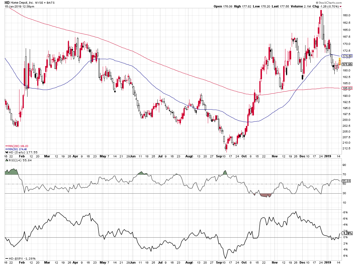
One of the common ways investors experience anchoring is with price levels, specifically your entry point. Buying Home Depot (HD) at $172 gives that level special meaning for you - you'll make decisions based on what HD does relative to that reference point. The market as a whole, however, couldn’t care less about $172!
So how can we look past anchor points and evaluate a chart based purely on the evidence?
First, you can cover up the tickers. This can be as easy as holding a piece of paper over the ticker on the screen. The moment you cover up the ticker, you stop thinking about your entry point for that stock. You also stop thinking about the time it really made you money as well as the time it got you absolutely killed.
In doing this, you’re looking strictly at price itself and forming your analysis based on the chart. This can be a game changer.
Second, you can invert the chart. If a stock you hold is in a downtrend and you’re debating whether or not to sell, why not flip the price series? On StockCharts.com, you can invert a price series by simply placing a minus sign (-) in front of the ticker.
 Now, is this a chart you’d be willing to buy here? If so, you’re basically expecting the actual price to go lower and you should seriously reconsider your long position.
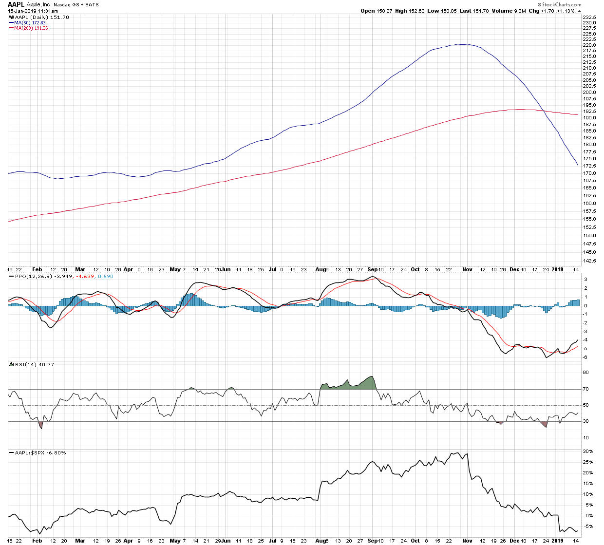
Finally, you can remove the price altogether. That’s right - get rid of the price series. Now, you’re no longer anchored to the price; instead, you’re just judging the trend.
 Now we see a chart with two downward-sloping moving averages, with the 50-day below the 200-day moving average. This stock has clearly been in a downtrend. What’s more, the relative strength (bottom panel) shows that this stock has been underperforming the S&P 500. On the short-term side, I’m seeing a buy signal from MACD, along with an RSI that’s beginning to slope higher after exiting the oversold region.
We can conclude that this is a chart in a long-term downtrend that is beginning to bounce. Perhaps there is an opportunity for a short-term trade here?
Note: To remove price from your chart, go to the Chart Attributes section, change the Opacity to 0.0 and deselect “Y-Axis Labels.”
 By making some minor tweaks to your analysis, you can minimize the impact of anchoring and make decisions based purely on the evidence in the charts.
RR#6,
Dave![]() David Keller, CMT
David Keller, CMT
President, Sierra Alpha Research LLC
![]()
Disclaimer: This blog is for educational purposes only and should not be construed as financial advice. The ideas and strategies should never be used without first assessing your own personal and financial situation, or without consulting a financial professional.
The author does not have a position in mentioned securities at the time of publication. Any opinions expressed herein are solely those of the author and do not in any way represent the views or opinions of any other person or entity.
