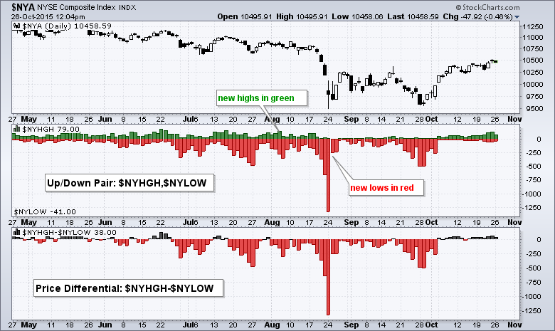
The percentage of NYSE net new highs remains at relatively low levels and chartists should watch this indicator for clues on follow through to the October surge. StockCharts users can plot new highs and new lows using SharpCharts. The first chart shows NYSE New 52-week Highs ($NYHGH) and NYSE New 52-week Lows ($NYLOW) as an "Up/Down Pair" indicator. Simply enter the two symbols separated by a comma in the parameter box ($NYHGH,$NYLOW). Chartists can plot the high-low differential by choosing "Price" as an indicator and separating the two symbols with a hyphen ($NYHGH-$NYLOW). There is a screen shot below the chart that shows these settings.

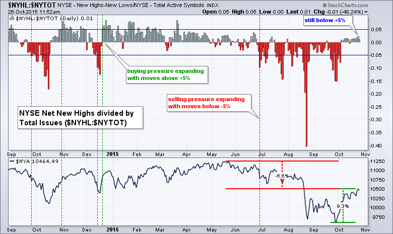
Chartists can also plot NYSE Net New Highs ($NYHL) as a percentage of total issues by choosing price and separating the symbols with a colon ($NYHL:$NYTOT). The total number of stocks traded on any given day fluctuates so this methodology is better for comparing values over time. Looking at this chart, we can see that the NY Composite surged around 9% from late September to late October and net new highs turned positive in October. Net new highs as a percentage of total stocks hit +2% last week. This is positive, but not that positive just yet. It seems that the 5% threshold, both positive and negative, represents a key participation level. A move above +5% would show broadening participation and this would be quite positive for the broader market.
****************************************
Thanks for tuning in and have a good day!
--Arthur Hill CMT
Plan your Trade and Trade your Plan
*****************************************


