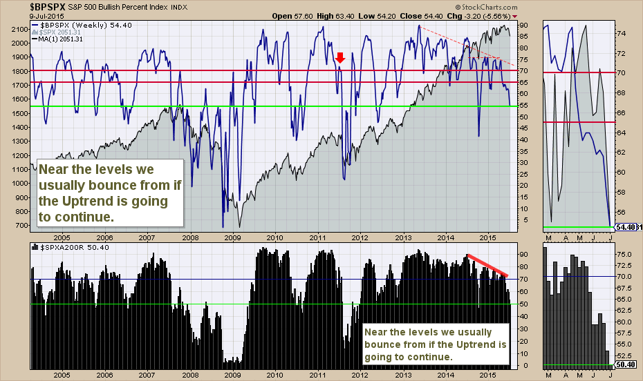
The Bullish Percent charts are one of the technical tools that quickly demonstrate how broad or narrow the rally is. I like to look at them together with the Number of Stocks above the 200 DMA ($SPXA200R).
Starting with the $BPSPX which is the blue wavy line, we can see the market ebbs and flows. The lime green line on both charts mark the current level. If this market is going to bounce, this is the level of market weakness we usually get before buyers step in. Looking in 2004, 2005, 2006 this 50% level is pretty important. How the market responds right now is important. With the Shanghai getting central bank support and the Greek Offer similar to what the Greeks rejected last week, it might just be that both of those trouble spots are under management if not already solved.
The $SPXA200R is important as well. We can see that during the major uptrends it does not go much below the levels we are currently at. This is a pretty clean line in the sand that demarcates a bull market from the start of a new bearish period. Looking left on the chart we can see the 2007 and 2011 periods were well below the 50 % level. So this is a great place to position for a bounce. Should a bounce not show up and we continue to get down to 40% participation and close the week there, investors should be very careful with their optimism. The Pavlovian response of buy on the dips might be more painful.
Good trading,
Greg Schnell, CMT.

