 StockCharts.com has an incredible wealth of technical tools available both for free users as well as subscribers. That said, though, users who subscribe will have a greater amount of tools and functionality available to them.
Very recently, there was a panel discussion on MarketWatchers LIVE with Tom, Greg and Arthur, in which Tom moderated, Arthur used the site as a free user and Greg used the site as a (logged-in) subscriber. If you have not seen this segment, I recommend watching it here, as it gives excellent insight into the benefits of a subscription.
And, in case you didn't notice yet, having access to customized Relative Rotation Graphs is one of the many benefits of a subscription. ;)
In this article, I want to show you how you can quickly get from a table of market movers to a trade idea based on Relative Rotation Graphs.
Converting The "Market Movers" Table Into an RRG
When you open up StockCharts.com and go to Your Dashboard, one thing you'll find is a section called "Market Movers," which is located in the top-right corner of your screen.
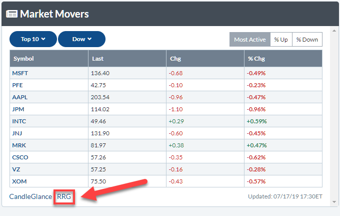 I currently have this section of the page set up so that it shows the top 10 most active stocks inside the Dow Jones Industrials index. This way, it gives me a quick overview and a general idea about market behavior for the day. To expand that overview a bit further, I can then click on the RRG link below the table, which will run the Relative Rotation Graph for those ten stocks.
The default benchmark is $SPX, but that can easily be changed to any other benchmark as necessary. In this particular case, I'll change the benchmark to $INDU, as I am looking at the most active stock inside that index.
That gives me the RRG below.
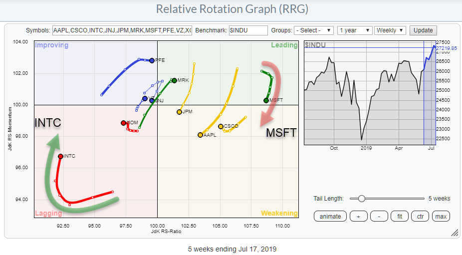
As you can see, the table from my dashboard has been translated into a visual overview using RRG.
Two interesting rotations stand out. Inside the leading quadrant, MSFT has rolled over and is now heading down towards the weakening quadrant. Simultaneously, inside the lagging quadrant, INTC has made an opposite move and is currently rotating upward towards the improving quadrant.
Although MSFT is still at the far right-hand side of the RRG (which means a strong relative trend) while INTC is at the far left-hand side of the RRG (a weak relative trend) on the weekly time-frame, the two stocks may offer a nice pair-trading opportunity. This idea gets even stronger when you look at the daily version of the RRG, which shows the moves for MSFT and INTC in opposite directions.
The next step is to open up the price charts for both of these stocks, with their relative strength against $INDU.
Microsoft Corp. - MSFT
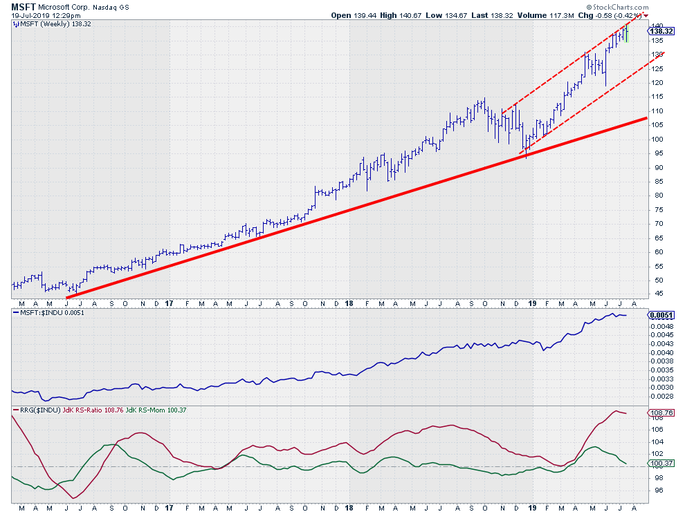 On the weekly price chart, MSFT is pushing against the top of the rising channel, which it has been doing for the past five weeks.
The RS-Line vs. the DJ Industrials index has started to move sideways after a rally from February to June. This flattening caused the JdK RS-Momentum line to start declining and the RS-Ratio line to start rolling over at a historically high level.
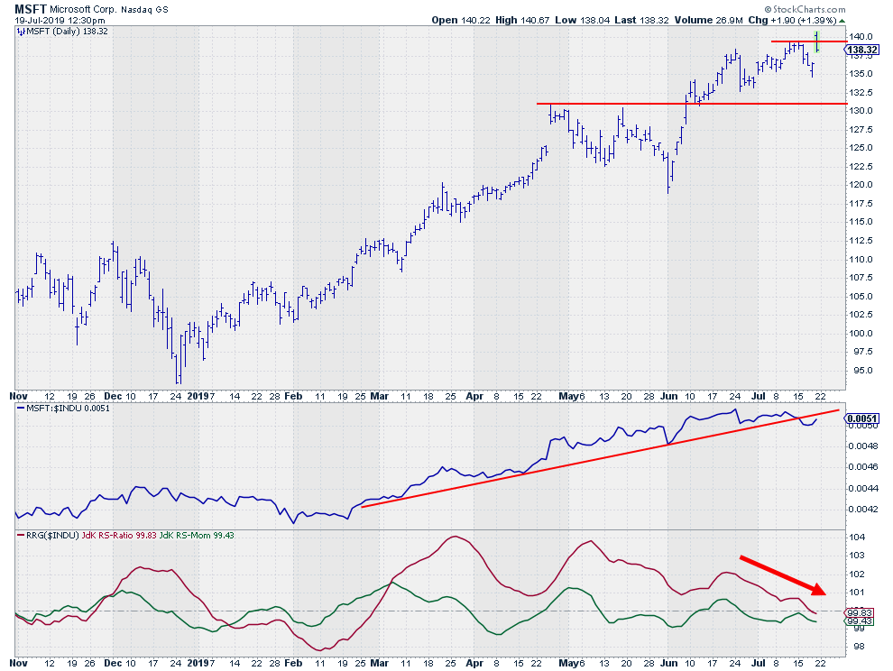 On the daily price chart, the deterioration is visible in more detail. The RS-Line has broken below its rising support line, while the RS-Ratio line has already broken below the 100-level, following the RS-Momentum line lower.
Today's price action so far is showing a reversal after peaking above the previous high, which is not very strong, but the day is not over yet (I am writing this around 6 PM European time, which is noon in New York). When we close this day around current levels or lower, that only adds to the weakness of MSFT.
Intel Corp. - INTC
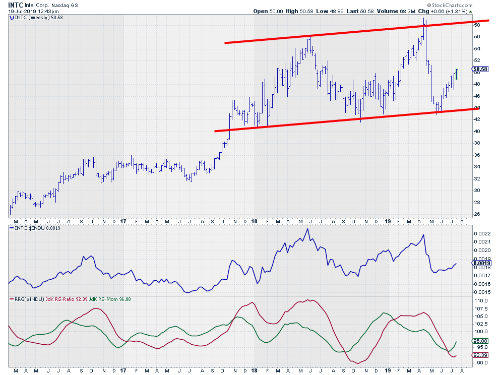 Intel is showing us a different picture. After bouncing off (and thus reinforcing) the slightly rising support level near $44, the price started to rally and is still underway at a very healthy pace.
This improvement is also visible in the RS-Line that turned around and picked up upward momentum once again. This is translating into a turn in the making for the RS-Ratio line.
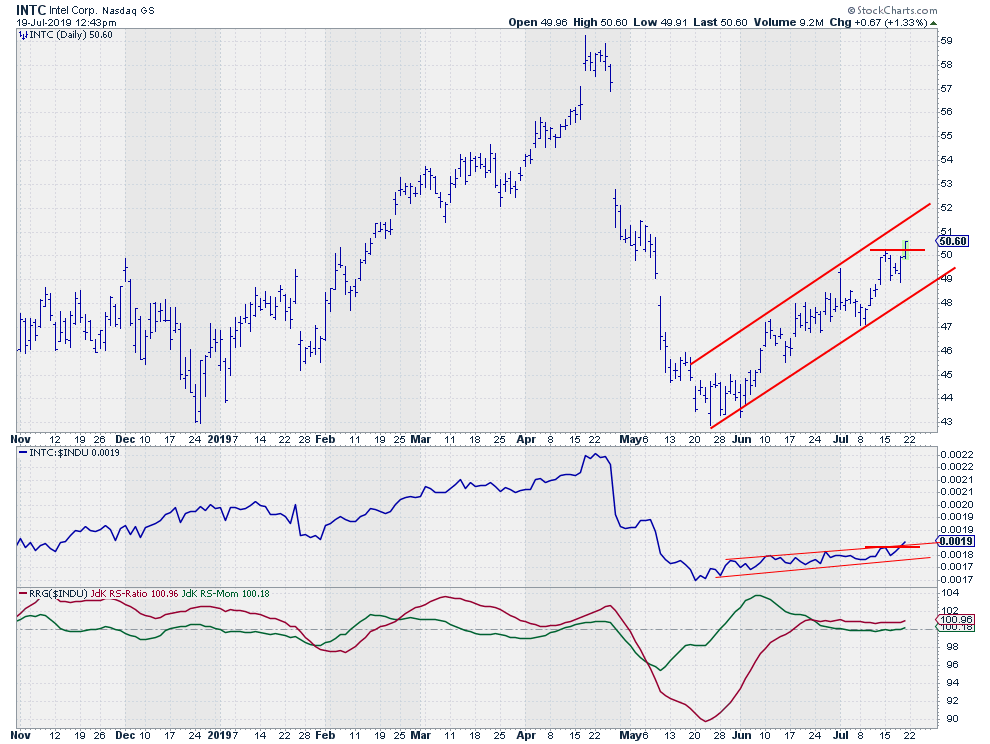 On the daily chart, a nice rhythm of higher highs and higher lows is underway. Today, so far at least, INTC seems to be breaking to a new high, which would confirm the current trend. Again, the market is not closed yet, but it's so far so good. A close at current levels or higher will only reinforce the current strength for INTC.
Back-to-Back
The final check for a (pair-)trade idea like this is to put both stocks against each other. That is done in the chart below.
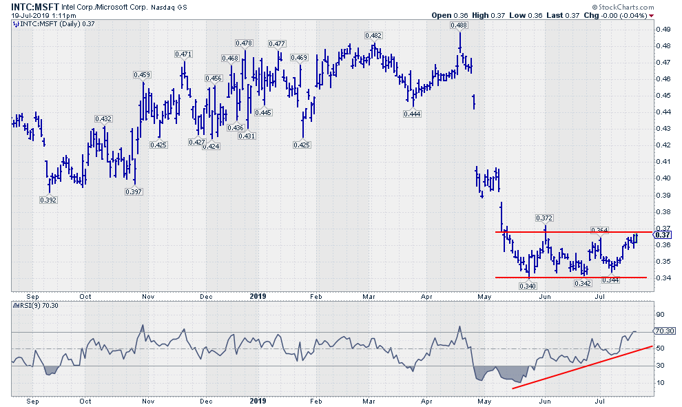 This ratio has been trading in a range since May, when the steep drop in relative strength was caught near 0.34. Just like a price break out of a range, a break of relative strength out of a range can be expected to jump higher.
The strong positive divergence between the ratio and its RSI supports a break higher.
All-in-all, this makes the INTC-MSFT pair-trade an interesting idea to keep on your radar.
My regular blog is the RRG Charts blog. If you would like to receive a notification when a new article is published there, simply "Subscribe" with your email address.
Julius de Kempenaer
Senior Technical Analyst, StockCharts.com
Creator, Relative Rotation Graphs
Founder, RRG Research
Want to stay up to date with the latest market insights from Julius?
– Follow @RRGResearch on Twitter
– Like RRG Research on Facebook
– Follow RRG Research on LinkedIn
– Subscribe to the RRG Charts blog on StockCharts
Feedback, comments, or questions are welcome at Juliusdk@stockcharts.com. I cannot promise to respond to each and every message, but I will certainly read them and, where reasonably possible, use the feedback and comments or answer questions.
To discuss RRG with me on S.C.A.N., tag me using the handle Julius_RRG.
RRG, Relative Rotation Graphs, JdK RS-Ratio, and JdK RS-Momentum are registered trademarks of RRG Research.

