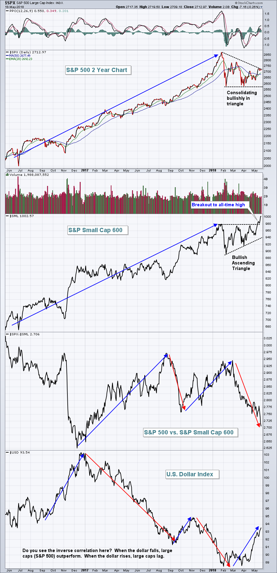
There's a raging bull market going on right now, but you might not realize it if you're stuck in the S&P 500. Take a look at the chart below of the large cap benchmark S&P 500 and its small cap counterpart, the S&P Small Cap 600:
The resumption of the bull market has taken shape in the form of small caps. I fully expect that the rest of the market will follow suit eventually, but rising treasury yields and the surging dollar have money rotating feverishly into smaller companies and that relative strength is likely to continue. In my last ChartWatchers article, I pointed out the strength of small cap healthcare shares (PSCH). In just the past two weeks, the PSCH has risen another 7.80% while the benchmark S&P 500 has only gained 1.86%. These types of return enhancements make a massive difference to your portfolio over time. It's one reason why sector and industry rotation is so important to follow.
My biggest takeway in 2018 is that treasury yields have ended their nearly four decade-long downtrend. All the free money provided by the Fed (think quantitative easing) and the liquidity that generated....is OVER. Rates are heading higher as the economy improves and the Fed reduces its bloated balance sheet and that's a new development that we all must consider in our trading/investing strategy. I discussed this earlier this week in my Trading Places blog and highlighted the long-term 10 year treasury yield ($TNX) chart. CLICK HERE to check out that article.
Happy trading!
Tom

