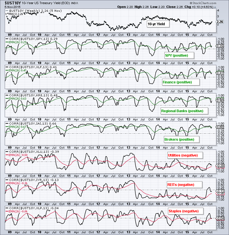
Chartists can use the Correlation Coefficient to understand the relationship between Treasury yields and certain groups, such as banks, utilities and REITs. The chart below shows the 10-year Treasury Yield ($UST10Y) in the main window and seven correlations in the indicator windows. I am using weekly data, a 13-week Correlation Coefficient and a 26-week EMA for further smoothing. This extra smoothing is because I am simply trying to determine the general tendency. This is clearly not a trading vehicle, but rather an observation to be considered along with the price chart for each ETF. A positive correlation means the group tends to rise when the 10-yr yield rises. A negative correlation means the group tends to fall when the 10-yr Yield rises.
As the chart shows, the S&P 500 SPDR (SPY), Finance SPDR (XLF), Regional Bank SPDR (KRE) and Broker-Dealer iShares (IAI) are positively correlated to the 10-yr yield. This means they tend to rise when the 10-yr Yield rises and fall when the 10-yr yield falls. An uptrend in the 10-yr Yield, therefore, would be positive for the broader market, banks and brokers. On the other side, utilities, REITs and consumer staples are negatively correlated with the 10-yr Yield. This means they tend to rise when the 10-yr yield falls and fall when the 10-yr yield rises. A rising rate environment would be negative for utilities, REITs and consumer staples.
****************************************
Thanks for tuning in and have a good weekend!
--Arthur Hill CMT
Plan your Trade and Trade your Plan
*****************************************

