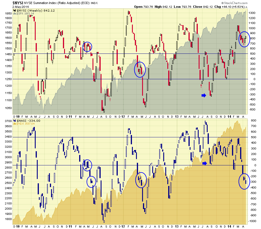
The summation indexes built by Sherman and Marian McClellan are almost paradoxical this week. The $NYSI and the $NASI usually track similarly.
Which one will be right? Here is the chart.
In Plot 1, the candlesticks are the $NYSI - New York Stock Exchange Summation Index and displayed behind on an area chart is the $SPX.
In Plot 2, the candlesticks are the $NASI - Nasdaq Stock Exchange Summation Index and displayed behind on an area chart is the $NDX.
Historically, when the summation indexes can't stay above zero, the stock market is very weak. When they both thrust up together its very bullish. Small candles for the week after a big move indicate the momentum is waning after moving higher or lower. The difficult period is when they pause with small candles and then continue the trend. You will also notice the lines generally seem to be important support or resistance areas. Pauses around those areas are even more difficult.
Currently, the $NYSI is near the highs, and the $NASI is making new lows. Going back through 2010 to 2014, I have circled 2 other times where the $NASI paused after hitting -300 and continued lower. The $NYSI also had to be declining from higher highs.
I did not mark the August 2010 occurence as this period was different for two reasons. The August 2010 pullback on $NASI moved quickly down, built a bullish candle on the bottom in early September and went straight up. It was not matched by the $NYSI staying below zero and was very bullish. The $NYSI was way up high. We also had a previous meaningful pullback to lower low levels on the $NASI in June and July 2010.
Lets cover the areas I circled as the market as the $NASI paused with small candles while in negative territory. After making a low below zero in March 2011, the $NASI bounced up to 100 around April 1 and then oscillated inside the first circle. While this happened, the $NYSI was up around 650 but making lower highs. Then the NYSI pulled back making a lower low under 500 the week of May 23. It ended up being a very weak summer. The April May 2011 period was somewhat similar to now in my eye.
Analyzing the 2012 period, the summation indexes both continued to fall, for another 2 weeks after the blue circles. However, the markets had already pulled back significantly so this was the final thrust down. It was an excellent place to get long from the June 4th, 2012 low to the September 18th high which was the Fed announcement of QE 2012. Currently, this is our first push down to -300 levels in over a year on the $NASI. We have now paused for a week and pushed lower on the $NASI to -334. What makes this so tricky is the bullish candle on the $NYSI and an equally bearish candle on the $NASI. I would say the jury is still out, but it is definitely a tricky period where mixed signals abound. The breakdown in bond yields on Friday to close the week leads me to believe we are going lower in the short term, but I could change my mind immediately should a bullish $NASI candle form.
If the May 2011 period was somewhat similar, what would we expect? A few weeks of selling would drop us to the 700 level. Looking left on the chart, when the $NASI gets into the -700/-800 area, you definitely wouldn't want to continue being short even if the market pushed lower. Most of the big selling would appear to be done. It might be more appropriate to get ready for some upside moves in strong stocks at that point unless you are in a 2008 market collapsing period.
I also found this condition of high (800) $NYSI and weak (-50) $NASI showed up in 2007. I did find often at 550 or 600 $NYSI. It was nowhere near the final market top. If you click on the chart, you can slide the date ranger back to the 2006-2008 period to see how the market was behaving. It is also insightful to see the Summation Index signals for an ultimate market top. I love using the date ranger tool. You will notice the new slider bar ( Date Ranger) beside the chart attributes. I did find the condition more often at 550 or 600 $NYSI.
To conclude, rarely are the markets this bipolar. The Summation Indexes are an interesting tool. For more information you can connect with the Chartschool article here. Summation Indexes.
Good trading,
Greg Schnell, CMT

