Hello Fellow ChartWatchers!
There's been a sea-change in the markets with the recent uncertainty about Russia and the Ukraine. Almost instantly the bullishness on the Sector Rotation charts turned into bearish concern with defensive sectors like Utilities taking off. John Murphy, Art Hill and the rest of our great commentators have a lot more to say about these changes so scroll down if you want to see their take on things.
This week, I, on the other hand, wanted to talk about a part of our Home page that almost everyone overlooks. During our SCU seminars, we spend a lot of time talking about what we now call "The Golden Line" (a term first coined by Greg Schnell). And at the end of these seminars, invariably, several people come up and tell me that they never noticed that line before but that it was, by far, the most valuable thing that they learned about.
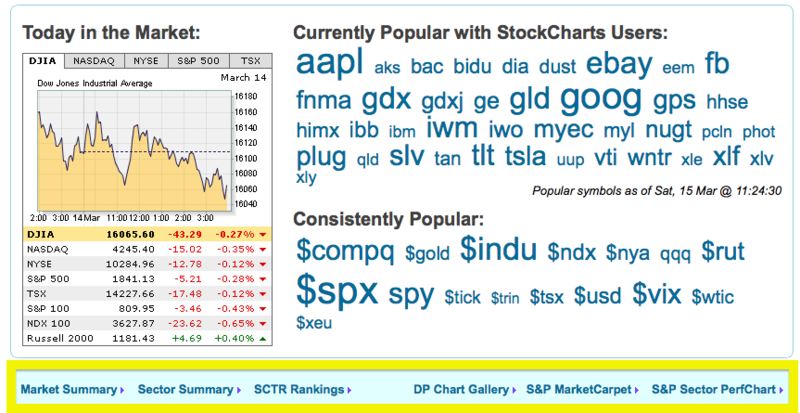
The "Golden Line" is the line of links located just below the big ticker cloud on the home page. Here's a screen shot of what it looks like:
Those links in the big yellow box are the links I'm talking about. Here's what each one does and why it is valuable:
Market Summary - Our list of the major market indexes, their current values and their change over the past 24 hours. Click here for more details.
Sector Summary - Three clicks will show you the strongest stocks in the strongest industries in the strongest sectors of the market. Click here for more details.
SCTR Rankings - Our "StockCharts Technical Ranks" show you which stocks are the strongest from a technical perspective. They have proved extremely popular with seminar attendees also. Click here for more details.
DP Chart Gallery - Our newest "Golden Line" member contains a collection of key market analysis charts created by DecisionPoint which can help you quickly see the direction and technical condition of the market. Click here for more details.
S&P MarketCarpet - All of the S&P 500 charts shown as a collection of red and green squares that allow you to see which stocks have outperformed the others. Click here for more details.
S&P Sector PerfChart - Possibly the most valuable of the "Golden Line" links, the Sector PerfChart helps you discover where we are in the market's sector rotation cycle.
So don't overlook these tools - they are some of our best. (Members can also now find these same links in the middle of the "Members" page as well.)
- Chip

