The Euro made a startling move higher on Friday. Rather than get into the daily perspective, I wanted to take a minute to look at the long term view of both the Euro and the Dollar Index. The $XEU is the Euro / US Dollar cross, whereas the $USD is the Dollar Index which reflects a basket of currencies. The Euro is the largest chunk of the Dollar Index, but the remaining currencies make up 42.2%.
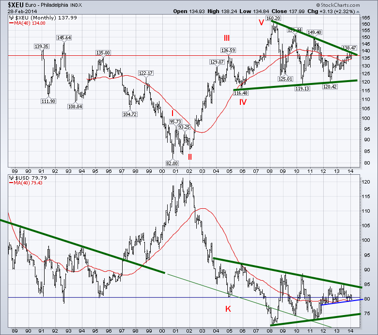
Here is the view since the Inception of the Euro. Two real big picture concepts on the upper chart.
The Euro has spent the vast majority of the chart below the red line. I have placed the red line based on when the Euro finally surged meaningfully above an old resistance level to make new highs. That resistance level is at Wave III in January 2005. The second big picture concept is the narrowing range on the right hand side of the chart. The moving average is a very long 40 months.
For the $USD in the lower plot, the same horizontal line is shown in blue and placed based on point K. There is a norrowing range on the $USD as well. The $USD is well above the 2008 - 2011 trendline. Interestingly both currencies are in the top 1/2 of these macro pennant patterns. On the $USD chart, if the trendline from the nineties is continued (thin green line) it was support for the currency in 2005, 2010 and 2011. The extreme low of the $USD at the height of the commodity bubble was the only exception. So will the $USD track back to this line if the Euro breaks out? We'll zoom in to get a better view.
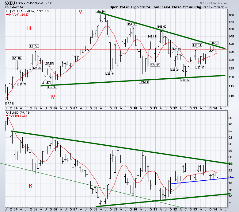
Looking at chart 2, we can see the red line is a serious support/resistance line. I have changed the moving average to a 10 month MA which is approximately 220 days. The Euro is above a rising MA. Bullish. It is also just below the major 6 year down sloping green trend line. The most recent low at the bottom of the pattern coincides with July 2012 that Mario Draghi states he'll do whatever it takes to defend the Euro. The Fed started QE 3 in September 2012. Lastly, the Euro has tried to get above the red line 3 times in the last 5 months. It closed February above it.
The $USD in Chart 2 is below its horizontal blue line but above the rising trendline from late 2011 to now. The 10 Month MA has turned down and the $USD appears trapped underneath it currently. It has been resistance since September. The $USD could move down to the 75-76 cent range and still be in the pennant.
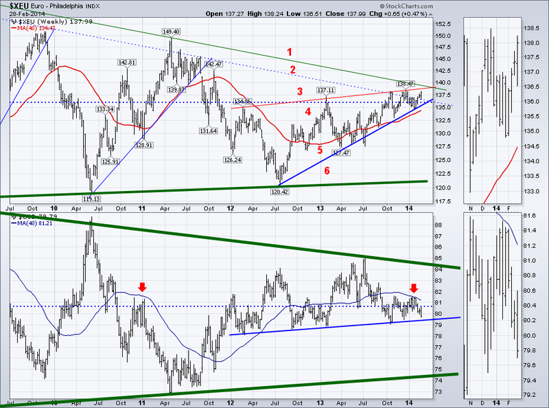
Lastly, let's zoom in one more time. I count 6 important levels on Chart 3. 2 above and 4 below the current price. 1 - Above is the Major green trendline. 2 - A secondary down trend line that has been strong resistance in the past. The Euro has been above it for 2 weeks. 3 - The rising red trendline that has been resistance since January 2012 similar to the Blue support line on the $USD in the chart above. 4 - The long historical support/resistance line for the Dollar and the price is above this line. Bullish. 5 - The upsloping 40 week MA which is very bullish. 6 - The rising blue trendline from the July 2012 lows - Draghi speech. Both cur In conclusion, we are at the apex of all of these lines for the Euro. They are in a tightening pattern. Will 6 year resistance hold, or will the Euro thrust through like it did in September 2007? September 2007 was a breakout month after hovering at resistance for July and August 2007.The longer the line, the more important the break.
Both currencies have up sloping base trend lines. The $USD is now below both the horizontal resistance line and the down sloping 40 WMA. That is very bearish. It is supported by the 2 year blue trend line just below. In 2012 and 2013, the $USD tested the blue up sloping support line in the early months of each year, but it held. It would appear there are major trend changes coming either way. If the Euro stops and the $USD rises, that will be a change for the recent push higher in commodities. If the Euro breaks out, it will be a major boost for commodities and European stocks. Should be an important month for the $XEU and the $USD.
Good trading,
Greg Schnell, CMT.


