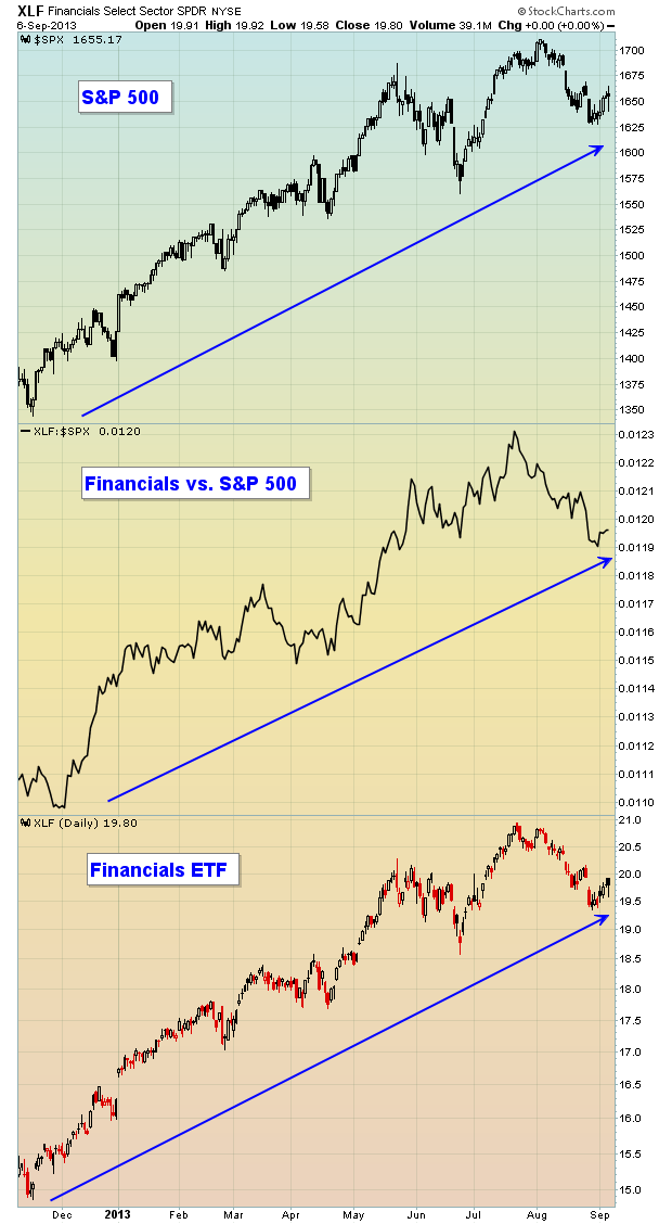
The past 5-6 weeks have not been overly kind to the bulls. In fact, since topping at 1709.67 at the close on August 2nd, the S&P 500 has lost more than 50 points or roughly 3%. Many are calling for the end of the four and a half year bull market...for the umpteenth time. Eventually, just like a broken clock, they'll get it right. I don't believe we're there yet and the relative performance of financials is backing me up. I'll get back to this in just a minute. But first....
Those who follow my column every couple weeks know that I'm a huge fan of history in the stock market. September is not the month to be particularly bullish and I am cautious in the very near-term.....and for good reason. September is the only calendar month where the S&P 500 has fallen more than it's risen. The annualized return during September on the S&P 500 since 1950 is a NEGATIVE 6.14%. The bad news is that we're already halfway through the first half of September and that's the good half of the month. September 1st - 15th has produced annualized returns of +3.70% since 1950. Now for the worst news. September 16th - 30th is obviously the bearish half of September where we've seen annualized returns of -15.82% over the past 63 years. It's hard to get excited about that from a bullish perspective.
History tells us to be cautious as we approach the next few weeks.
I always like to take a step back from the day to day charts and view the longer-term relative charts of key sectors/industries. These charts are much more powerful in signaling to us when major shifts are taking place "under the surface". In my opinion, there's no better place to look than the financials. Our economy is dependent on a sound financial structure. We saw what happened to the stock market when our financial system imploded in 2008. It's very difficult for the overall stock market to move higher when the critical financial space is struggling. So one simple chart I like to follow is the XLF (ETF that tracks the financial sector) and how this ETF is performing relative to the S&P 500 as a whole. Take a look:

Not only is the S&P 500 in the midst of a powerful uptrend, but financials (XLF) are among the leaders of the rally. On the chart above, you can see that the "Financials vs. S&P 500" line continues to print higher highs and higher lows. This tells us that financials aren't just going higher, they're going higher faster than the overall market, a sign of a sustainable rally in my humble opinion.
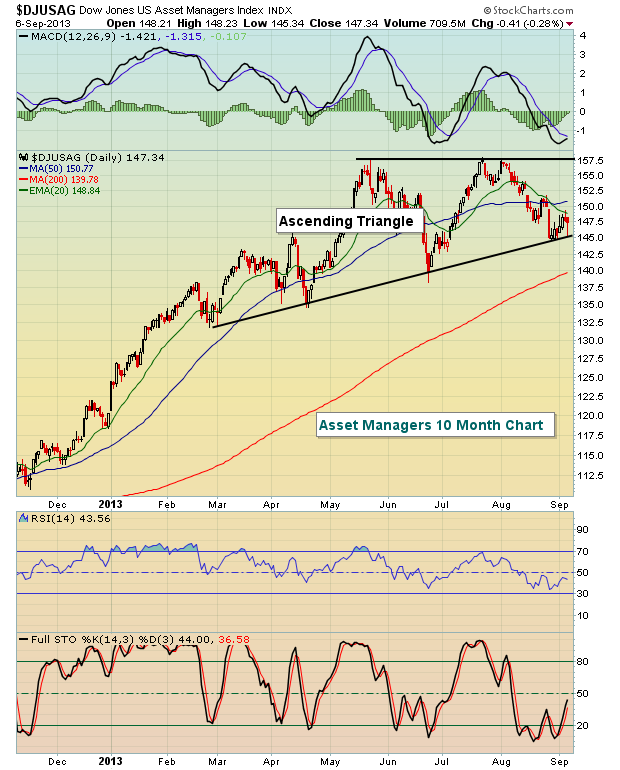
If the S&P 500 is likely to move higher later this year and financials are showing relative strength, it would make sense to look for beaten down industry groups in the financial space to lead the market as we wrap up 2013. I think I've found a very strong group to focus on - asset managers. When the stock market consolidates in a bull market, I look for bullish continuation patterns - cups with handles, triangles, inverse head & shoulders, etc. Check out the ascending triangle pattern on the Dow Jones U.S. Asset Managers index ($DJUSAG):

Taking this one step further, there's a stock within the asset manager space that rallied more than 30% from the June 24th low to the early August market high. Since that time, however, it's fallen back as profit taking has kicked in. It's beginning to find some support at its 20 day EMA, 50 day SMA and 20 week EMA. In addition, it recently tested a significant price support level. While the balance of September may be difficult for equities, this stock candidate beat Wall Street estimates on its top line and bottom line recently and is poised to advance into year end. I'm providing it as my Chart of the Day for Monday, September 9th. CLICK HERE for more details.
