At its highest level last week (Thursday afternoon), the VIX was up 50% from its prior Friday close. That's a HUGE spike in volatility.
Volatility, as measured by the CBOE Volatility Index (VIX), provides us a gauge of fear in the stock market. The VIX measures the market's expectation of stock market volatility over the next month. It represents a weighted blend of prices for a range of options on the S&P 500 index. As the market begins to price in higher volatility, premiums on S&P 500 options rise. Theoretically, as S&P 500 prices show increased volatility, option premiums rise. Therefore, the VIX becomes a bit of a lagging indicator. I like to use it as a confirming indicator, however, as it tends to trend higher in bear markets and lower during bull markets. Many popular technical analysis tools designed to help traders with indexes and stocks simply don't work when analyzing the VIX. Why? Because volatility rises and falls very quickly based on investor mentality. The use of moving averages is rendered almost useless. The key for me is whether the VIX confirms the trend taking place on the S&P 500. Think about it. If the pricing of the VIX is based on the behavior of options that track the S&P 500, then it makes sense that the VIX should follow the S&P 500. It actually follows it INVERSELY. When the S&P 500 drops, fear in the market rises. That sends the VIX higher, reflecting this expected increase in volatility. Therefore each new low in the S&P 500 should be accompanied by a higher VIX - in theory. And a new high in the S&P 500 should be accompanied by a lower VIX - again, in theory.
The two don't always move together, however, and that's where we can glean some possible clues to help us from an S&P 500 directional standpoint.
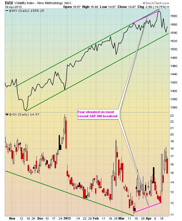
Take a look at recent action in the VIX and the accompanying price action in the S&P 500:

As expected, the VIX continued to fall with every movement higher in the S&P 500. This makes perfect sense because volatility tends to dry up during a period of rising equity prices and this creates a narrowing of price movement. That's the general rule, although the late-1990s proved to be one exception. But as you look at the VIX chart above, note that the last rise in the S&P 500 was accompanied by an INCREASE in expected volatility (VIX). Increases in expected volatility normally are associated with declining equity prices, so was it a precursor of a drop in the S&P 500? Well, hindsight is 20/20, but we do know there is a clear relationship between the movement in the S&P 500 and the behavior in the VIX so, if nothing else, it should have at least raised a few eyebrows.
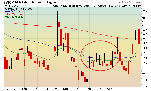
I indicated above how the moving averages tend to prove virtually useless when trying to determine which way the VIX is heading. As an illustration, check this chart out:

I've highlighted (red circle) the late-March and early-April period as it shows how many false signals you can receive in a very short time frame. Instead, focus on the overall TREND in the VIX - that's what I use to determine whether the VIX is confirming price behavior in the S&P 500 or suggesting that a change in direction may occur.
The interesting part right now is that there's been significant rotation into defensive areas of the stock market. For the month of April alone, utilities, healthcare and consumer staples have all gained more than 3%, while energy, materials, industrials and technology have all lost more than 3%. That's more than a 6 percentage point swing in just three weeks between these two very different groups of stocks. Clearly, traders are nervous as they're willing to commit to equities, but only the defensive groups. Defensive sector outperformance should be interpreted as increased fear by market participants. But the longer-term signal in the VIX doesn't confirm that increased level of fear.
For Monday, April 22nd, I'm including a long-term chart of the VIX as my Chart of the Day to illustrate one reason why I believe the bulls may return in full force sooner rather than later. CLICK HERE for more information.
Happy Trading!
Tom Bowley
Chief Market Strategist
Invested Central
Volatility, as measured by the CBOE Volatility Index (VIX), provides us a gauge of fear in the stock market. The VIX measures the market's expectation of stock market volatility over the next month. It represents a weighted blend of prices for a range of options on the S&P 500 index. As the market begins to price in higher volatility, premiums on S&P 500 options rise. Theoretically, as S&P 500 prices show increased volatility, option premiums rise. Therefore, the VIX becomes a bit of a lagging indicator. I like to use it as a confirming indicator, however, as it tends to trend higher in bear markets and lower during bull markets. Many popular technical analysis tools designed to help traders with indexes and stocks simply don't work when analyzing the VIX. Why? Because volatility rises and falls very quickly based on investor mentality. The use of moving averages is rendered almost useless. The key for me is whether the VIX confirms the trend taking place on the S&P 500. Think about it. If the pricing of the VIX is based on the behavior of options that track the S&P 500, then it makes sense that the VIX should follow the S&P 500. It actually follows it INVERSELY. When the S&P 500 drops, fear in the market rises. That sends the VIX higher, reflecting this expected increase in volatility. Therefore each new low in the S&P 500 should be accompanied by a higher VIX - in theory. And a new high in the S&P 500 should be accompanied by a lower VIX - again, in theory.
The two don't always move together, however, and that's where we can glean some possible clues to help us from an S&P 500 directional standpoint.
Take a look at recent action in the VIX and the accompanying price action in the S&P 500:

As expected, the VIX continued to fall with every movement higher in the S&P 500. This makes perfect sense because volatility tends to dry up during a period of rising equity prices and this creates a narrowing of price movement. That's the general rule, although the late-1990s proved to be one exception. But as you look at the VIX chart above, note that the last rise in the S&P 500 was accompanied by an INCREASE in expected volatility (VIX). Increases in expected volatility normally are associated with declining equity prices, so was it a precursor of a drop in the S&P 500? Well, hindsight is 20/20, but we do know there is a clear relationship between the movement in the S&P 500 and the behavior in the VIX so, if nothing else, it should have at least raised a few eyebrows.
I indicated above how the moving averages tend to prove virtually useless when trying to determine which way the VIX is heading. As an illustration, check this chart out:

I've highlighted (red circle) the late-March and early-April period as it shows how many false signals you can receive in a very short time frame. Instead, focus on the overall TREND in the VIX - that's what I use to determine whether the VIX is confirming price behavior in the S&P 500 or suggesting that a change in direction may occur.
The interesting part right now is that there's been significant rotation into defensive areas of the stock market. For the month of April alone, utilities, healthcare and consumer staples have all gained more than 3%, while energy, materials, industrials and technology have all lost more than 3%. That's more than a 6 percentage point swing in just three weeks between these two very different groups of stocks. Clearly, traders are nervous as they're willing to commit to equities, but only the defensive groups. Defensive sector outperformance should be interpreted as increased fear by market participants. But the longer-term signal in the VIX doesn't confirm that increased level of fear.
For Monday, April 22nd, I'm including a long-term chart of the VIX as my Chart of the Day to illustrate one reason why I believe the bulls may return in full force sooner rather than later. CLICK HERE for more information.
Happy Trading!
Tom Bowley
Chief Market Strategist
Invested Central

About the author:
Tom Bowley is the Chief Market Strategist of EarningsBeats.com, a company providing a research and educational platform for both investment professionals and individual investors. Tom writes a comprehensive Daily Market Report (DMR), providing guidance to EB.com members every day that the stock market is open. Tom has contributed technical expertise here at StockCharts.com since 2006 and has a fundamental background in public accounting as well, blending a unique skill set to approach the U.S. stock market.
Learn More