We have a few wonderful indicators we can use to judge the overall health of the market. The problem for the technician is when to say, "I'm Out!"
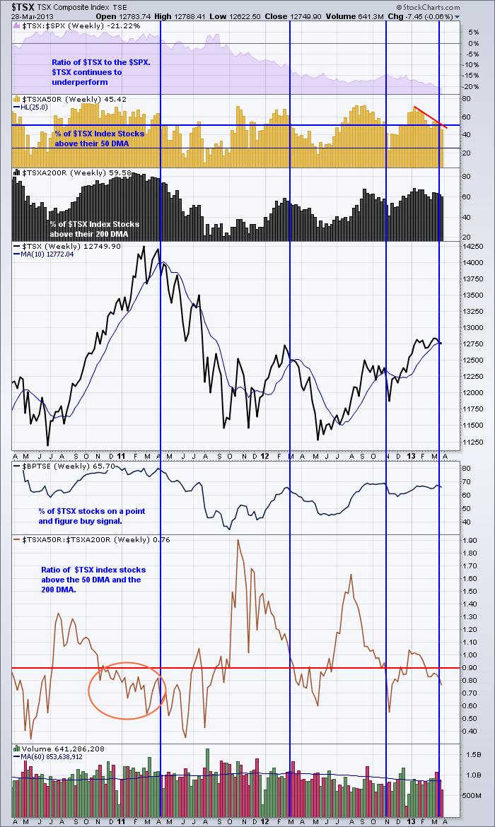
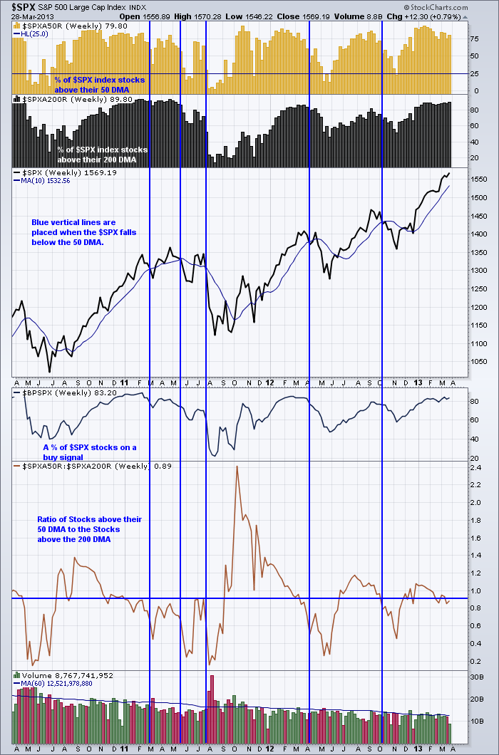
Lets compare the $TSX to the $SPX using these two charts to analyze the broader picture. Here are the links. $TSX, $SPX
The blue vertical lines are placed when the index fell below the 10 week or approximately the 50 DMA line. The $TSX looks like it is ready to breakdown here, with the exception of the stocks above the 200 DMA. That still looks strong as does the Bullish percent. But both are at levels where markets have broken down before.
The $SPX appears stronger. Period. The only signs of weakness are the stocks above the 50 DMA appear to be making lower highs. The Ratio of Stocks above the 50 and the 200 DMA seems to be weakening to a level where things normally break down from.
Looking back up at the stocks above the 200 DMA (black) area, you probably don't want to wait until that number starts falling. But a drop below 80% would be ending a trend I think. The % of stocks still above their 50 DMA is strong. The level was almost 10 % lower midweek so there is some weakness.
Good Trading,
Greg Schnell, CMT


