Gold has become pretty unloved. That in itself is usually bullish. This week we look at why it might be time to renew your interest in Gold and the miners.
First of all, Lets look at the Gold Miners. Here is a link to the live chart. Gold Miners Index.
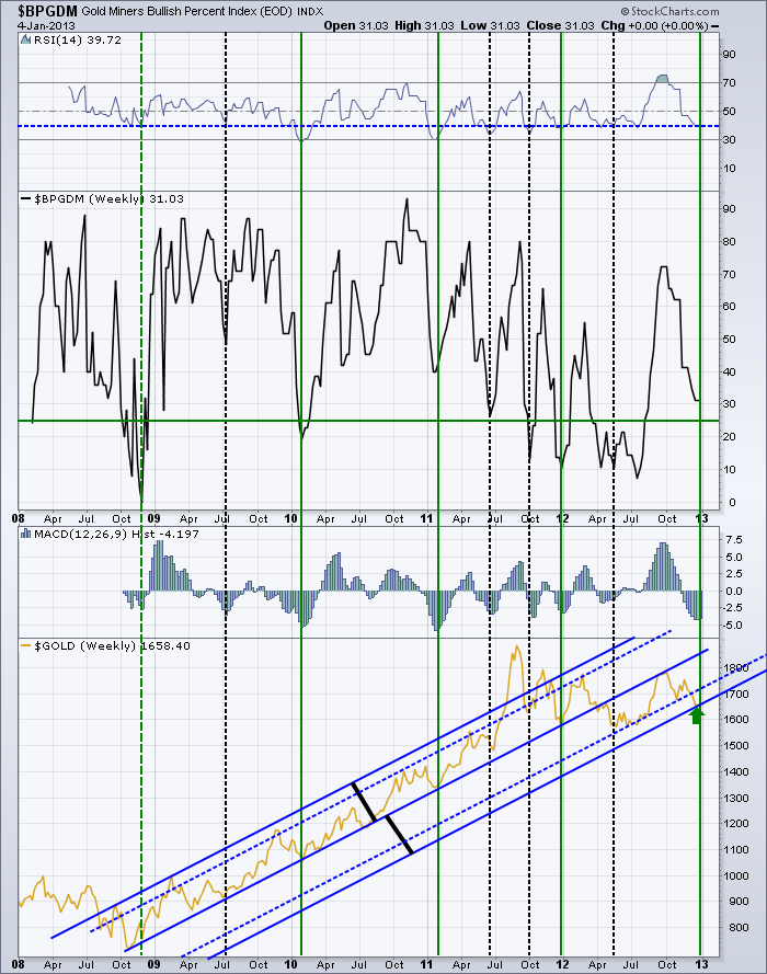
Lets start at the $BPGDM. First of all, the Bullish percent index is very close to the level it normally reverses at which is denoted by the green line. The index has 29 stocks in it, so each stock is more than 3% influence. It would only require 2 stocks to change the index below the line. So, getting into bullish territory.
In examining the chart information for more detail, I found a couple of interesting points. Lets start with the RSI.
There have been 4 times in the past 5 years where the index has dropped below the current level of 40. All of them produced nice trading rallies. It is clear that down at 40 is a pretty good area to look for a buying opportunity.
Next, the MACD histogram shows a deep push on momentum. This is the momentum of the Gold Miners index, not Gold. We have only had the selling momentum reach this level 7 times. This is one of the worst if you look at the area of the histogram over the last few months. It looks really bad. So that could be bad or good. However, the histogram recently seems to have bottomed out and made a higher low this week. That is important. I have drawn vertical lines where the histogram starts to improve. You can compare it to Gold's price at the bottom panel. Pretty nice location to start buying. The April to July 2012 period was harder to call as the histogram didn't go very deep.
Next is seasonality. I marked the vertical lines green if the rally started near the first of the year. Look at how strong those rally points were. I dotted the one in 2008 because of the trauma that was ensuing that particular year. While it did not happen in January, it did start near the beginning of the year. The seasonality factor looks to be huge. 4 for 4 in rallies for the beginning of the year. 3 rallies started around July.
Continuing down is the final panel where I have $GOLD plotted in Gold color. I have annotated the chart with some blue trend lines. The solid lines are equidistant from the middle as shown by the black lines. The dotted lines are best fit based on the trends in the price. This could be due to a log scale chart which would normally be used for a multi year chart with so much price movement. What I see from here is that GOLD is at an area that is near the lower extreme of distance from the trend. The blow off top of 2011 was a clear exaggerated move outside the trend. Could we see that to the downside still? Anything is possible. But this chart shows a lot of good reasons for a trade right here.
Lets look at a chart of $GOLD on the daily. Here is a link. $GOLD
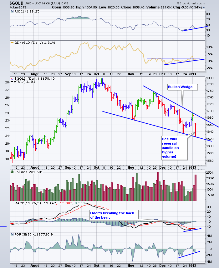
Recently, the RSI has been improving. The GDX:GLD ratio is rising which is very good to see. The downward sloping bullish wedge is also a positive signal to help spot a reversal. Friday's reversal candle was textbook on higher volume as a lot of stops were tested on the weekly chart below. The MACD appears to be trying to make a higher low while price is making a lower low. The force down was not as significant on this push so that too is bullish. I have shortened the time to 6 months so the price action is clear, but the shelf back in August is at a very important level. This level has marked support and resistance for 15 months. You can see that on the weekly below.
Here is a Weekly of $GOLD. $GOLD Weekly
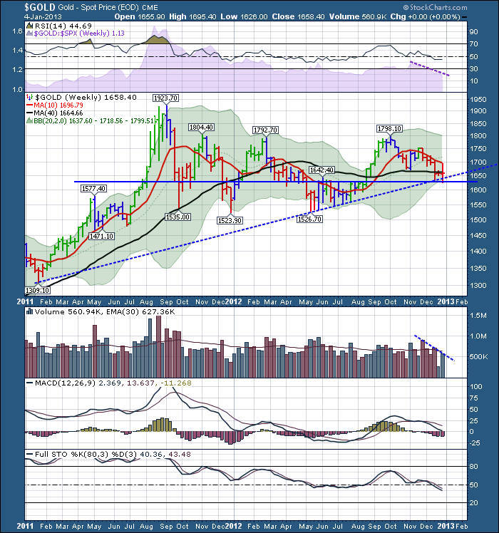
On this weekly chart, the RSI is holding 40 which is excellent. The purple shaded area represents relative strength compared to the $SPX and is declining so that is not a good sign.
$Gold looked to find support at the horizontal line of $1625. This line has been a support resistance zone for the last 15 months. The $GOLD price also tested stops below the 2 year uptrend line this week. This is a very nice place for the chart to reverse, especially with seasonality.
The MACD is making higher highs in October compared to March 2012 even though the price was the same. That is a bullish divergence.
One thing that looks weak on this chart is the full sto's falling below 50. They really need to find a floor right here or that would mark a significant negative trend reversal.
This looks like a very interesting place to enter a gold related trade to the upside. Like all great entry points, they have significant potential to fail if no new major investors join the falling trade. For the gold followers, it has been a very difficult trade and they would sure like to see some upside reprieve.
In conclusion, I like the seasonality and the bullish candle. We'll see how 2013 treats the gold trade.
Good Trading,
Greg Schnell, CMT


