This is the third part of a series of articles about Technical Analysis from a new course we're developing. If you are new to charting, these articles will give you the "big picture" behind the charts on our site. if you are an "old hand", these articles will help ensure you haven't "strayed too far" from the basics. Enjoy!
(Click here to see the beginning of this series.)
Chart Construction
Charts are created from data - Price data and Index data. After discussing the various types of data used, we'll look at how charts are constructed.
Price Data
Exchanges record the price and number of shares for each stock transaction. These individual transactions are called tick data. Tick data is compiled over different periods of time to construct price bar data. Price bars show the beginning, highest, lowest and ending prices for a chosen time period. Individual price bar time periods can range from one minute to one year. Daily, weekly and 60-minute price bars are other common examples.
Price bars less than a day long are known as intraday price bars. Intraday price bars range from one minute to one hour and are typically used in technical analysis by day traders who hold positions for a matter of minutes or hours.
A daily price bar is constructed of all the transactions during a full day of trading. Daily price bars are most often used in technical analysis by investors who hold positions from days to years.
The number of shares traded in each transaction is called volume. Volume is recorded as tick data just like price. Volume tick data is added together to construct volume bars and are then charted with their corresponding price bars for technical analysis.
Index Data
Data for hundreds of indices, published by financial service companies and the major exchanges, are provided to StockCharts.com through third party data providers. Indices are not tradable financial instruments. Indices represent domestic and foreign market averages, industries, commodities, currencies, bonds and many other price, volume and breadth measurements of market activity. Examples of market indices include the Dow Jones Industrial Average ($INDU), NYSE Healthcare Index ($NYP) and the New Zealand Dollar ($NZD). The financial service companies are responsible for the accuracy of the indices they publish.
Breadth indices measure how many issues move within a particular market index. Breadth indices give analysts insight into investor sentiment. Examples of breadth indices include NASDAQ Advance-Decline Issues ($NAAD), NYSE Advance-Decline Volume ($NYUD) and AMEX Issues Unchanged ($AMADU).
Price Chart
A price chart is a graph which shows how price and volume changes with time. Price charts on StockCharts.com are called SharpCharts. (Time-independent charting methods like Point & Figure charting will be discussed in detail later.)
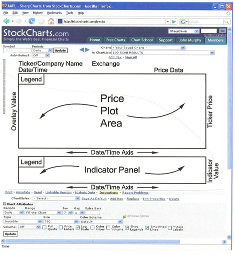
The diagram above illustrates the layout of a typical SharpChart. Price data, volume data and technical indicators are displayed on a SharpChart. A technical indicator is a mathematical expression of price and/or volume which can provide insight into future price movements. We will talk more about technical indicators later.
Price data and overlays are plotted in the Price Plot Area. Overlays are technical indicators that are normally expressed in terms of price. Non-price values of overlays are displayed on the left axis as shown above.
Technical indicators that cannot be expressed in terms of price are normally plotted in the Indicator Panels. Although only a single Indicator Panel is shown above, SharpCharts can be created with multiple Indicator Panels displayed above and below the Price Plot Area. Additional date/time axes can be added between the Indicator Panels if needed. The legend for both the Price Plot Area and Indicator Panel contain the information used to create the SharpChart.
Next time, we'll get into the specifics of Line charts, OHLC Bar charts, and Candlestick charts.

