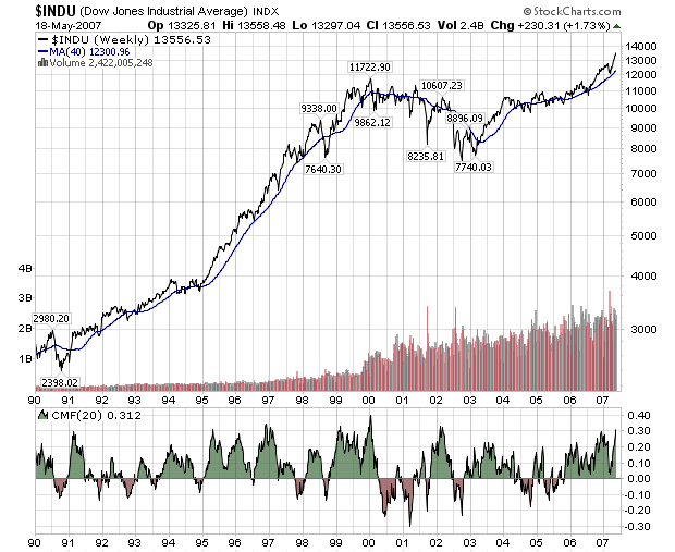
The Dow Jones Industrials continues to rise week after week setting new records as it goes. I thought it would be good to take a quick look back and see if history can teach us anything about what the Dow does to signal the end of these long up-trends. Here's a weekly chart of the Dow Industrials going back to 1990.

This is a semi-log scale chart (the vertical axis is logarithmically scaled, the horizontal axis is not) and includes my favorite one-size-fits-all indicator, the 20-period Chaiken Money Flow.
The log scaling helps us see that the recent rise, while impressive, is no match for the HUGE rise in the Dow during the mid-nineties. We also see that during the nineties, the Dow's 20-week CMF stayed in the green for several multi-year periods. Both of those observations bode well for the current long-term trend. The Dow has done this kind of thing in the past and might be repeating itself now.
On the downside (there's always a downside, sigh...), the CMF has been in the green for just over 18 months now and that is about as long as it has ever been in the green without some kind of drop. Even during the go-go nineties, the CMF dipped into the red in mid-1996 to break up the longest above-zero stretch on the chart. With history as their guide, alert ChartWatchers will be watching the 20-week CMF for signs of weakness in coming months.
BTW, be sure to read our previous newsletter for details on our Spring Special which is almost over!
