This week, the markets unilaterally moved in one direction. Some of the underlying indicators are very supportive of additional rally strength to the upside; the $NYHL, for example surged to a level that is usually indicative of a bull market breakout. I am having a deja-vu moment as I write that sentence, though, because I remember saying the same thing in 2016. I think I promised myself that, when the next time came, I would just get on the bull train and avoid the news. Yet here I sit at a station, waiting for the next train respecting the 200-DMA friction above. Courage is a wonderful concept.
On the bearish side, the bond charts look like they are setting up for another rip higher in prices and lower in yields. For years, I have scrolled past the $LIBOR3 chart in my chart pack, always seeing nothing new there. This week, the chart caught my attention for the first time when I noticed the momentum indicator. The 2-, 3- and 5-year charts are still inverted compared to the 1-year. The 2-year chart has been a 45-degree slope up and to the right ever since the 2016 November to Remember low. News alert... this chart is losing that slope of hope. The 5-year is currently parked on a very important trend line, while the 10-year chart is not firing off any directional clues. My cheating chart for the direction of the 10-year is telling me that, as the price goes higher, yields go lower. Check out the video for more. The 30-year chart is a big deal. I think I got a few of the bond charts right in 2018. With the momentum it currently has, it does look like $USB could go all the way to the other side of the channel.
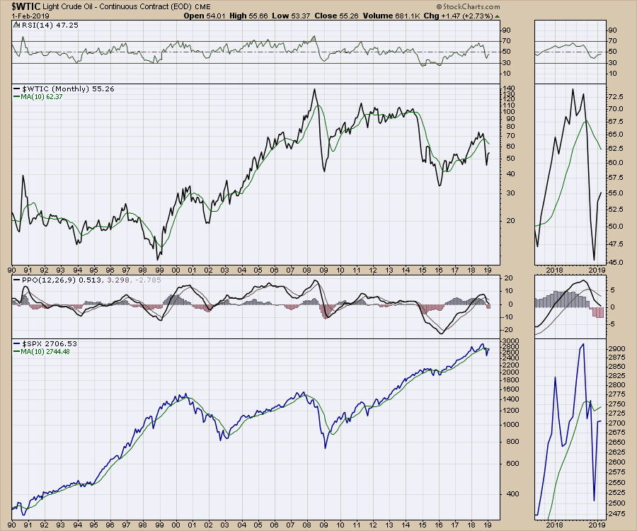
You can feel the tension looking at the commodity charts. Oil currently sits at $55. A chartist would see that as a typical price; we spent most of 2015, 2016 and 2017 rubbing the $55 figure from the bottom side before pushing above it in 2018. Now, in 2019, we're rubbing the $55 figure from the bottom side again. Natural Gas moved parabolically higher only to crash back to where it started, creating a tombstone on the chart and handing every bullish trader losses on a platter of pain. Gold has been on a run within a range and is now back near the top of the 5-year range. Copper hasn't gotten out of bed in months, but some industrial metal stocks have been rising.
BHP made new 52-week highs! TECK warned on earnings the day after moving above the 200-day moving average (arggh), subsequently reversing and dropping back below. VALE is dealing with a deadly tailings pond breakdown, so I don't expect that chart to be bullish for now. FCX is mining the bottom right hand corner of the chart, having lost 10% in mid-January when everything else was surging higher. The good news: FCX didn't take out its December lows this week. Some mega-cap miners had a stellar week. There are lots of smaller companies where the charts are flying, but the mega-cap miners look directionless like ducks on a pond. Action-Alert: I'll be covering off these miners on my show on Wednesday! Catch Market Buzz at 10:30 AM ET.
Looking at the currencies, the $USD can't make a ripple on a sink of cold water - but the tension is there. The charts are arriving at Indecision Peak in the run-up to the China-US tariff talks in three weeks. The direction of both the Yen and the Euro appear muted. The Canadian dollar wants to go higher, suggesting oil might as well. The British Pound is climbing while the politicians keep working on Brexit. The Swedish Krona is paused and the Swiss Franc is always stuck in its sideways trading range.
The Bullish Percent Indexes (BPI) look bullish until you look back at price action during previous difficult markets. These BPI charts are also positioned in the middle and sitting right where they have failed before. Thus, this article is a combination of all that is right with the optimists and the eyes of the alligator sitting just above the water. Technical Analysis, like a court case, is the weight of the evidence, not one chart.
 Photo credit: Dreamstime.com
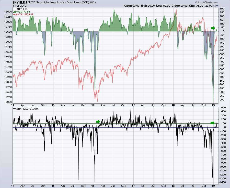
The Bulls are taking control of the Net New Highs. Looking left to October 2015, this is the friction zone. The question, though, is whether we're at October 2015 or March 2016 in terms of Net New High Momentum.
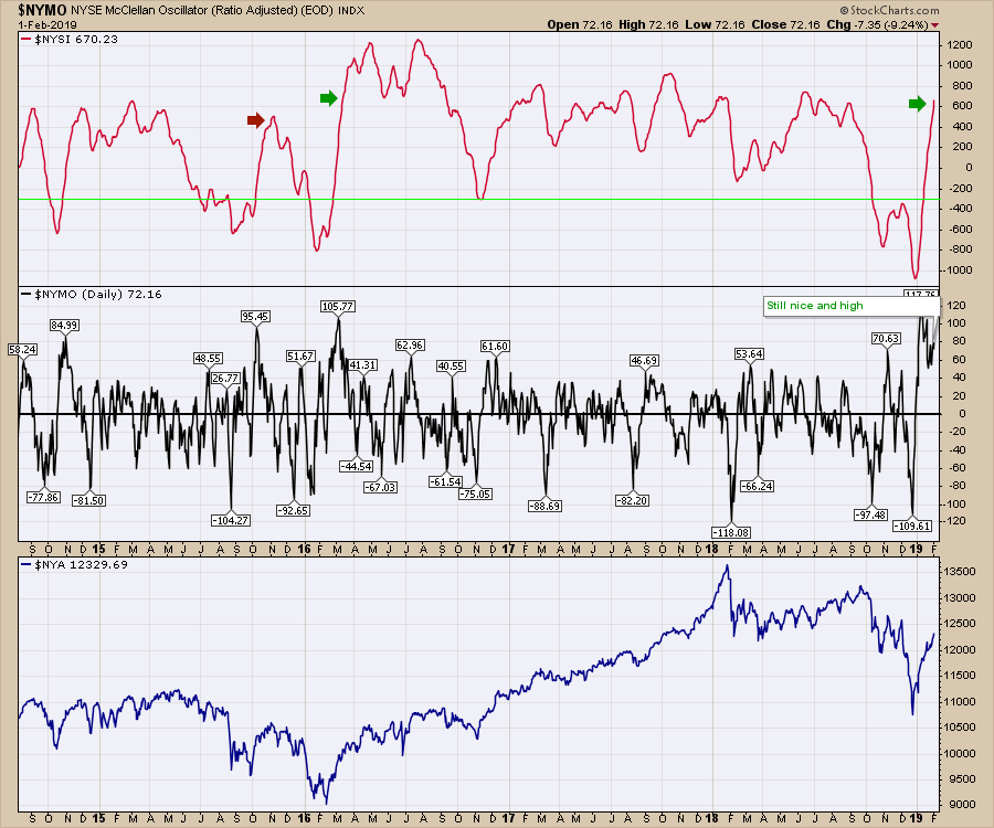
 The McClellan Summation indexes soared, with the Fed consoling the market participants below the 200-day moving average. In October 2015, the summation index topped out and rolled over hard. While there are plenty of peaks in the summation index around this level, 2017 marched bullishly higher while 2018 marked the downfall from this level in January and September. The consolidation of the McClellan Oscillator above zero for so long suggests plenty of strength here. If it had just rolled over after surging, I would be more concerned. A pessimist would say it's lower now than the peak, but it's been that way for several weeks already. I think the chart makes me bullish from this point, not bearish. These are definitely positive charts.
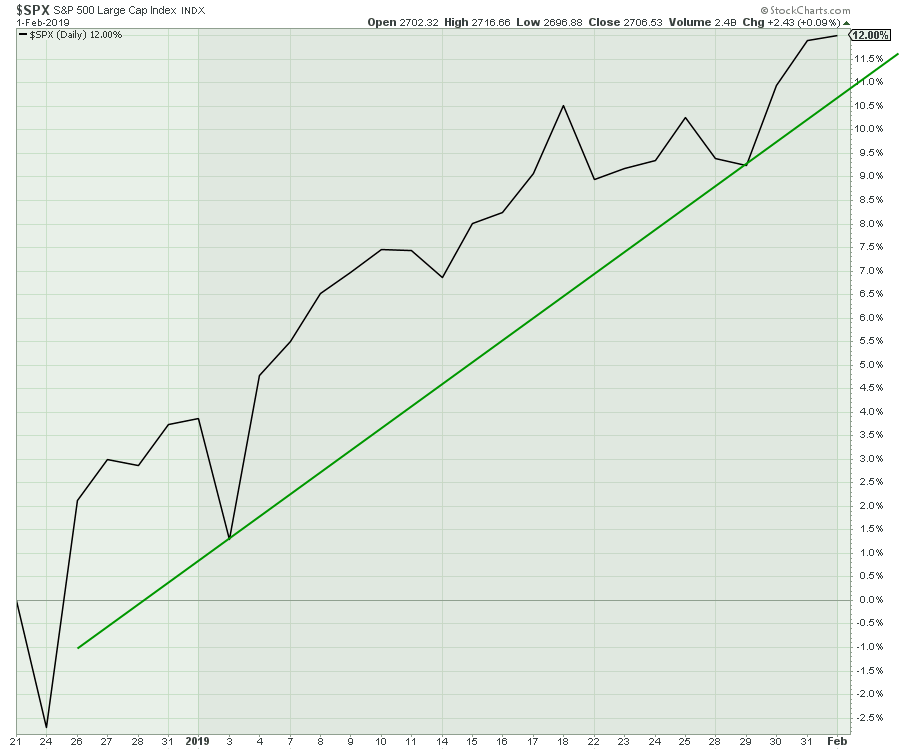
 Friday had a lot less euphoria than Wednesday and Thursday. This 1-month trend line has started to come into play. The percentage scale shows a move from Options Expiration day, which was a Quarterly OE that has always had high volume. I am wondering if the Fed push was a final exhaustion push and Friday's flatness might end up marking an interim high. I am sure we're all wondering this, as we don't usually get 8% monthly moves every month!
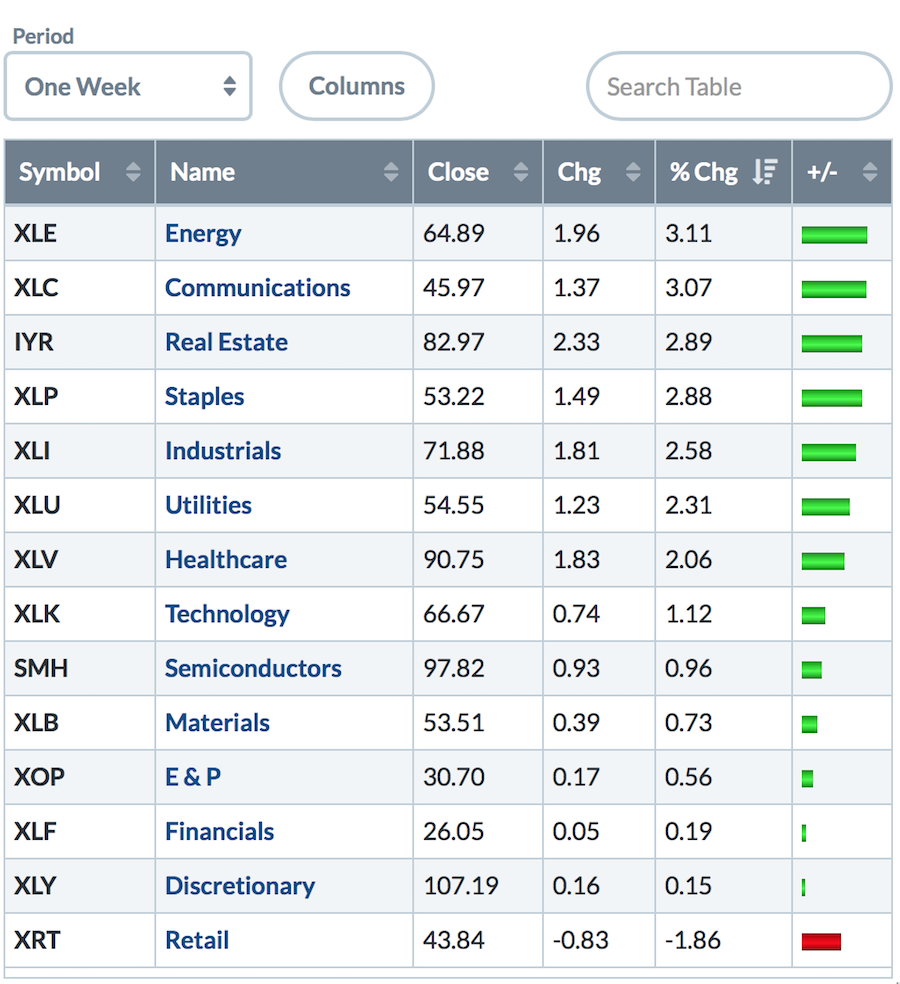
 The summary pages for the markets this week all looked pretty good on the back of the Fed being market-friendly on Wednesday. Continued weakness in retail is a little disturbing; Amazon didn't exactly roar after earnings. Semiconductors dropped down the list meaningfully after leading for a few weeks in a row. The passive performance by financials and consumer discretionary also suggests that the momentum is fading in this rally. The Oil Exploration stocks (XOP) were near the bottom, but XLE roared on the back of soaring renewable energy stocks. Industrials had a great week. Based on my bond market notes below, you can understand why REITS, Utilities and Pipelines might continue to perform well.
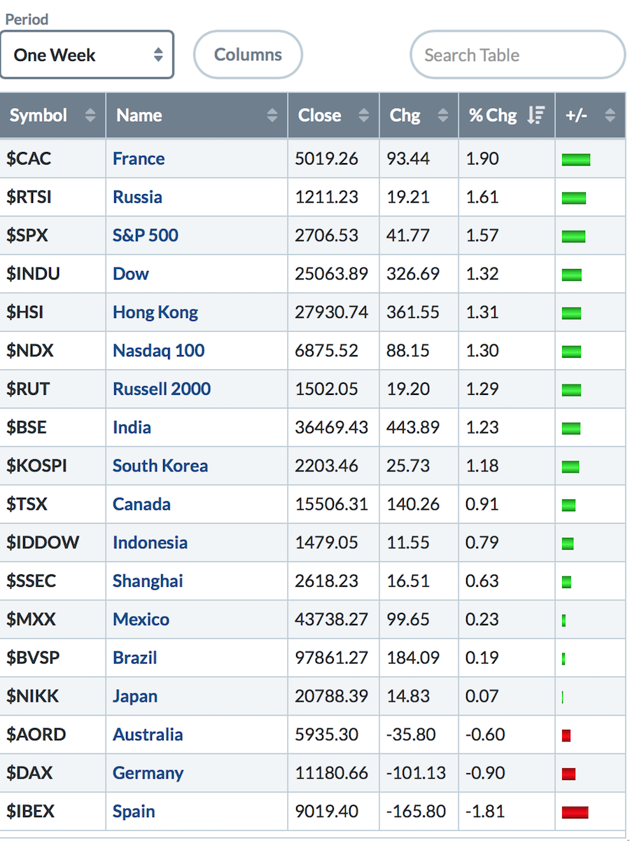
Global markets also fared well, with Germany a little surprising.
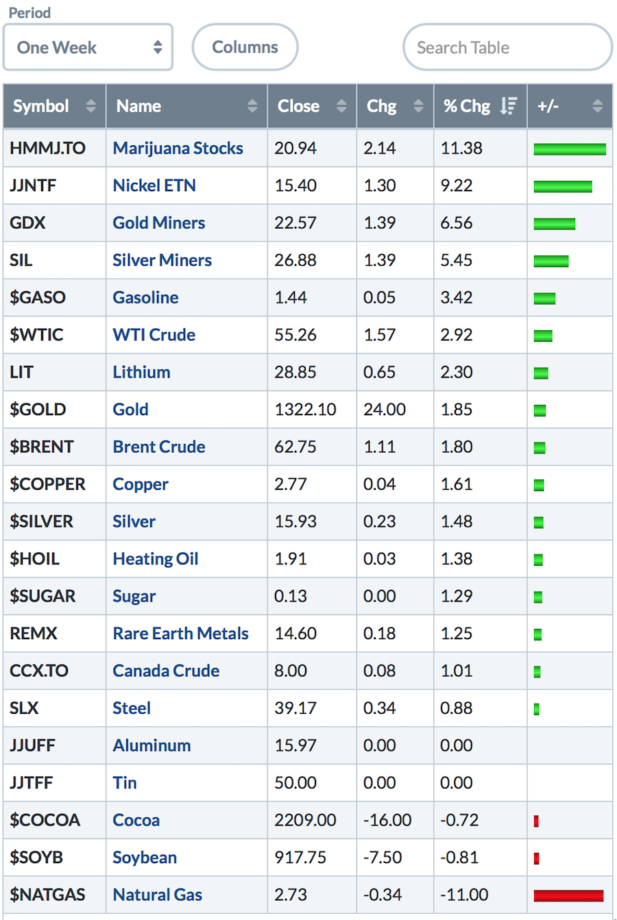
 Next up, Commodities. There is a little consistency on the story here. Last week, I mentioned that the Gold and Marijuana Miners were doing the best. This week, that held true. Meanwhile, Natural Gas had back to back -11% weeks! Ouch!
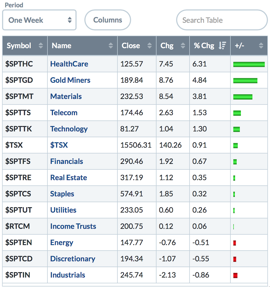
 Canada followed the US sectors, but the percentages were skewed lighter. Marijuana stocks show in the Healthcare space. The Utilities, Real Estate and Staples were up marginally, which is different than the US market where those were some of the best performers. Canadian Industrials moved down the most.
I am pretty sure most technicians have a red light flashing in their heads as we return to the underside of the 200-day moving average. Why so much concern? Historically, if you look back through the charts of time in the stock market, the 200-day MA has been a common place where the market finds support or resistance. On the left side of the 2008 chart, you can see the 200-day MA support stocks. As the market makes the topping structure, the 200-day moving average becomes a cluster zone. On the way down, the rallies stopped around the 200-day. In hindsight, after the bear market rally off of the lows, the market consolidated for two months near the 200-day MA. Notice that the PPO indicator has trouble rallying above the zero line and continually rolls over. There have been many articles written about the bear markets as they hold a level of respect for losing significant capital.
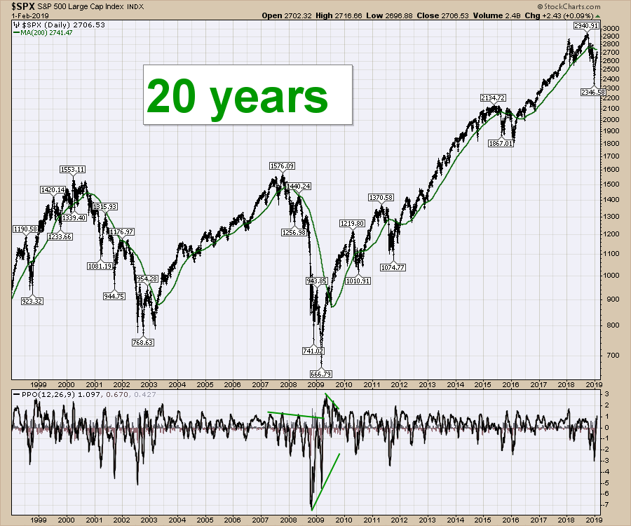
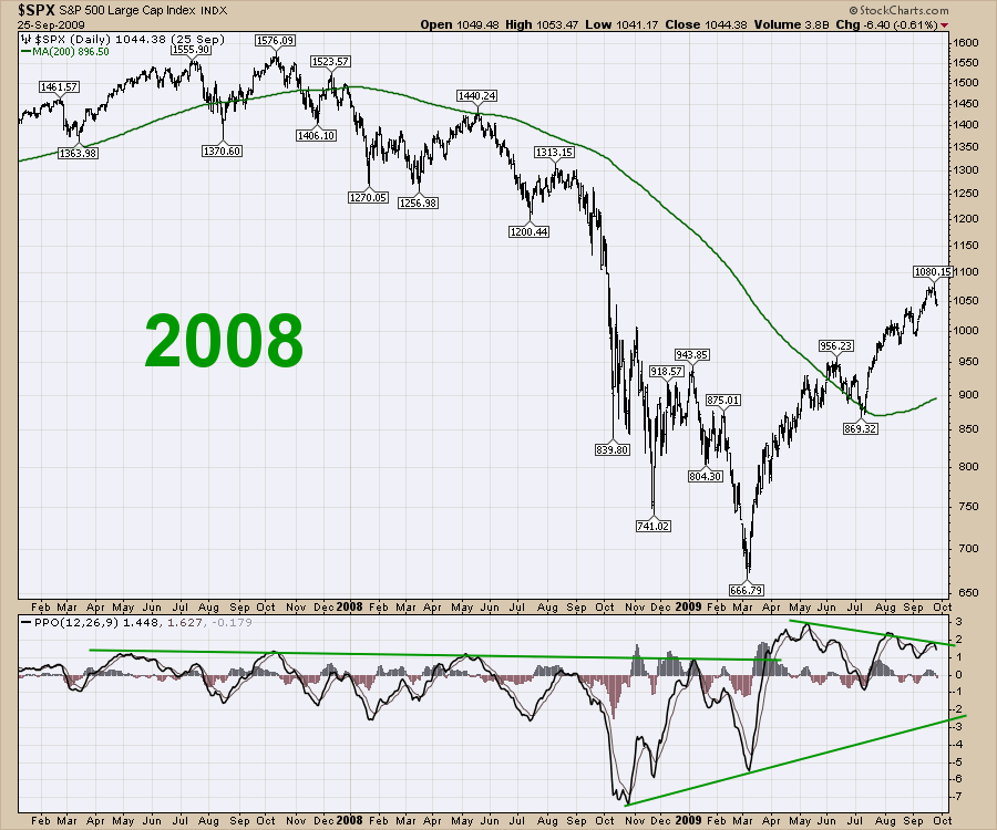 Staying with a daily chart, here is the green line representing the 200-day moving average.
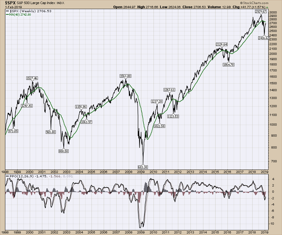
 Here is an expanded view using the 40-week moving average, which is similar to the 200-day moving average as 40 weeks times 5 days/week equals a 200 days. This makes a cleaner chart when I use a line chart instead of bars. Looking at the PPO indicator at the bottom of this weekly chart, it shows how difficult bottoms are to trade as price swings wildly both ways.
 The 10-month moving average is also similar to the 200-day MA, with roughly 20 trading days per month.
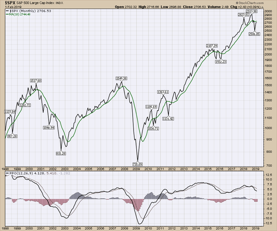 The charts above show why technicians prefer the 200-day moving average, as it is a nice benchmark. When above the 200-day MA, harmony exists. Below it, bad storms can show up. When computer programmers are trying to define a trend direction, they will use a short-, medium- and long-term moving average to help organize the direction of their trading bias. In this case, a down-sloping 200-day MA would typically be a place to short the market from when the setup presents itself.
Speaking as a trader, most traders don't want to start going short when the market is down 20%, but rather when the market has just had a huge rally and reaches exhaustion. Even if a trader doesn't short the market, protecting your profits by using options, selling part of the position, etc. is prudent. This in itself creates friction for the market to go higher as the professional traders are selling into strength. Understandably, this current stock market level just under the 200-day moving average adds caution to even the most bullish technician. For all new readers, this is why the technicians are starting to get concerned. Notice the PPO in the bottom is pretty much exactly where it would stall if it was going to roll over like in 2008.
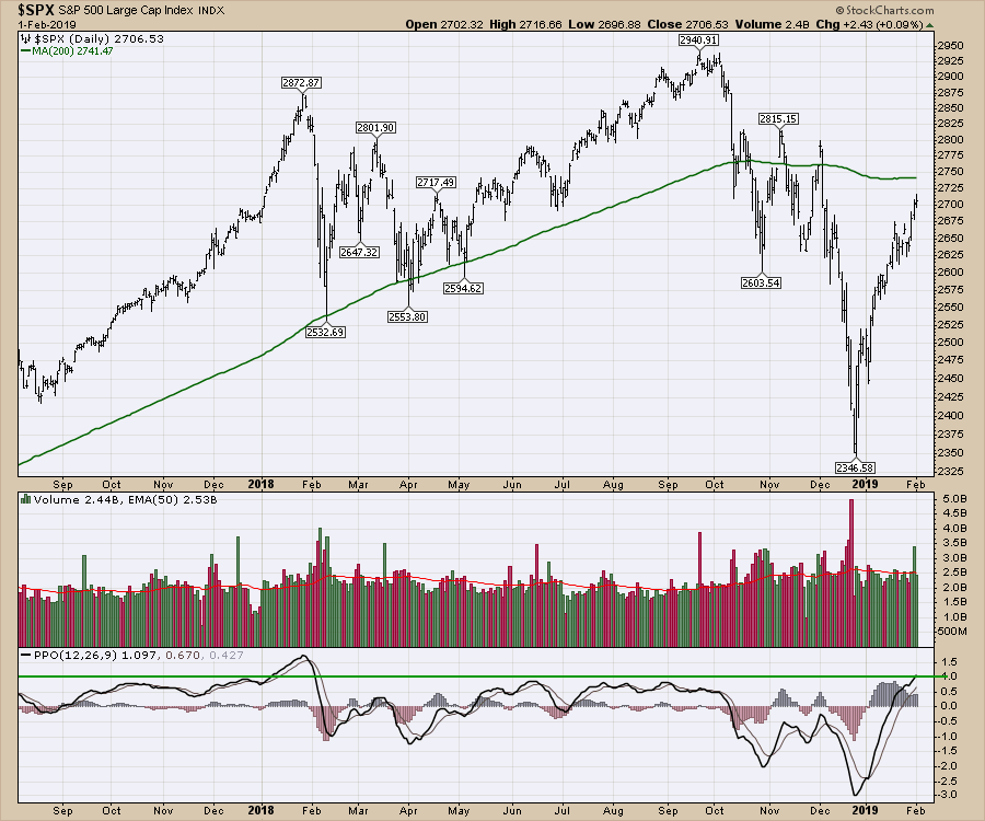 One of the difficulties for every investor is that the market has to get through these levels every time we have a major market drop. Technicians are ready to trade in either direction, whereas most fundamental investors are assuming the rally will continue after a nice 6-week move that suggests the lows are in.
Bond market blues
Here is the $LIBOR3 chart I mentioned at the top:
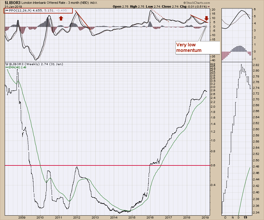 Notice the negative divergence. While this doesn't mean doom and gloom for all holders, the zoom panel shows very little bullish movement higher, even as the stock market rallied. It also has a PPO making a relatively quick lower high; any breakdown on the PPO would suggest weaker momentum than any seen in years. While it is not bearish, it is a definite trend change from the huge bullish rally we have grown accustomed to. The last PPO low in July was lower than that of the previous three years. This moves the chart to "something to watch" status, instead of "something to fear" status. If the PPO starts to accelerate down now, I would get more and more worried should it break below zero. Libor is the interest rate banks charge to borrow between themselves. When there was concern about banks going broke, this chart accelerated higher. More commonly, this chart represents the direction of short-term interest rates. Ben Bernanke's book The Courage to Act suggests those rates usually follow the 2-year note. If interest rates were dropping quickly and the PPO goes negative, I would take that as a meaningful hint that the bull market trend is changing. This would add to technical fears around the 200-day moving average on the indexes; a cross of the 40-week moving average on this chart would probably alert a few more people.
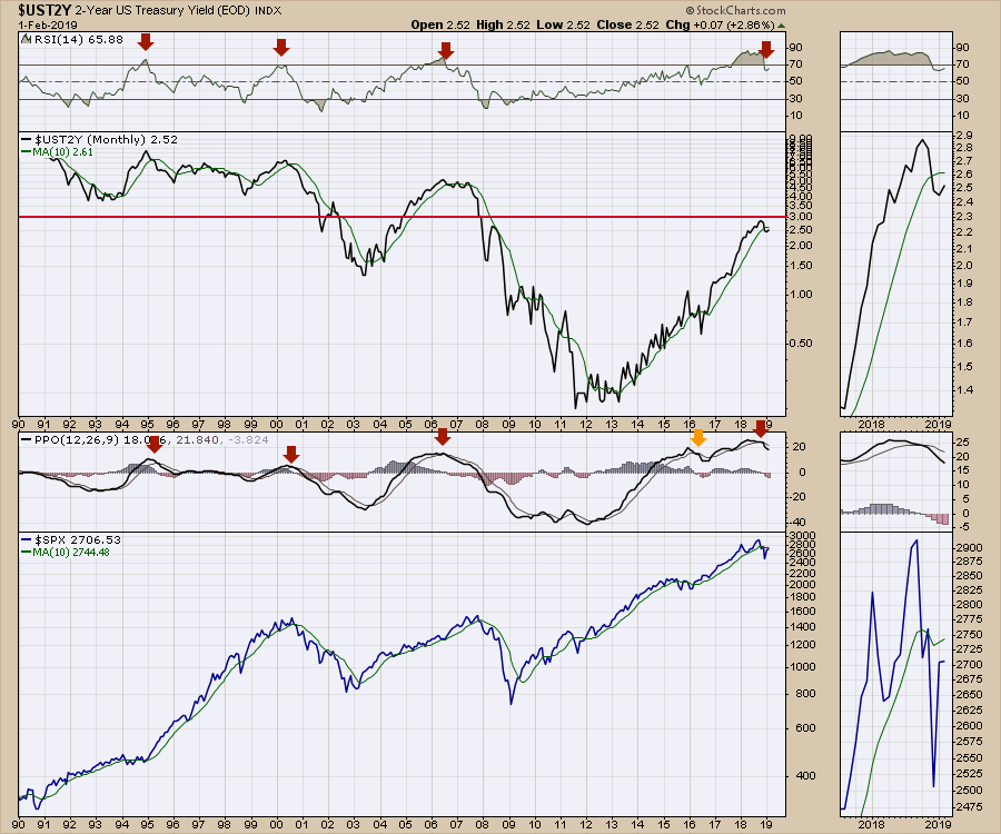
If the two-year chart below doesn't get your anxiety going, your optimism scale is very high. This is a monthly line chart. Look at the RSI and PPO peaks. While this doesn't always mean the stock market is going into the dumpster, it certainly suggests it's not time to go get popcorn. We are at the dramatic climax of this decade's edition of the market!
The 2006-2007 top made multiple wiggles before giving up. When the bond price topped in 1995, the stock market was not below the 10-month moving average and it never did go below. The same can be said about 2006, at least until 2007. In 2016, all the conditions were in place as the Fed stopped QE in 2015 - but another rally ensued. Will we be so fortunate this time? While chartists worry a lot, these charts suggest why paying attention might not be such a bad thing right now.
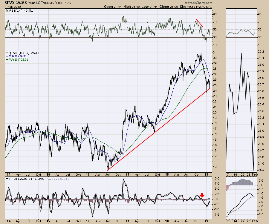
 Here is the five-year chart I mentioned, which bounced after the Fed meeting January 30th. Where exactly it bounced could not have been more important, as a break of this trend line is a big deal. This has a trend line from the 2016 lows with a radically different, steeper slope than the yield before that July 2016 low. I certainly think this is a big deal.
Below is my cheat sheet for the direction of the 10-year treasury. This Municipal Bond Fund is now breaking above the prior highs. The bond market is in higher prices mode, regardless of the equity rally. Though they don't always bottom together and can have significant lag, this chart suggests there is more appetite for municipal bonds and higher prices.
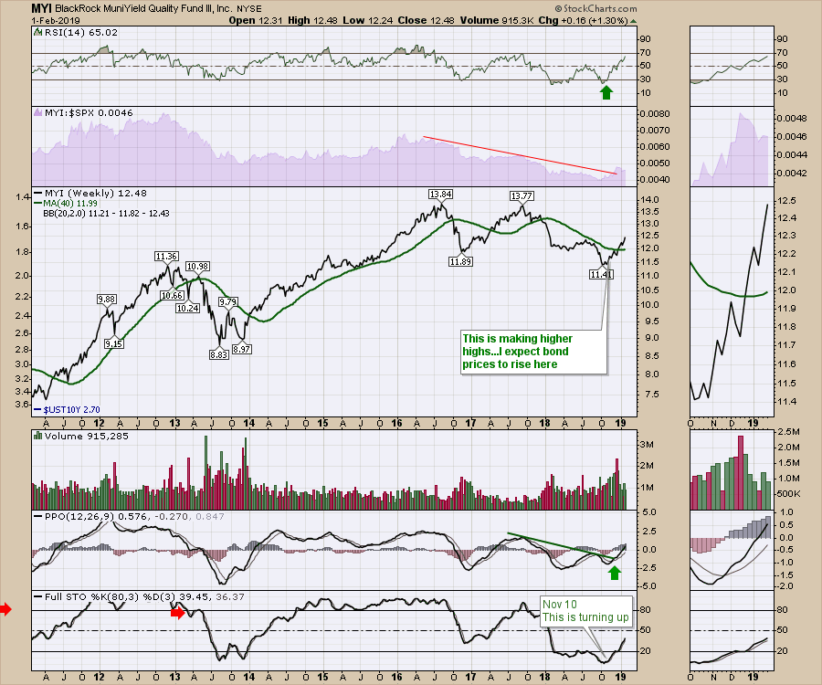 I would suggest the bond market is "shaken, not stirred" at this point in the mixing process. We are about to find out whether or not it spills over.
Commodities
The $WTIC chart is painful here, hugging the $55 level. Notice the weekly PPO is just above zero. A bounce here is extra bullish, but a failure here would help identify negative momentum. Notice how weak the chart is when the PPO is below zero. Of course, this all shows up as the $SPX returns to the 10-month moving average - one more thing to put in the middle of the range.
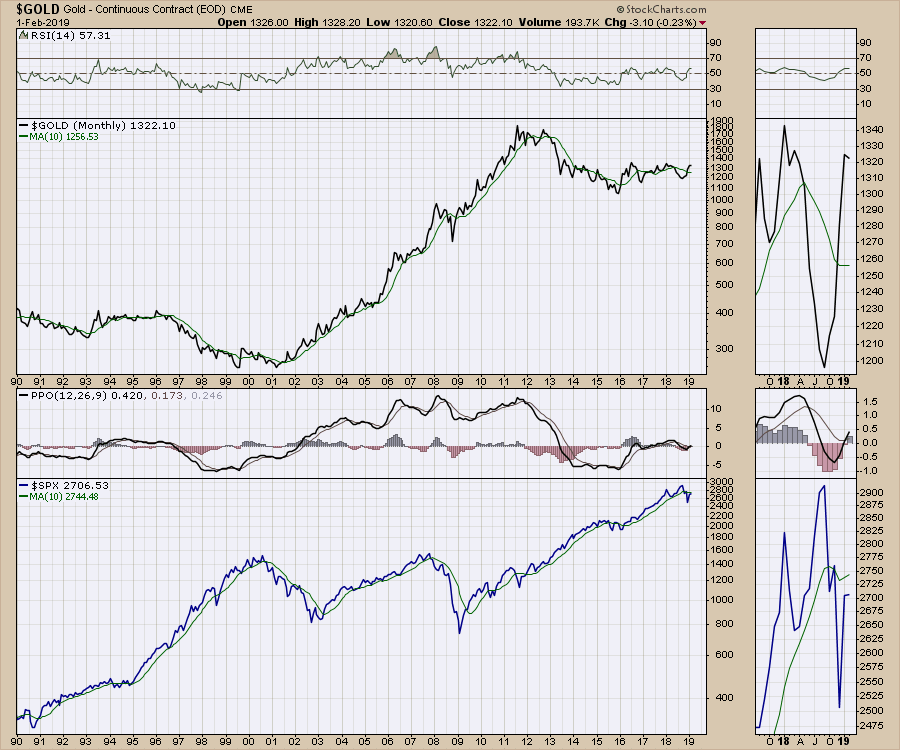
 Our good friend Gold has been a wonderful trade off of the lows. Now, as we approach the top of the 5-year range, the PPO is pointed higher, suggesting more momentum. In general, this is a very bullish setup, and the move above zero is comforting. Until it breaks out of the five-year range, optimism should be tempered. The chart shows the first day of February representing the entire month, so don't be focused on the last little tick in the zoom panel. The top line on gold suggests the hard work lies just ahead.
 Copper has closed between $2.60 and $2.80 on a weekly basis since July. That's a tight range for commodity traders to make money in. Copper is trying to break out of a trend and is approaching an important moving average from the underside again. While I don't want to slight the move in Copper, its PPO suggests it might be ready to break out. No chart required! Catch the video for more details.
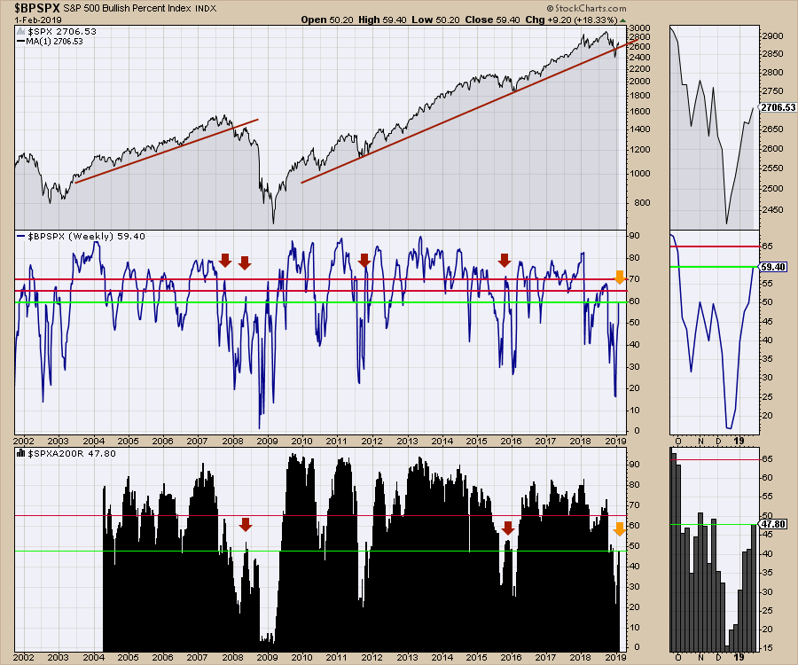
I'll put a bow on it with the $SPX Bullish Percent Index chart. Look at the panel in the center. Notice the 60% level is a difficult level historically in some of the larger bear markets. When you add the percentage of stocks above the 200-day moving average sitting near 50% (in the lower panel), it tells us that this is where to expect failure if it happens.
With that as a wrap, February 2019 in the markets makes the Super Bowl look like "no big deal." Be very careful, as bear market swings are not usually nice enough to let you off gently. With trade issues, global growth, tariffs, politics, Venezuela, and host of other things to climb for a Wall of Worry, it's been a typical month. Until we remember that the markets are trying to get above the 200-day moving average this week, which is different than a typical month. With the bond market shaking, the commodity markets hovering and the monthly charts showing a 10-month moving average "check furnace flashing light", all during a Polar Vortex, it adds up to a lot of incentive to protect your positions. Having some insurance like taking partial profits, tight stops or options to capture your gains is not wasting money - it's just good planning. We don't know how it's going to resolve, but sometimes defense needs to take the field.
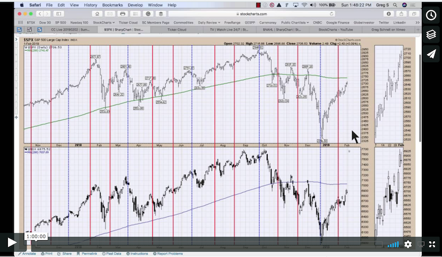
There are lots of my videos from the past week available for you to watch. This is the latest Weekly Market Roundup. I put a lot of work into this one!
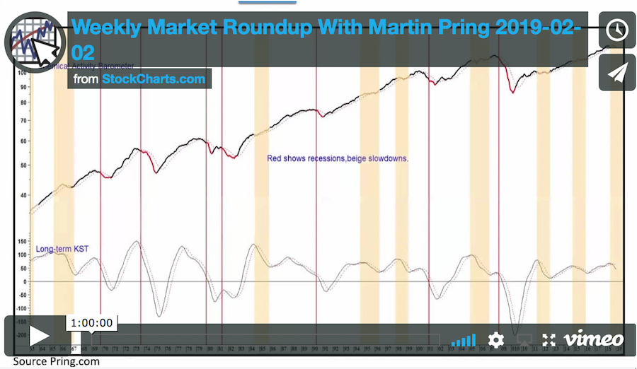
I also have a February Market Roundup with Martin Pring. Look for that on the StockCharts YouTube page or on my Vimeo channel or click on the image below.
 I was recently on the MarketWatchers Live show with Erin Swenlin, where I presented Gold stocks. Click on the image to enjoy the video.
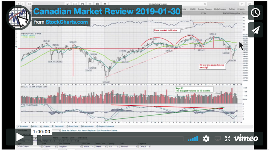
Here is this week's Canadian Technician Market Review.
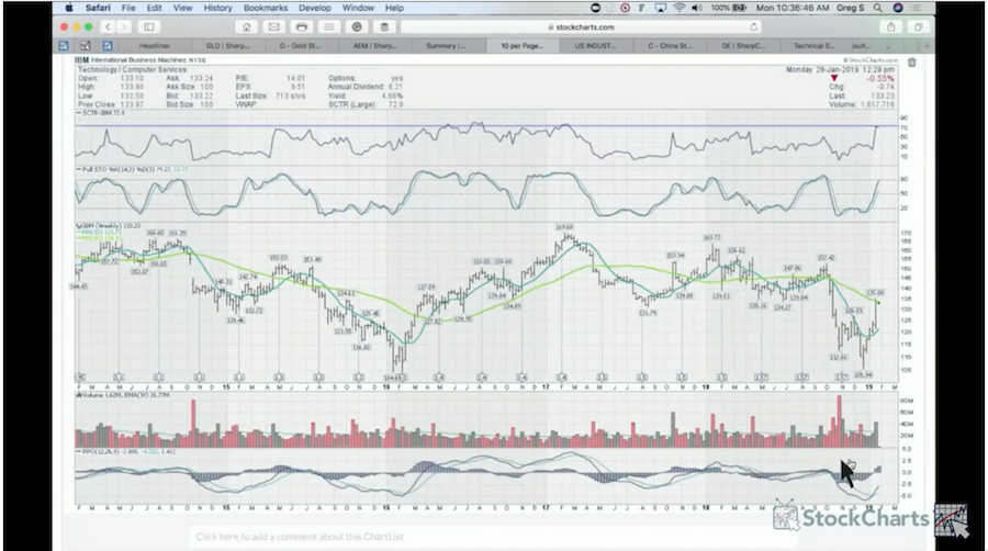
Lastly, the industrial metals group is starting to run. One particular US-listed stock that made new 52-week highs this week is BHP Billiton, a world leader in mining. I will be working through this industry group on Market Buzz Wednesday morning at 10:30 ET. Watch it on StockCharts TV! You can find past editions of Market Buzz here!
If you would like to learn more about the basics of charting, check out Stock Charts for Dummies. The first section of the book walks through all the chart settings to get the charts you want, the second section explores why you might use charts for investing and the third section is about putting it all together.
Click here to buy your copy of Stock Charts For Dummies today!
If you are missing intermarket signals in the market, follow me on Twitter and check out my Vimeo Channel. Bookmark it for easy access!
Good trading,
Greg Schnell, CMT, MFTA
Senior Technical Analyst, StockCharts.com
Author, Stock Charts for Dummies
Hey, have you followed Greg on Twitter? Click the bird in the box below!
Want to read more from Greg? Be sure to follow his StockCharts blog:
The Canadian Technician

