In what could be described as a calming week for commodities, oil finally stopped falling. Gold and Copper bounced a little, and some of the industrial metals are holding up. Lithium and the rare earth metals are trying to rally. After a $20 move down in oil, crude finally stopped at the most logical place for support. The real question over the next few weeks is can crude oil continue to find support here?
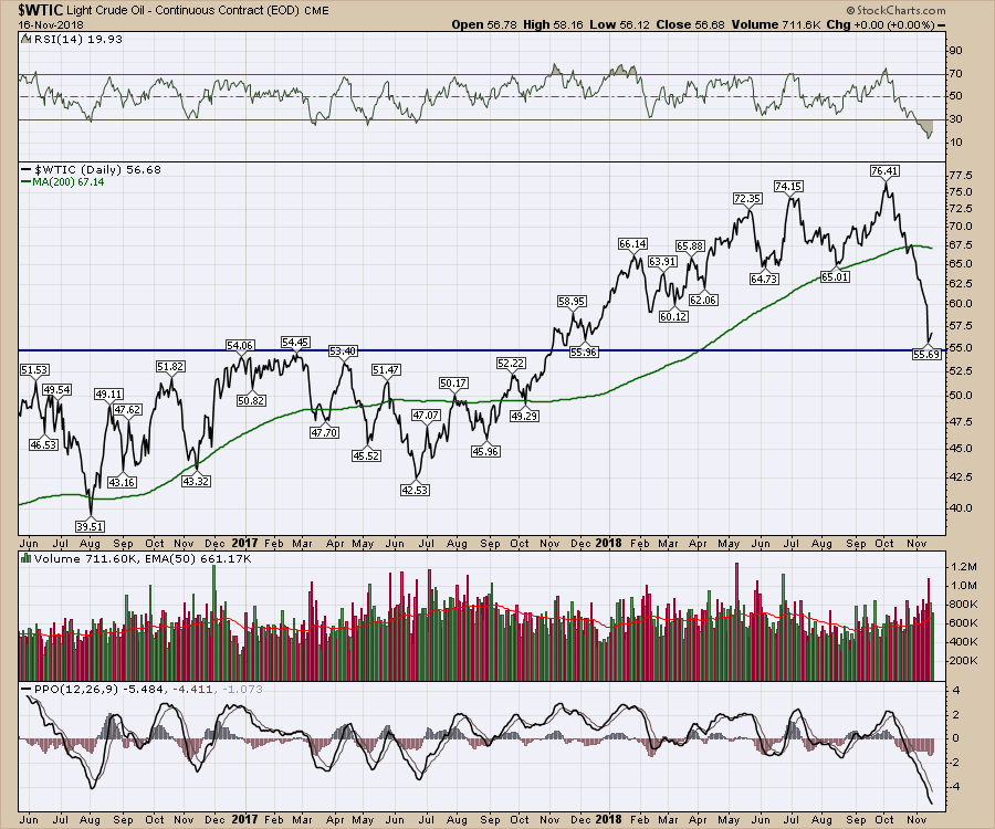 I don't have an answer for the question. In 2014, when crude oil plummeted, the $USD soared. The $USD has been rising begrudgingly, so it is not the same set up. I will say in 2014 the market had QE infinity as a tailwind. It took until May 2015 to top out the markets. All the commodities and the stock market bottomed in 2016 together. Yields started falling in January 2014, well before crude made its last high in June 2014.
A lot of people are expecting inflation to show up with the tight labour markets along with an economy moving higher on the back of reduced taxes. Yields are a measure of inflation as well. Markets have seen bond yields fall from 1982 to 2016. We made the intra-month low in yields a few months after the 2016 lows in the equity markets. In 2018, the US economy has had tax cuts and increased spending to help the bull market. With all this euphoria in the economy, the yields have pushed higher, but now we see crude oil lower. Which is right as a signpost for inflation?
This bull market wasn't free. It came along with a $770 Billion dollar annual deficit. As one of the TV economists likes to say, how much debt should a bull market cost? The YoY deficit increased from September 2017 to September 2018 by 17 %. Yes, just this year. Take a quick look at the numbers yourself. Just briefly look at the US Treasury data. It would require greater than a 30% increase in government revenues while not allowing any more debt or any increases in spending to balance the budget. Even then, the rising interest rate environment we find ourselves in adds interest on the new debt rolled out every month. While we are individually numb to the current situation, the financial hawks of the world are seeing debt inflation in the US. The US Government forecasts annual deficits around $1 Trillion for each of the next three years. That is a 25% increase over the 2018 level and up 50% from 2017 levels! Yes, the deficits are accelerating way faster than income or economic growth. The US is not alone. Most governments in the world are staring at the same extreme problems. Italy and Japan have massive debt to GDP ratios and recently we have seen the Italian debt show up in the news.
So while inflation may not have shown up in wages in a big way, it is showing up in the government. Any new debt going forward has much higher interest rates attached than just a few years ago. As the debt moved above 3% and a doubling inside 2 years, anyone using a calculator sees the issue in spades. I am not a fundamental analyst, however this interest rate and debt is a problem for us when the market starts worrying about it.
A good question to ask is: Is this why the broad markets ($SPX, $NDX) are unable to maintain the breakouts above the old high? It is the 3% rate level ? I think it might be more about the rate of change? September 10-year yield ($TNX) was at the highest close since the 2013 high, which was in the middle of QE infinity. The Fed announced more interest rate hikes and a hawkish tone forward at the end of September. That was literally the week the stock market rolled over. The rollover on interest rates was smaller as a percentage compared to the rollover in the equities. The scale on the chart below shows $30. That is 3.0% on the yield. So the August-September-October move was 16% in three months. Compare that with Golds 6% swing in the same period. Now we see why the bond markets are getting testy. Also look at the extreme level of the monthly PPO on the yield chart below.
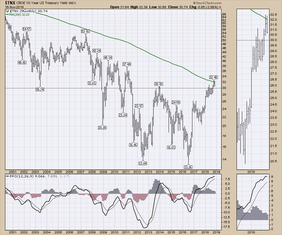 We have not been in a rising rate environment. Pretty much only Art Cashin of UBS has been around long enough to remember rising rates. He has been on the floor of the exchange for over 60 years! I asked him if he would have to retire twice?
This strong hint of debt inflation, that has been of little consequence to the market for the last ten years, is starting to hurt. Hopefully the sentences above summarizes the size of the issue.
While these inflationary pressures are showing up in yields, they traditionally show up in commodity circles as well. So with that brief step into the dark world of bond yield inflation, let's revert back into commodities.
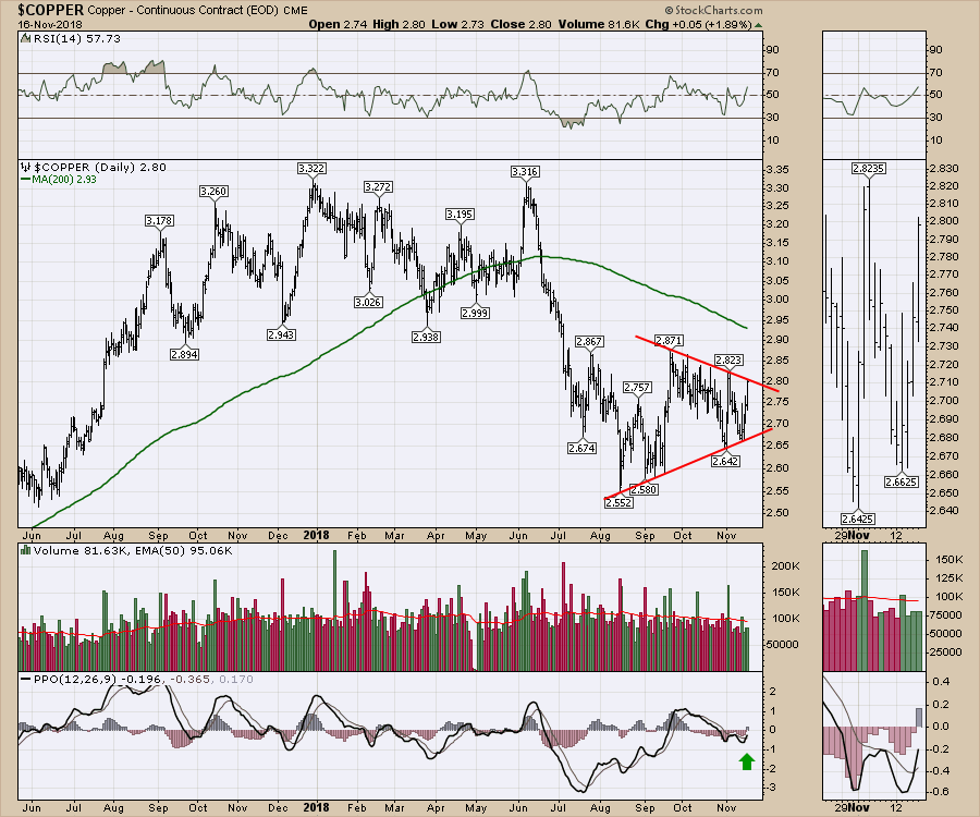
Copper has been working hard to trade in a range with lots of overlapping bars. The chart is at an important point in time and price. A breakout here either way suggests a big move. Closing Friday at this trend line suggests all eyes should be on the chart for a breakout.
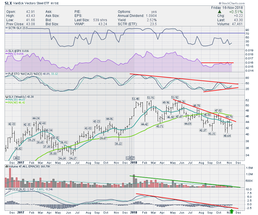
 The steel ETF, SLX, is trying to turn up in momentum. Right now the Full Stochastic has positive divergence. The relative strength is trying to break out to new fresh 3-month highs. I am particularly interested in the PPO breaking the momentum downtrend. So this chart needs to be watched for a potential move. While price is in the middle of the recent range, the indicators are all suggesting some potential exists for a trend change.
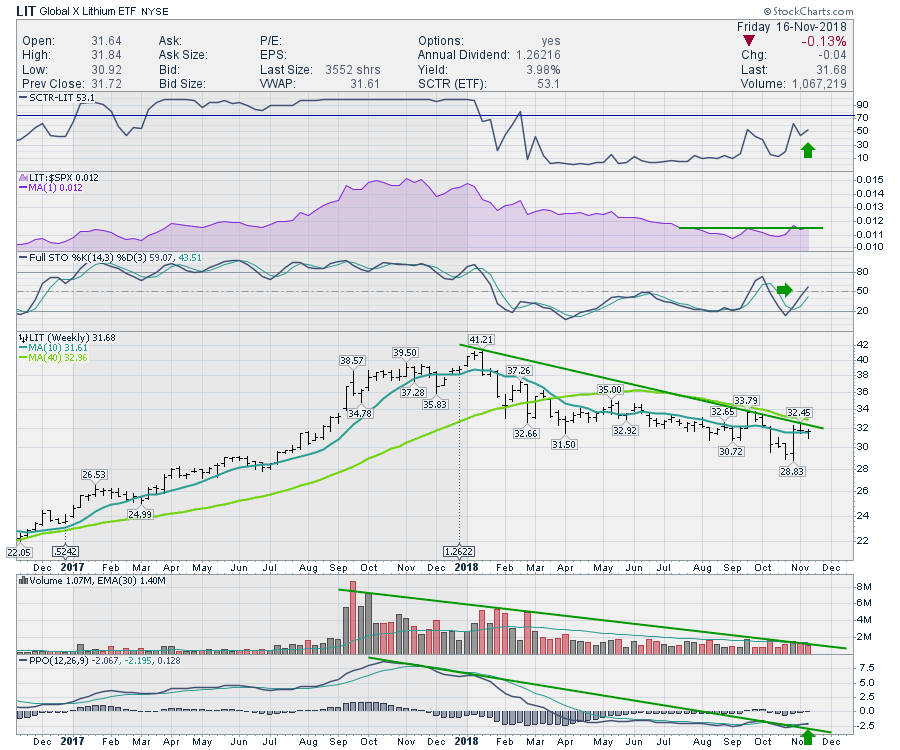
 The Lithium ETF, LIT, has been slowly downtrending. Friday gave us the third weekly close above the 10 week moving average. The momentum is turning up above the trend line and the full stochastic is moving above the 50% line. With the relative strength trying to make new three month highs, this chart is also set up to break out here. A big strong week would move above the trend line and the 40-week moving average.
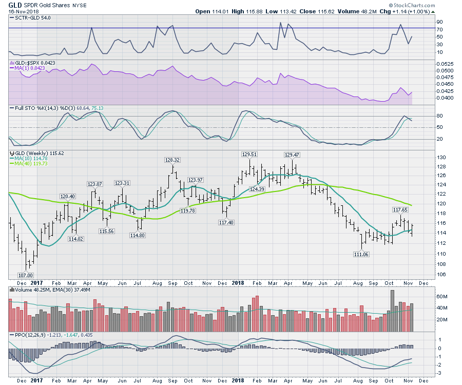
 Let's get into the gold chart. The GLD chart closed back above the 10-week moving average again. The relative strength made three-month highs. The SCTR has given a small pullback and looks to want to climb back up. The increase in volume this week looks great on the chart. Notice the increase in volume on Gold since the extremely low volume early in September. That weekly volume was the lowest on the chart including Thanksgiving lows. Ralph Vince, author of five books, loves to find extreme lows or highs in volume. They can be one of the signals for a major change in trend. The rising momentum on the PPO suggests the chart shape is improving. We can see that with the price panel trying to form a higher low here.
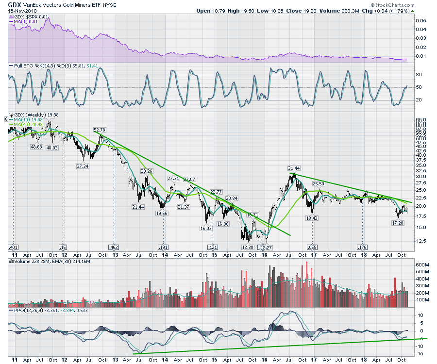
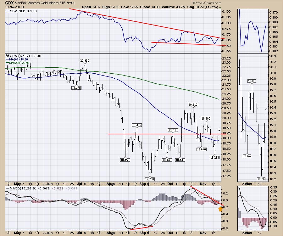
 The two charts I am more interested in are the gold miners ETF, GDX, and the ratio of the GDX:GLD. Both are shown on the chart below. The miners jumped back above the horizontal resistance. Friday was a nice close that suggests paying more attention. I want to see the ratio in the top panel break above the down trend. Usually when the miners break the trend line on the ratio, that is a good time to be involved in gold stocks. If the MACD can turn up above zero here making a higher low compared to September, that is usually a sign that the momentum wants to shift to positive. You'll notice it has not been that way so that would be a positive improvement!
 This weekly chart of GDX shows the two major downtrends we have experienced in the gold miners. Notice the PPO bouncing off the long major trend line. So the PPO is above the signal line (See the legend) but below zero. That can be a problem but currently the PPO is sloped up. The full stochastic is moving above 50, which is bullish as well, but looking left on the full stochastic suggests no advantage in information here.
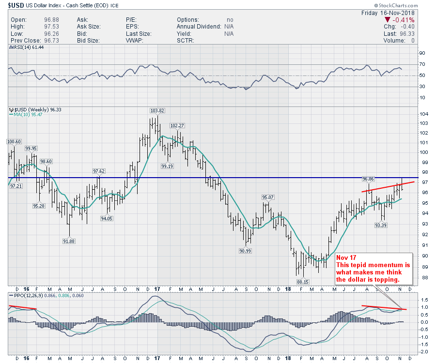
However, there is one chart that makes all of these charts point to higher ground and that is the chart of the $USD. First of all, let's set the stage on the long term picture. A horizontal line at 97.5 is important. That is where the bounce topped out this week. As I have been suggesting the last few weeks, this 97.5 level on the $USD chart doesn't seem to have momentum to go higher.
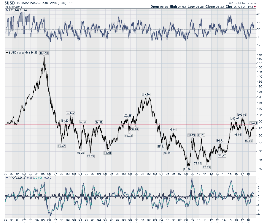 Here is the 3-year view. This tepid momentum on the weekly chart is what suggests the dollar might be ready to drop lower here. Notice on the chart, the same weakness was set up in late 2015, early 2016. This was the period when gold mining stocks went on a huge run in early 2016.
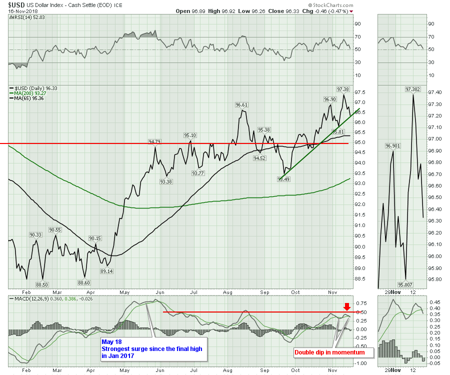
Zooming in on the dollar, we have some divergence on the recent highs on the daily chart. It looks to me like the dollar wants to roll over here. Leaving all the macro analysis from above behind, this looks like a potential starting point for commodity inflation as the dollar rolls over.
While all the charts are lining up suggesting this lower dollar is going to send the metals and mining charts higher, it is not a done deal. My suggestion is to watch these areas for potential investment. They also have good seasonality trends to expect them to move up this time of year as well.
I think the video is much watch every week, but if you like these setups please watch the video. I caution that extreme moves come both ways when the charts are setup with this much tension.
Here is this week's broad market review video.
This video covers off some of the recent price action including Gold and a return to some of the growth sectors.
If you are looking for a small gift, you might have family or friends that would like to learn more about the basics of charting. The first section of the book walks through all the chart settings to get the charts you want. The second section is why you might use charts for investing and the third section is putting it all together.
Click here to buy your copy today! Stock Charts For Dummies.
The Canadian Technician video shows the bounce off the late October lows in Canada. Canada is back below the 2008 highs. Tough ten years for investors.
If you are missing intermarket signals in the market, follow me on Twitter and check out my Vimeo Channel often. Bookmark it for easy access!
Good trading,
Greg Schnell, CMT, MFTA
Senior Technical Analyst, StockCharts.com
Author, Stock Charts for Dummies
Hey, have you followed me on Twitter? Click the bird in the box below!
Want to read more from Greg? Be sure to follow his StockCharts blog:
The Canadian Technician

