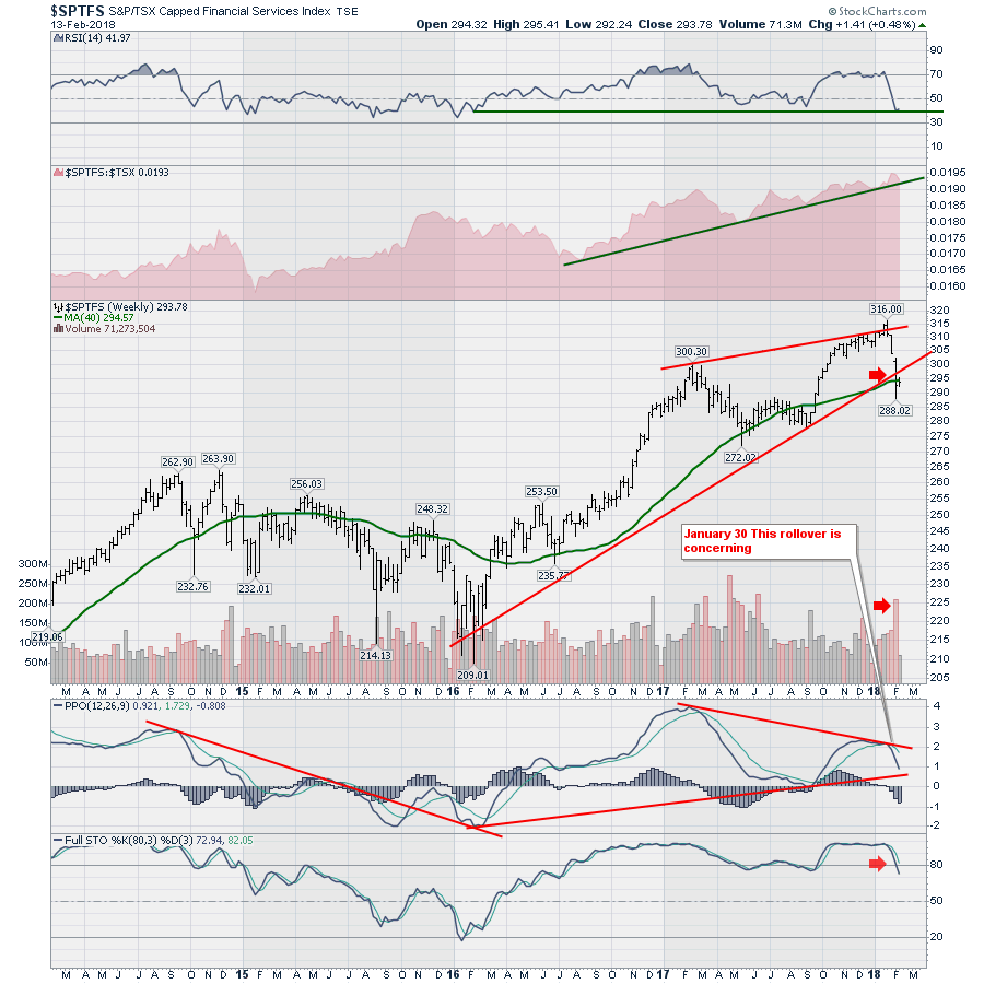
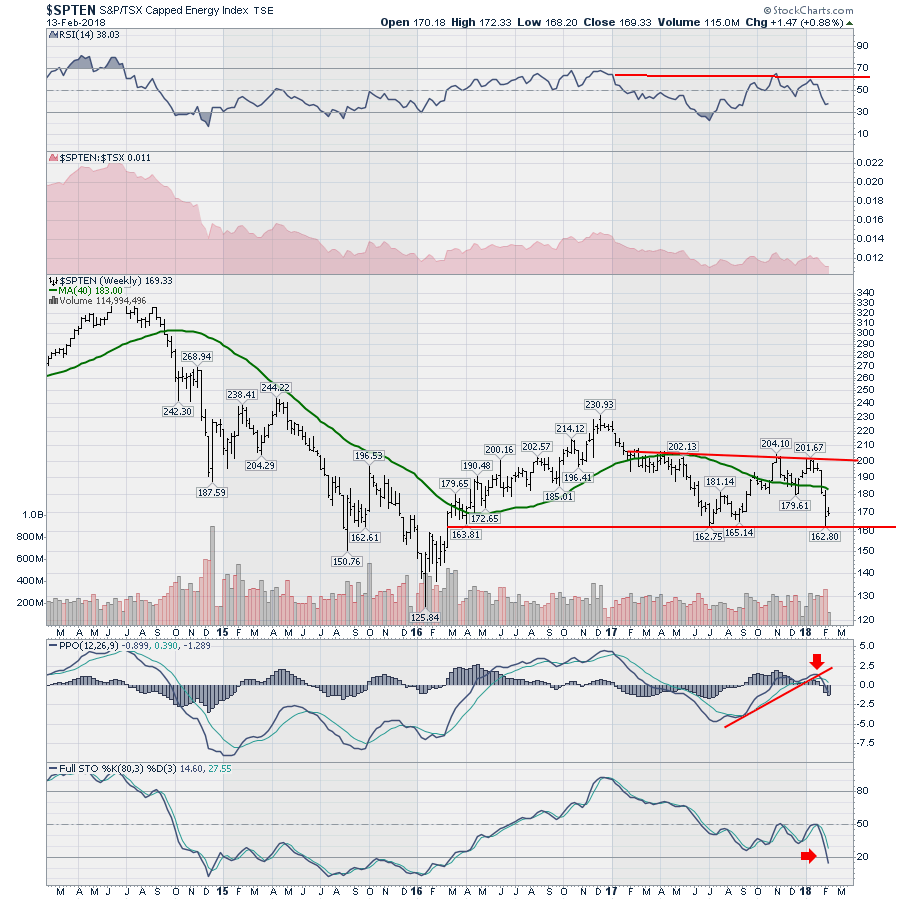
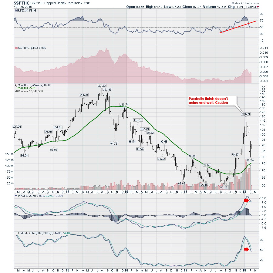
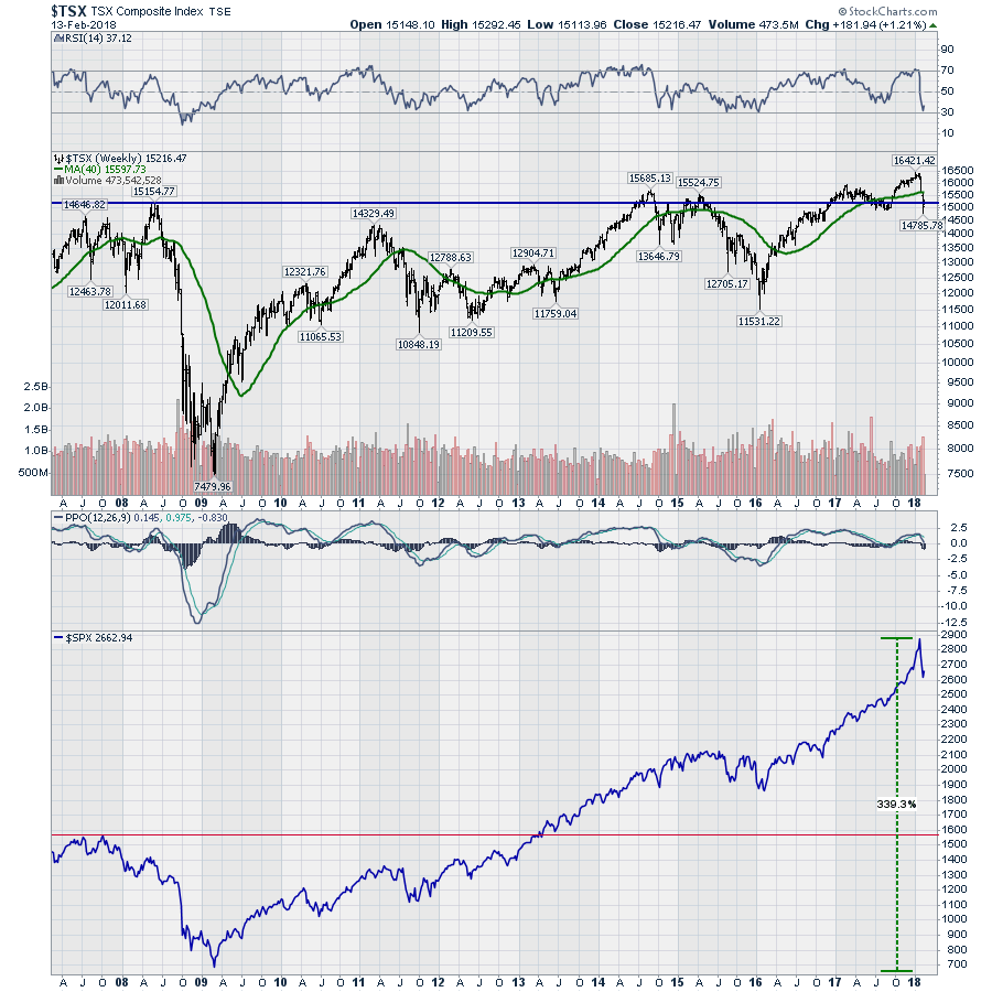
The Canadian charts have been getting weak for a while. The last two webinars pointed to declining strength in the Canadian market. The breakdown in the last two weeks just accelerated the downward trend, it didn't start it.
The financial sector really needs to rebound soon to not break the uptrend in momentum shown on the PPO chart.
The energy sector is abysmal. The RSI is in bear market mode. The energy sector is near if not at 2-year lows. That was sudden. The 8-month uptrend on the PPO is breaking down at or near zero. That is just terrible. It is also a significantly lower high in momentum on the PPO. The Full Stochastic dove down this hard in 2014. This is not a movie we want to watch again.
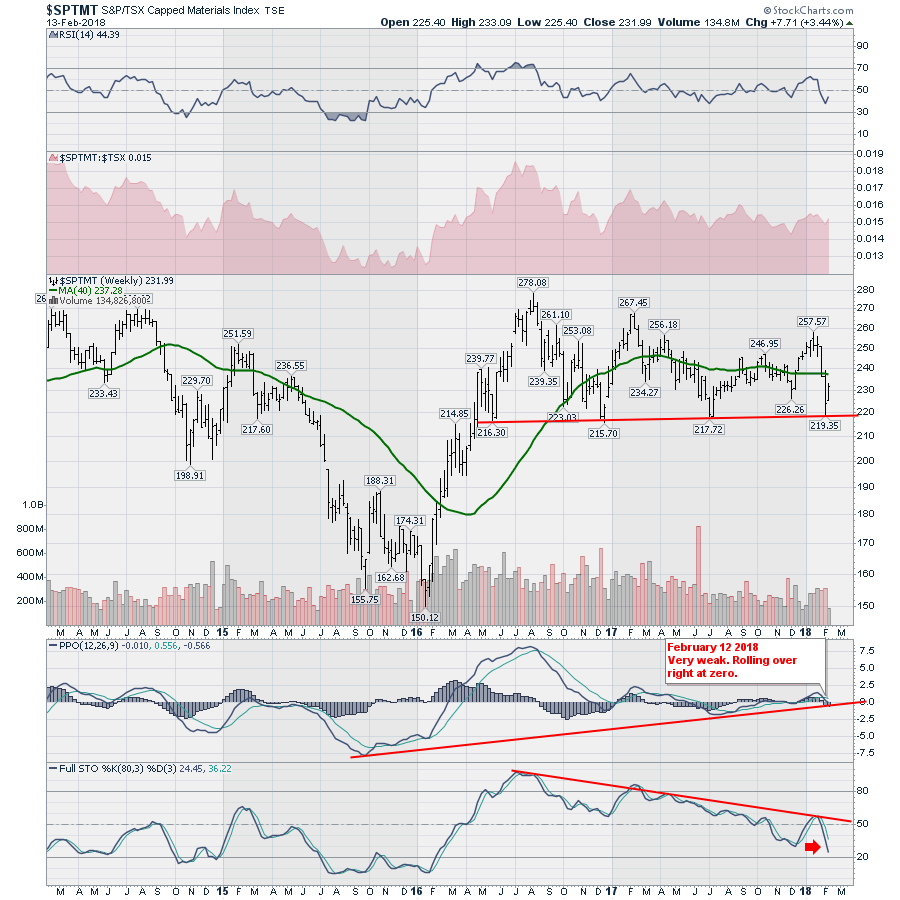
The Material sector ($SPTMT) is the next most important sector. It is trying to hold up but is being weighed down by the weak performance in Gold and precious metals. Looking at the legend, the PPO is now in negative territory. The 30-month trend line on the PPO is threatening to be broken and move deeper into negative territory. In my work, this is a serious spot to watch for support. We need this sector to bounce in the next two to four weeks or this chart is a strong sell. With the full stochastic making lower lows, the chart has the flu.
 Healthcare has been a bright spot with the medical marijuana surge. That looks to be over. The PPO is giving a sell signal. The Full Sto is falling below 50. None of this action is bullish and its been underway for a while. The chart failed to bounce at a place that would represent a normal pullback. The Healthcare chart is ill.
Chartcon 2018 is only a few months away. Please register if you are interested in hearing 15 technicians over two days. Chartcon 2018.

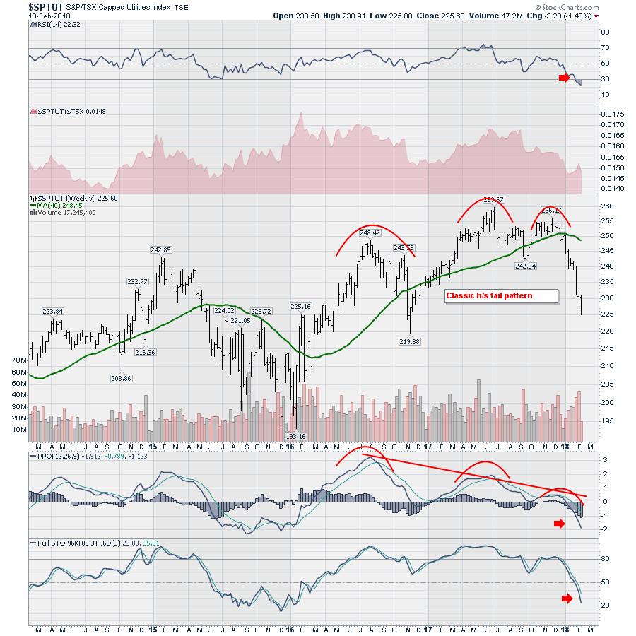
Utilities don't look like a great place to look for investing returns at this point. The head/shoulders top with two lower highs in momentum is a classic failure pattern. At this point that is concerning. If there is any good news on the chart, it is that the RSI is below 30 and should probably bounce soon. But it could stay there for months.
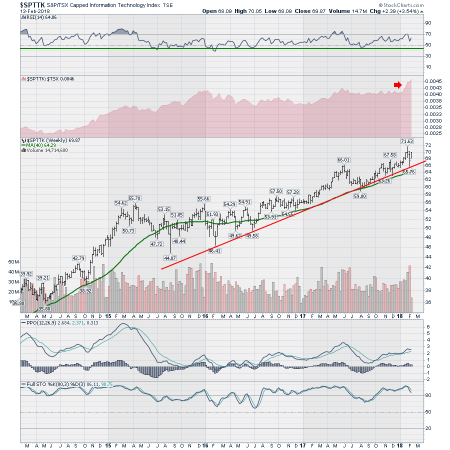
 If there is a bright spot, the Technology sector looks great. Whew. Finally something is going the right direction. The full stochastic is still trending above 80 and the chart almost ignored the recent volatility.
 To wrap it up, the stunning thing is the $TSX returned to the same level it was at in 2008. The RSI is currently at 37. That is horrific. Bull markets stay above 40. The RSI closed near 30 on February 8th. This means this is a bear market signal for the $TSX until the momentum changes. The PPO is near zero. That is not good. The price clearly went below where we were back in 2008. Ten years later, zero progress. The red line on the $SPX chart at the bottom is the level the US market was at when it topped in 2007. Clearly, its been an awesome run for US investors. Not so much for the Canadian investors.
Here is a link to the video about the new StockCharts for Dummies book! It is now available!
Below is a short briefing about my new book. It is now available wherever books are sold.
I cover off a lot more data on the video. What would it take to swing the charts to bullish? That's on the video. What is happening in other commodity markets around the world? That is on the video. The Bullish Percent index analysis is also on the video. I also covered off Natural Gas, Gold, Lumber, and crude oil. I also covered off Consumer Staples, Consumer Discretionary and income trusts on the video.
Stock Charts for Dummies Reviews
The reviews for the book are starting to come in.
"I have been a Stockcharts member for several years. There are many things I did not know, or now know in more depth. Although I am trained in fundamental analysis, I now feel there is no substitute for the information you can discern about money and how it is moving that technical analysis provides. Volume and price pierce many a market veil. Using Greg's excellent book, and the tips and tricks ("I didn't know Stockcharts could do that!") there are lots of new ways to "follow the money."
"One particularly useful analysis came out of the well organized ... Section 2 "Viewing the Money Trail Through Different Lenses." "
"Written by an experienced technical analyst, this book shows swing, position and longterm traders how to use Stockcharts.com to analyze the market and find stocks with the best potential for significant gains. Not for day traders. Contains lots of excellent information that is worth much more than the price of this book."
Available through the StockCharts.com bookstore or wherever books are sold.
Good trading,
Greg Schnell, CMT, MFTA

