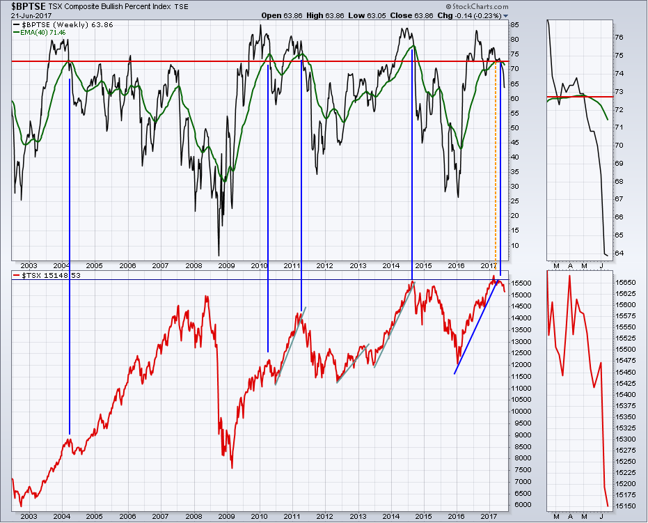
After months of watching the oil stocks underperform crude, the broader Canadian $TSX was able to withstand some of the selling. Now the breadth of the market has shrunk considerably. All market breadth measures are weak.
The chart below shows the Bullish Percent Index ($BPTSE). This measures the number of stocks on a buy signal. The blue vertical lines on the chart show when the $BPTSE breaks below the 40 Week Moving Average shown in green from a really high level. The correction is usually considerable. This correction has just started.
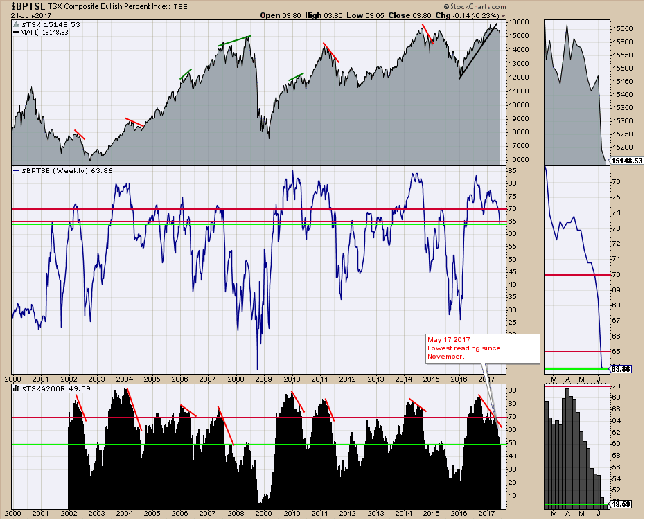
Looking at the centre panel, this is a different interpretation of the Bullish Percent Index. We can see the normal area of support above the lower red line. Now, the market is clearly breaking down. On the lower panel, we keep track of the percentage of Canadian stocks above the 200 DMA ($TSXA200R). This is not just an energy industry problem as less than 50% of the Canadian stocks are above their long term 200 DMA average. That's just not bullish.
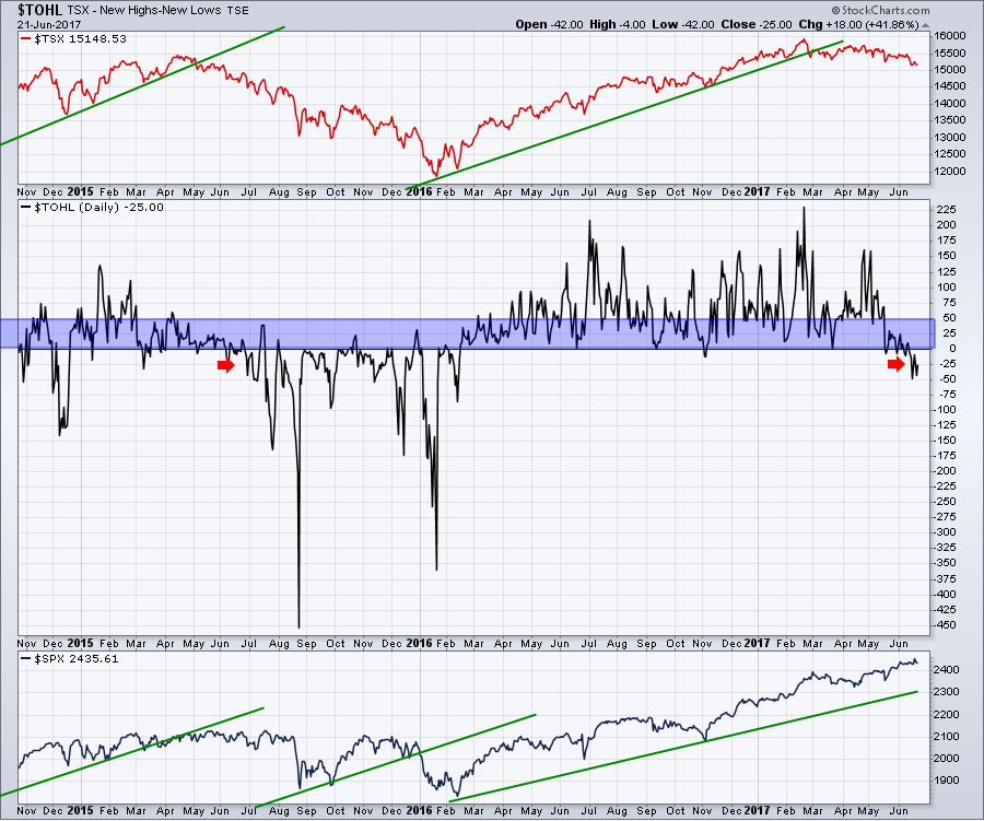
 If we look at the Canadian Market $TOHL (New Highs minus New Lows) line, this is clearly breaking down as well. You can click on any of these charts and change the dates to extend the view for more history. We are now seeing more new lows than new highs shown by the red arrow.
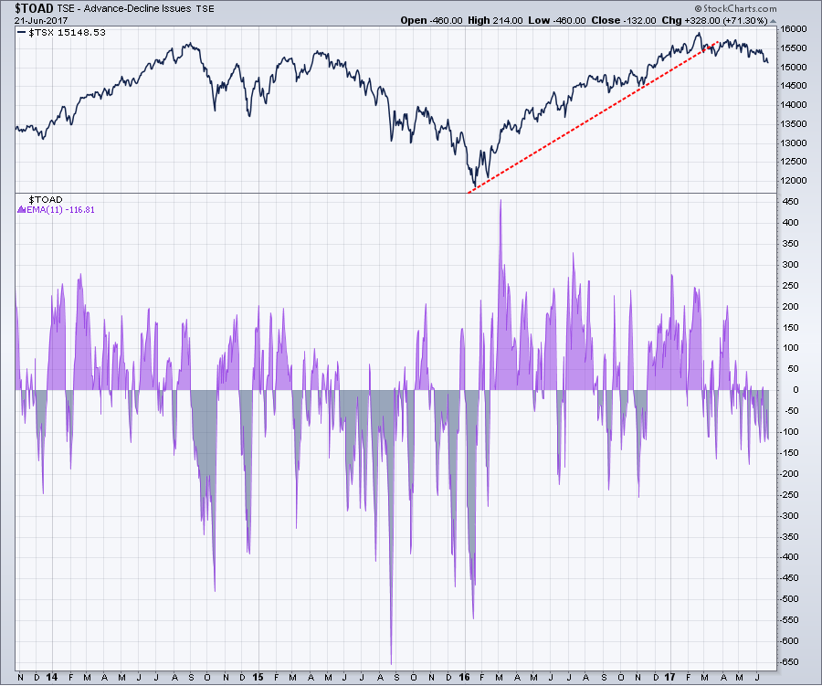
 The Advance Decline indicator ($TOAD) is very choppy, so using a moving average helps make the data more visual. In the chart below, using an 11 period EMA, the market is continuing to correct.
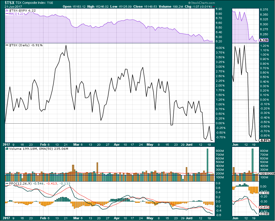
 The Toronto Stock Exchange Year To Date is negative by 0.91%. The purple panel at the top shows how the $TSX is doing compared to the US market. Obviously, we are underperforming the US market.
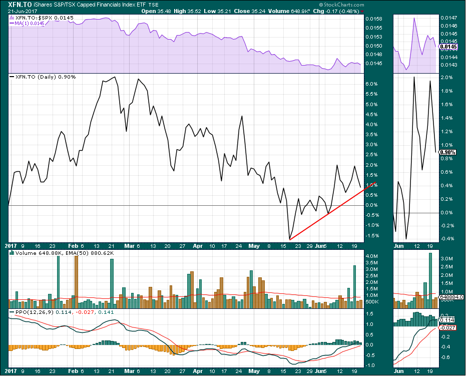
 The Canadian Financials (XFN.TO) continue to hold up in the face of a broader decline due mostly to energy and mining stocks. The momentum (PPO) is just approaching zero from below. If it rolls over here around zero, this is typically where we fail if we start to enter a major market correction. All hands on deck to hold this afloat.
The rest of the world has been outperforming Canada for a while. The real concern shows up on the $TSX monthly charts. The monthly momentum is rolling over on the MACD. The sell signals are pretty clear on the MACD on a monthly chart. When the MACD rolls over below its signal line, it usually takes a long time to improve. We don't want to see this signal confirm the long term trend as lower.
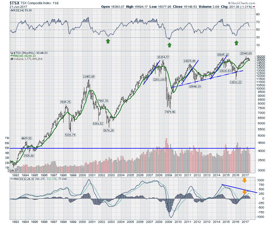 The bottom line of all of these charts is they look to be headed signficantly lower. Unless the bull market in the rest of the world starts to lift commodities, we might see Canada as the canary in the coal mine for a signal of a broader, more global slowdown.
Good trading,
Greg Schnell, CMT, MFTA.

