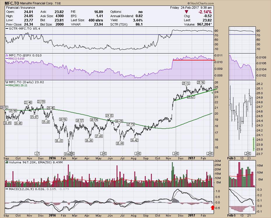
Working through the charts of the Canadian Insurance equities, they are starting to weaken slightly. Manulife is starting to make 3-month lows in Relative Strength.
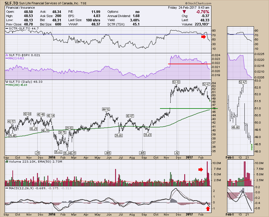
Sunlife looks weaker yet.
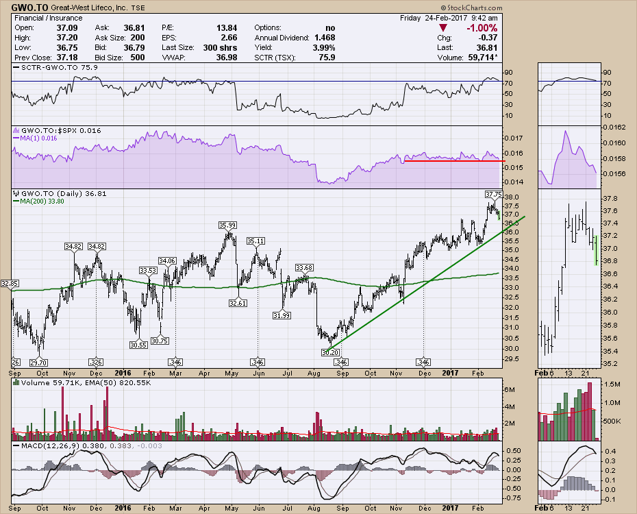
 Great-West Life is close to a 5-month low in RS. While it never had the spurious Trump jump, it is a 7-month uptrend. The scale on the side is $0.50 increments so let's keep the 'move' in perspective. However, the break above $35 broke through a two-year ceiling.
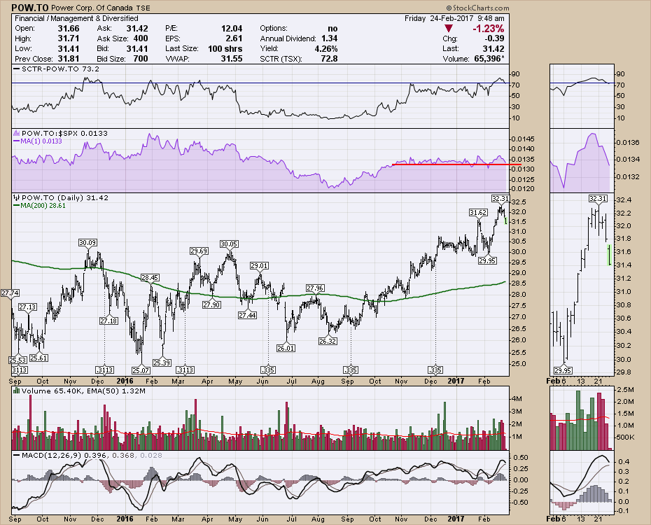
 Power Financial (POW.TO) made a similar move to Great-West Life. We can see on the Relative Strength in purple that the chart briefly dipped to new 3 and 4 month lows. That also brought volatility to the price of the stock as it tried to break out above a 2 year consolidation.
 Industrial Alliance is also close to 4-month lows in RS.
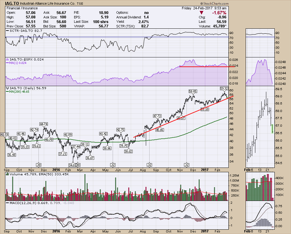 All of the insurers broke above the previous range. Now they seem to be pulling back. Watching the previous breakout levels for support will be important in the coming months.
For my educational component, I would like to talk about Martin Prings Inflation - Deflation indicator (!PRII:!PRDI). We have the benefit of many brilliant technicians putting their indicators on StockCharts.com that are just not found on other sites. Greg Morris Breadth indicators, Carl Swenlin's indicators, John Murphy key ratios, McClellan Oscillators including volume tools and the work of Martin Pring including KST and Special K through 2o books being published. This Inflation - Deflation indicator is just one gem in the jewelry box.
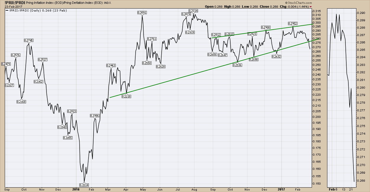
This indicator takes many different data inputs and combines them into inflationary assets and deflationary assets. Coming off the 2016 bottom, inflationary assets like commodities really started to improve. By November we had a line formed by three data points. In December, we briefly dipped below and the indicator whipsawed higher.
Now the indicator clearly looks to have broken the trend. Perhaps this will find support as a sideways channel around 0.25 on the scale. For investors in Inflationary assets, this sends a cold chill of information for technically inclined investors.
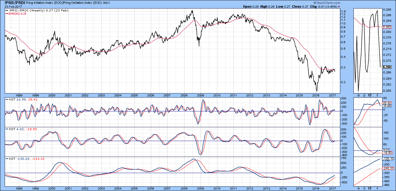
 How does this look on the broad view? Martin loves his long term charts, so I'll post a 20-year version of weekly. Here we can see a serious downtrend since 2011. I would suggest the recent rally looks more like a bear market rally than a new breakout above the 65-week Moving Average. In the zoombox, you can see two thrusts above the 65 WMA in 2017 and they have failed to hold. The short term KST went below zero in the 4th quarter of 2016, rallied back up just above zero and has now rolled over on a sell signal. The intermediate trend KST is flattening at zero as you can see in the zoombox on the right. The long term KST still looks bullish but the lines are starting to narrow slightly.
 Members can look through StockCharts.com entire library of signals. How can you do that?
 You can find Martin Pring's work by using the "!PR" in the search box.
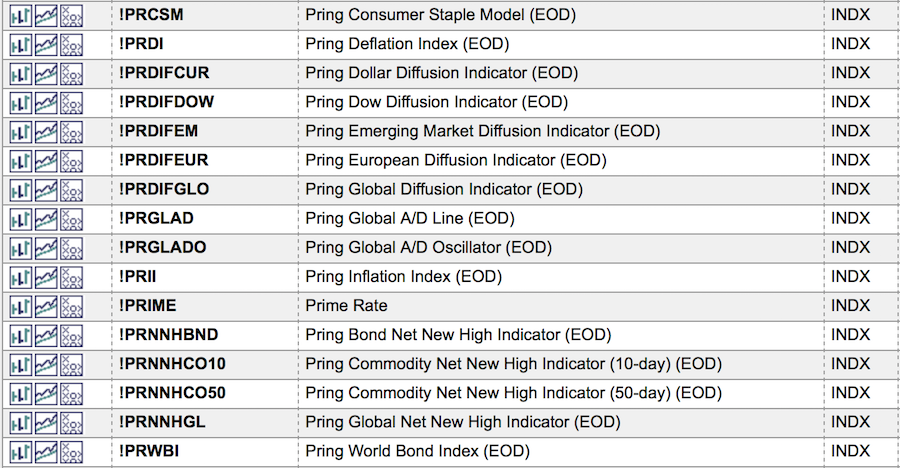 Programmers have spent thousands of hours programming all of these codes in.
The benefits of joining StockCharts.com at such a low monthly fee is remarkable when you consider the volumes of work placed on the site by the world's leading technicians.
Click here to start your one-month free trial. This allows you to save the charts from these world famous technicians in your own chart collection. The second benefit is that as a member you'll have access to articles written by the 'indicator authors' that explain how to use and interpret them.
Have a good weekend.
Good trading,
Greg Schnell, CMT, MFTA.

