If you did not read Part 1, some of these explanations may not be clear enough.
Continuing into Europe, let's go through the charts.
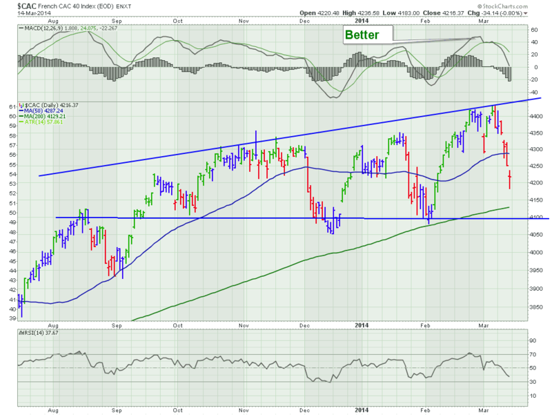
France is an interesting market. It still has the camel humps, but it has a flat base line. This is an expanding wedge or a megaphone pattern. It is considered a pattern of indecision.
So let's be cautiously optimistic and use the upsloping neckline.
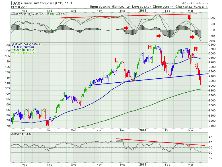
We now move to Germany. This was the strongest European chart on the monthly charts in Part 1.
This is very difficult to be optimistic looking at the chart pattern of the 'strongest market.' Notice how the MACD has broken down to new lows. It is making lower lows on every dip. This means the momentum is waning. The actual price plot is showing a perfect head/shoulders topping pattern complete with a neckline breakdown. The rally on Friday opened lower and closed slightly higher than the Thursday break at the neckline. The MACD and the RSI are perfectly correlating to a head/shoulders pattern. The price at the head went higher, but the lows were getting deeper on both the MACD and the RSI. Then on the right shoulder, the MACD had a lot less momentum. The price was moving flat for the last 2 weeks of February, before the Crimean occupation situation developed. So the momentum was already slowing.
Let's move to England.
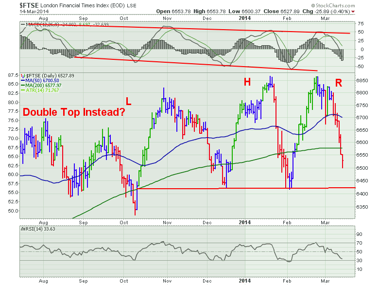
You may recall the London market on the monthly chart was stuck at resistance from 2000 and 2007. The $FTSE has spent most of the time moving sideways in 2013. While each new high was marginally higher, the market really was is a sideways channel with a slight,slight upslope. Whether you call this a head/shoulders pattern or a double top between the head and right shoulder, does not really matter. Both are topping patterns. The MACD is waning momentum. Not as drastic as Germany, but clearly this is the 4th trip below the 200 DMA on the price plot. This market is weakening. If I extend the red base line to the left, it could also be considered support for the August lows as well. Eight months of revisiting the same price level over and over.
So, when I look through the Asian and European markets, they are building topping patterns in almost every market. We could debate Australia, India and France to some degree, but for the most part, as a group they are showing a collection of topping patterns.
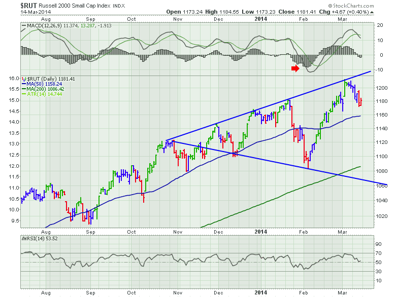
Let's move to America. Starting with the Russell, this was the strongest index since the 2009 lows. Up 254%.
Now we are looking at charts for the strongest markets in the world. Starting at the top, we can see the MACD made a low below zero that was clearly a change in trend. This pattern is a megaphone top pattern. We can also draw it as a flat bottom megaphone at 1080. Either way, it's a megaphone. The lows are getting closer and closer to the 200 DMA. Still a bullish chart price wise. We made new highs the first week of March. It is important to keep looking at the lows and where we find support. The MACD says the indecision is picking up with lower highs and higher lows. It could break either way. The Fed could add more money and send the market surging. But this is a pattern of indecision.
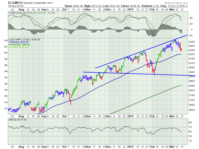
Here is the Nasdaq Composite. It was up 245% off the lows of 2009.
We can see the MACD is starting to change behaviour. The swing below zero was a shot across the bow telling us to be more careful on the next rally. The RSI is still nice and high so that is bullish. I have drawn the base line as almost horizontal. So I would suggest that this is still a bullish chart, but the MACD is hinting that this is a megaphone top. Indecision.
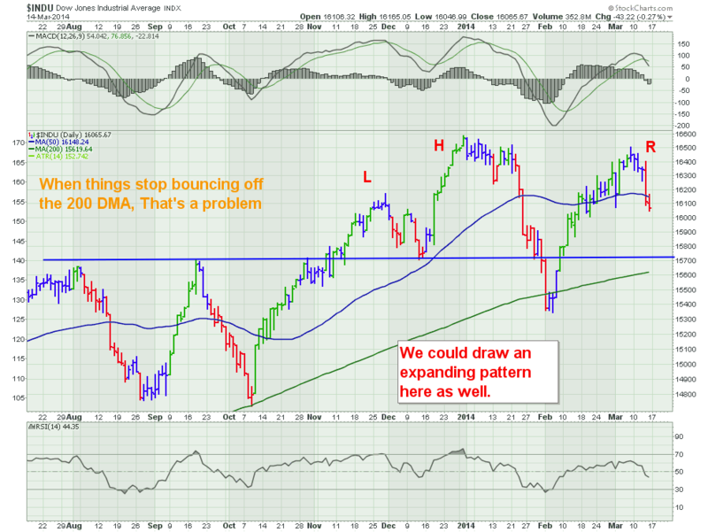
Now we'll look at the DJIA. The Dow Jones Industrial Average.
This is the only US index that has bounced off its 200 DMA twice in the last 6 months. Like England above, this is a market gettting weaker. The first bounce off the 200 DMA was in October and was a slingshot. The February low was down there for 4 days before getting back above. The price action is clearly different than that of the Nasdaq and the Russell. The break of support is important on the February low. Now making a lower high, now having the 200 DMA being touched twice, now having the price quickly drop below the 50 DMA is really showing weakness. We can see the MACD is making a significantly lower high after making a significantly lower low. Remember that this is an index of 30 of Americas strongest companies. They need to sell into global markets to keep sales growth.
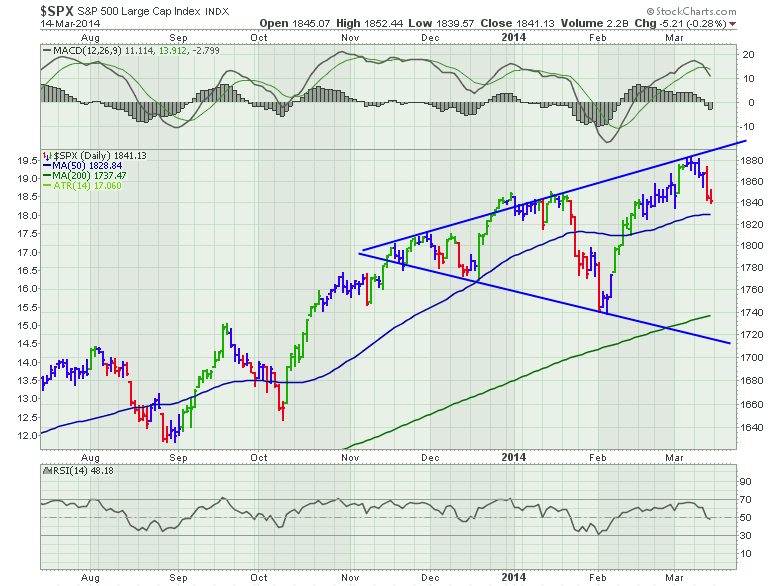
Let's go to the big market. The SP 500.
I think a megaphone fits the nicest on this price plot. We can debate a support line at 1740 instead. The $SPX has not touched its 200 DMA in 68 weeks. That is the 4th longest rally since 1984. The megaphone pattern points to indecision. The RSI touched 30 for the first time in a very long time. It's still a bullish chart, but the February low breaking both the December and November low is a pretty compelling reason to pay attention.
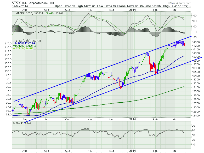
Lastly, let us look at the Canadian market.
Now this chart is almost funny. It is clearly making higher highs and higher lows. No sign of impending change. The MACD is nice and strong with no low dip in February. The RSI is nice and strong. The uptrend channel is perfect. The only major problem, is that this was that last market to finally rally. It only broke out to new 52 week highs last October. So while the US has essentially had a monster rally off the 2011 lows, the $TSX has only rallied for the last 6 months. Commodities have recently surged which is bullish for Canada. So that is a nice change in trend. Canada is a nice thermometer for growth in the metals and mining which should happen in our economic rotation model. Ths is a critical time for the market. It is telling us we might have a pullback as we go into a major uptrend for the middle of the big economic cycle.
In Part 3, I'd like to demonstrate how tops are formed.
See you in the next article.
Good trading,
Greg Schnell, CMT

