Its been a few months since October when the $TSX was able to break out to new highs. Since then, it has not been much of a look back. Because of the strength of the gold miners, even the pull back in the early February lows was much shallower on the $TSX than on the $SPX.
This chart has enough information on it to keep a chartist blogging for a novel. I'll work in in pieces, so head down to the next text section and use the chart below the text.
Lets start at the top on the chart just below.
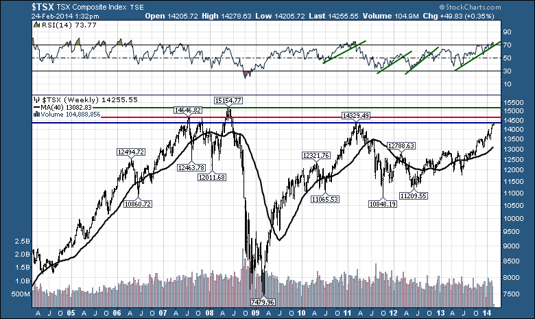
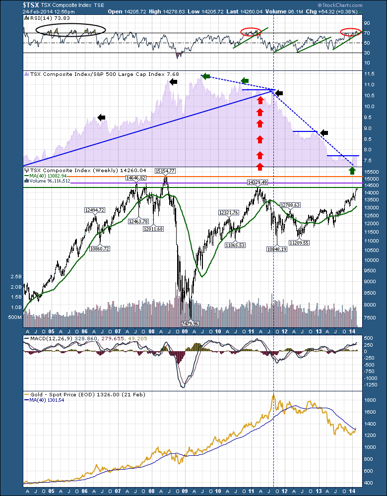
The RSI is up in overbought territory. The last time it was this overbought, was the 2011 highs. Way on the far left, you can see in the 1990's uptrend, the $TSX had annual visits to the overbought area and stayed above 40 until January 2008. That change in behavior marked the lower low up to the lower high. The final run was almost 5 months long before rolling over in early June 2008. Moving to the right, the three green trend lines that were broken by the RSI were also good trend lines for protecting profits. Notice the slope on the 2012 trend line. I have drawn it differently on the major chart above. While it was helpful on this one, it was also important to keep the longer trend line in view as shown above. It would have terminated in early 2013. Currently we have a good strong trend line in place on the RSI as well. But something has changed in the rest of the chart that should be a little help to us. More on that later.
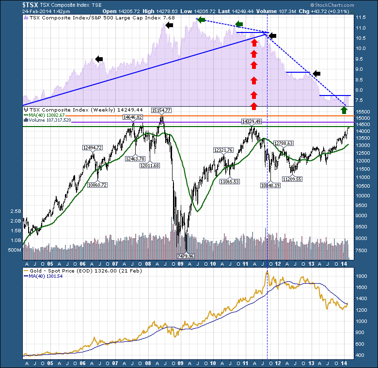
The second area in purple on Chart 3 below, which I like to call the SPURS, is a fascinating study on relative strength. Look at all the data here. Staying left of the vertical dotted line, we can see a glorious uptrend marked by a very strong up trend line. When that line was broken, at the home of the vertical red arrows, there was a huge change in the air. The relative strength was unable to maintain a higher up trend and the peaks across the top made a head/shoulders topping pattern. How many times do we need to watch that movie play out? One of the other critical pieces of information are the little arrows marking the tops of extreme moves. Its easy to look back and see these markers. It is not as easy in real time. As an example, in 2007 when the $TSX made a perfect double top, there were no spikes at all. But look at the January 2008 breakout on the SPURS and we can coincide that with the low on the $TSX on its way up the final run. Now this is where it gets hard. We know the $SPX was declining rapidly at that point. However the $TSX went on to gain 25% off the lows! In the meantime the $SPX was down in a bear market. An investor placing a steep trend line on the SPURS in the June high would have seen the final exit signal!
But there is so much more as shown below in Chart 4. Look at the confluence of lines at the 2011 high. The major trendline is breaking on the SPURS. As well, we have 3 lower highs. We have a H/S pattern on the peaks. We had a horizontal resistance line that couldn't get back through. The RSI was breaking down. Price was nearing 2007 resistance. Look where the three lines pointed to. The Apex of those three lines, ended up being the final spike high for the last commodity to roll over, $GOLD. It even finished on a perfect backtest up to the bottom of the broken trend line from 2004 to 2011. I was just plotting the $TSX against the $SPX at the time, and noticed the break in the long term trendline. It was a meaningful break. The longer the trendline, the more important it becomes. Now we are able to see the huge underperformance of the $TSX. Oil has been sideways but $GOLD has underperformed massively. Each time the $TSX SPURS has tried to break out of the 2011- 2014 downtrend by starting to make higher highs, the $TSX rolled over again. That would be the blue 2011 horizontal line, the 2012 horizontal line and here we sit at a junction of the 2013 horizontal line. At this juncture, one thing has changed. The downsloping trend line has broken. This is very meaningful potentially as we saw when the uptrend was broken.
OK. Onto the price. We are currently just below the 2011 resistance level of 14329. Another three hundred points higher we have the 2007 resistance of 14646. Then 600 points above that we have the 2008 highs of 15154. We need to watch the behaviour of the $TSX and the SPURS at this juncture. Will it just rollover again? Or will this mark a new sustainable outperformance by commodities and $GOLD?
The MACD is at a similar level to where it was at the 2007,2008 and 2011 peaks at similar prices. Definitely time to watch for any erosion in strength.
Lastly let's talk about the shiny yellow metal $GOLD. Gold is turning above the 40 WMA and usually this might be resistance on the trip back through from the bottom. The change in behaviour of the $TSX SPURS leads me to believe this could be the final bottom for $GOLD. However, a back test of the $TSX SPURS line would still be something that technically fits.
Everything points to resistance up ahead, but nothing is telling us to avoid the mining and minerals yet. Keep watching for further strength in this area. I am surprised by the huge move in the US market today and the minor move in the Canadian market. One day is not enough to break this SPURS data but it does bear watching if we meaningfully start to underperform this week.
Stay tuned, after a major spike higher on the SPURS, it just means we need to be aware of trend changes, especially with the horizontal resistance line on the SPURS. A continued thrust of outperformance would be extremely bullish for the commodity complex and a great time to build a firm position in the new $GOLD bull market. That's what we are trying to find and we have a host of signals that are close to ringing. Finding new long term bull markets is never easy, but some of the major trend changes on this chart are hinting at a big change potentially. This chart is a great example of where the inter market technical study can give us big advantages to finding real trend breaks.
Good trading,
Greg Schnell, CMT


