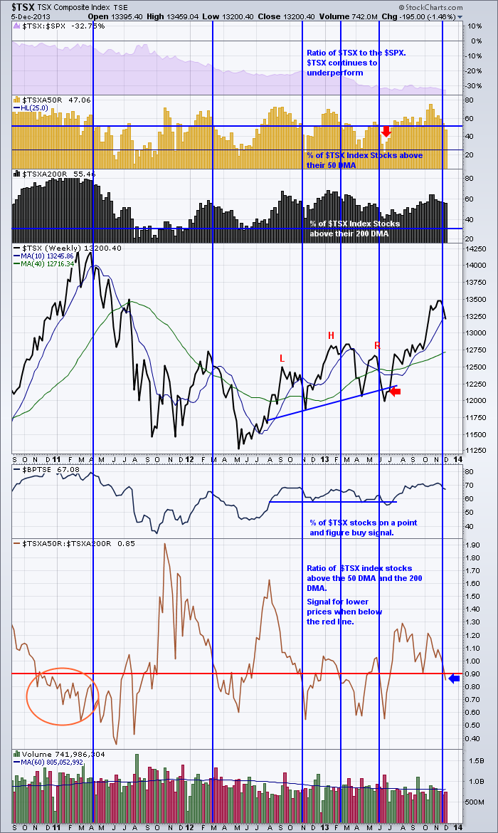
We spend a lot of time looking at price action trying to figure out if its short term or long term. Sometimes it is as simple as just using the things that seem to work most of the time with stops in place when they don't. One of my favourite charts gave a sell signal on the $TSX this week.
So this week, the $TSX put out a sell signal on this chart. What does that mean? Well, let's walk through the indicators starting at the top.
First of all is the SPURS. The relative strength compared to the $SPX. The $TSX continues to under perform the $SPX, so money is going to stay invested in the US equities until Canada's exchange starts to outperform the $SPX. If Canada starts to outperform, then money will look for opportunities in Canada. Not there currently.
The next one is an important one. Shown in gold, this shows the percentage of stocks above the 50 DMA. You can see that less than 50% of the stocks are above the 50 DMA. That is usually when the market pulls back. When this number goes below the blue line, it is usually signalling broader weakness. Of course when stocks are in an uptrend, there are more stocks above the 50 DMA. When the market rolls over, they fall below their 50 DMA first. When they start to push below the 200 DMA as well, that is when things get really sour. The horizontal blue lines are important. When you are above the top one, all is good! When you are moving down between them, the market is probably falling. When you get below 25% of the stocks being above the 50 DMA. You should be thinking about buying stocks, not selling. The last 4 dips below that level were good buy signals. However, the previous signals in 2011 were painful each and every time. How could we know when to reenter the market? The first thrust back above the 50% level was a good signal that more stocks were improving. The market was even nice enough to retrace back to 25% above the 50 DMA before it took off on a good long run. So the easiest way to use this in real time, is to use the daily chart of this same information in concert with this chart of the weekly. When the market is in a downtrend, I like to set buy orders just above the market, so if it reverses, I get filled. Then I have to use stops to hold me in case it reverses lower again. You can also use the 10 WMA line if you want to be more cautious. It will help you enter, but you have also given up much of the quick moves off the bottoms.
The black histograms are the 200 DMA. First of all, lets just compare the series of highs to the $TSX. You will notice on this recent push up in the $TSX, that the number of stocks above the 200 DMA changed very little compared to the previous peak. We had a couple of weeks above 60%. That is not good. We would expect a lot more stocks to jump above the 200 DMA, because they are rising in price as shown in the $TSX. The real problem is, the banks carried us higher, but not a lot of other stocks moved up above their 200 DMA in price. Just as a comparison, in 2007 only 50% of the $SPX stocks were above the 200 DMA in October 2007. That was the final high. How about this one for timing? Well, once again, when the market has less than 25% of the stocks above the 200 DMA, you don't want to continue to be short. The reversal rallies are swift.If you look in October, 2011 you can see the number of stocks above the 50 DMA soared but the number of stocks above the 200 DMA just barely moved. That is a good signal, that the market is starting to get more optimistic. On the way back up off a low, the stock price will climb above the 50 DMA first before going back above the 200 DMA. So this resurgence, is a good clue that the big money is starting to buy as they push a wider number of stocks above the 50 DMA compared to the 200 DMA. More on this a little later in this article.So if you stare intensely at the chart, you can see just before the last blue line on the right in November 2013, the number of stocks above the 200 DMA was getting less, even though the market was going to new highs. So the fact that the $TSX could only get to 60% above the 200 DMA on this last push, is very concerning, considering how high the $TSX price moved relative to previous highs. Only a select few stocks carried us up there. That means it was not a broad rally but a 'narrow' rally of a few stocks. The rally can expand, so the first week that it is less than the previous week is not a sell all signal. It is a clue to be aware of more subtle changes.
The next is the $TSX itself. You will notice a simple 10 WMA and 40 WMA on the chart. (WMA = weekly moving average). The 10 WMA is a pretty good gauge of buy and sell signals, except the May June 2013 period where you were whipsawed. Interesting how the head/shoulders trend line was broken, but that is when the market quickly turned and thrust higher from the head/shoulders neckline. This is why technicians use stops! I'll describe the blue vertical lines in a minute.
Next is the bullish percent index. This is a nice tool, because it is PnF related. PnF charts have the distinction of taking small price moves out and the PnF signal is only made when the market makes a higher high, or a lower low. A column reversal is not a sell signal. Only taking out a previous low is a sell signal. So it stands that a stock will stay on a PnF buy signal as long as it is making higher lows! So this is also a good gauge as it is a slow moving signal. When more stocks start making lower lows, it shows up here in a timely fashion. Just by looking at the chart, you can see that when the market is having trouble holding above 60 % on a buy signal, an investor may wish to protect profits! If you look at the far left side of the chart, the $BPTSE started making lower lows in mid May, 2011. You will notice currently that we started to drop below the September, October, November levels. This is worrying but this is a good signal for us that something might be changing on a broader picture. This chart is weekly, so it would be good to wait for Friday to finish the weekly data, but an investor should be thinking about protecting profits here based on all this coinciding data.
Now this ratio is one of the most powerful charts that I really like. Long time readers will have seen this chart before. The $TSXA50R:$TSXA200R chart is so powerful for me. First of all, you will notice that I have a red line running though the chart at .90 level. This chart compares the gold histograms above to the black histograms. When this ratio chart crosses from below to above, you should be getting bullish. The higher it rises, the more bullish you should get on strong stocks. When it gets above 1.05 or 1.10, it is usually signalling a start of a strong uptrend. It is saying that lots of stocks are starting to get above the 50 DMA even though not a lot of stocks are above the 200 DMA. This causes the ratio to soar. Conversely, if it can't get above the 1.0 area, you have to be cautious. It is saying that same number of stocks that are above the 50 DMA are above the 200 DMA. That is not that bullish. Next, what about when the line has been far above and starts to decline? Well, no problem actually. That usually means that the number of stocks moving above the 200 DMA is increasing. So the ratio is still fine. However, once it crosses below the red line, I get more cautious. You can't sell because it is below, but you need to be aware that the rally is getting thinner or narrower. This means there are less stocks above the 50 DMA than above the 200 DMA. In other words, it is starting to weaken. If you look at the red circled area back on the far left in late 2010, the ratio was below 0.90 but the market kept rising. Is this a bad signal? No actually. It is giving you one of the strongest signals it can give. That less and less stocks are holding up and you should be cautious. You just have to wait for price action to confirm the top. How nice is that! Lastly, look across the bottom of the range. At roughly 0.60, you can probably expect a serious rally attempt, even it it only lasts a few weeks.
Now a perfectionist will say that it didn't work perfectly. OK. I don't have anything that works perfectly in a market of hundreds or thousands of stocks. But this is a big picture helper. Even the June spike low below the head/shoulders neckline was telling you that you should be very cautious about continuing to be short as the market was at levels where bounces are usually produced. As a package the gold histogram charts up above suggested that it was getting pretty close to a short covering rally. You might have figured out that being bearish is a very quick sport.
I would encourage you to look at this same chart on a daily setting. As a pair, they are really helpful for swing trading.
Lastly, look at the volume in the last 8 weeks. Lower almost every week as the market goes to new highs.
So let's recap.
Top Indicator - still on sell signal.
Gold indicator - Short term signal. Moved to a sell signal by going below 50.
Black Indicator - Thinning market, back below 60, divergences to February and last 4 weeks - Sell.
Price action - moved below 10 WMA - The index is confirming the sum of the other data. Sell.
$BPTSE - Making a lower low - Sell Signal
The Ratio: Sell Signal.
Volume: Sell Signal. But its been that way for a while. Call it no signal.
The weight of the evidence says to protect my portfolio.
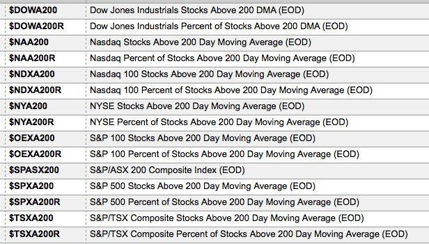
Here is a list of indicators like this. You can see there are percentage lists and exact count lists.
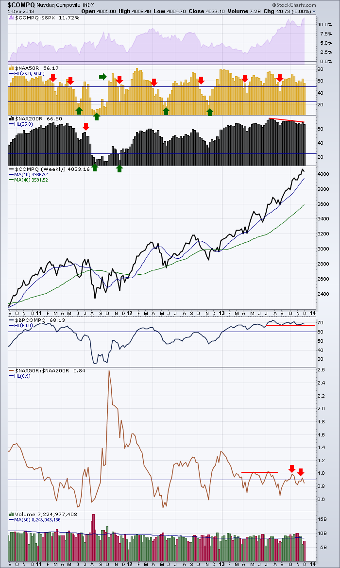
Here is the Nasdaq Composite.
Let's go through the indicators.
The Nasdaq is still outperforming the $SPX so money is flowing there. Buy
Gold Histograms - gradually lower peaks. Bearish. Above 50 Short term Signal - Buy
Black Histograms - Above 60 - Long term Signal - Buy
Price - Ballistic - Still above 10 WMA - Stays a Buy until price action crosses below 10 WMA.
$BPCOMPQ - Still no lower lows - Buy
Ratio - Flashing huge warning signs - 4 weak bumps - Last can't hold above 0.90 - Be prepared to Sell.
Volume - 2 high volume red weeks. Low volume green weeks - weakening trend.
Conclusion: Still on a buy signal but weakening short term. Notice the major market selloffs when the $NAA200R could not hold above 60. This looks like the next dip will still be bought.
Lastly, the Grand Pooba, the NYSE.
Let's go through the indicators.
Under performing the $SPX. Money flow not destined here. Sell.
Gold Histograms - declining on each rally, bearish. Above 50, Short term Signal - Buy.
Black Histograms - declining on last 2 rallies, bearish. Above 60, Long term signal - Buy.
Price Action - At 10 WMA. See what Friday brings. Still above so: Buy.
$BPNYA - Rising Lows - Buy.
Ratio - Was above 1.0 Bullish. currently below 0.90. Sell.
Volume - Getting weaker the last 4 weeks.
My Conclusion:, Short term weakness is a short term sell, but I expect a retest of this high. Watch for buy opportunity on the Ratio.
Hopefully, I've explained this thoroughly. If you are following along with the SCTR chapters, this will be the Big picture helper. We want to be buying on the dips. So with this information, we will wait until the buy point appears for the overall index. It might be by putting orders in just above the market so if it reverses you get filled. I think we'll get a 0.60 signal on the ratio and the 25% Gold histograms when it might be a little better buy signal.
Need a little West Coast lifestyle? Don't forget about the SCU 101 and 102 Courses in Vancouver coming up in January. Vancouver Link.
Good trading,
Greg Schnell, CMT


