This article continues our discussion of the SCTR. Call it Chapter 2
A few general investing principles are required here. With the availablility of ETF's, you can find investments that have less risk than single stock investing. You still need to find a method of outperforming the broad market index like the $TSX in order to do better than the market. If you are not investing in stocks or ETF's that are outperforming the market, it is difficult to do better than the index. So we commonly refer to an expression of relative strength. One definition of this type of relative strength is something ourperforming something else. Like AAPL outperforming the $COMPQ or AAPL outperforming the $SPX. One of the major issues in the Technical Analysis community is the frequently used discussion of relative strength. Unfortunately, there are different types of relative strength and they need to be discussed here so we understand where the SCTR is in the discussion.
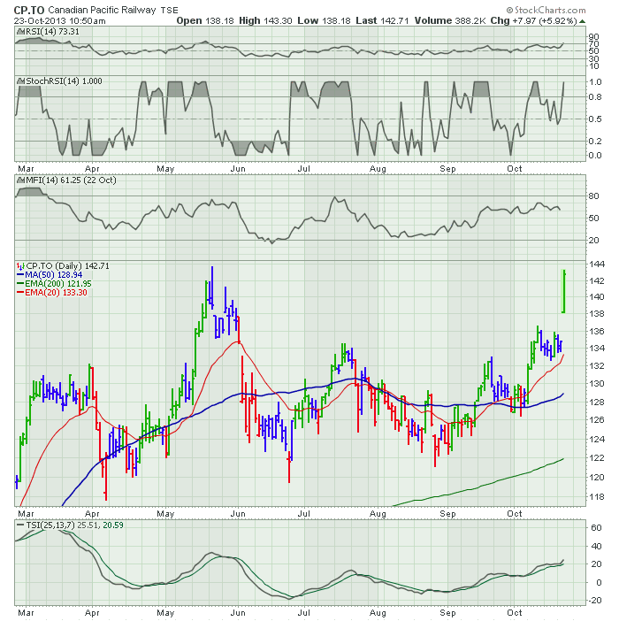
There are a few different types and new investors are commonly confused by them. A summary of the major types of relative strength would include the RSI by J. Welles Wilder. Others to be discussed include using a ratio like AAPL:$SPX. There are also platform based RS indicators like Investors Business Daily mystery RS. I won't discuss it in this article, but it creates a black box sort of approach where the user of the site is not educated how the indicator is created. Many other platforms sell a similar mystery indicator that is proprietary. There are also StochRSI indicators. Then there are others like the MFI - Money Flow Indicator that uses Volume Weighted RSI. Imagine that, someone being confused by all these different references of relative strength. I would propose to attach a name that helps users understand which relative strength we are talking about. StochRSI is a great example of that. The CP.TO chart below shows a few different types of strength indicators you could use.
I won't explain all the rest. The ChartSchool articles do a great job of explaining each indicator. The most important part of the relative strength discussion for the SCTR is the information below.
The Welles Wilder -internal RSI - is really a measurement of the strength of the price action within the stock. So it is measuring the size and frequency of the up moves compared to the down moves. Internal only, not compared to other symbols or indexes.
For a ratio chart, we compare the move of the stock on a given day to the move of the index being compared to . So when you compare a stock to the huge $SPX and it starts to perform better than the $SPX it is probably moving higher. When a stock is being compared to the $SPX, I have coined an acronym for it as it is one of the most popular unnamed tools. I use SPuRS. SP500 Relative Strength. A nickname of something memorable like SPURS helps you understand that the stock has started accelerating. Again, SP500 Relative Strength would be SPURS. Let us remember that every investor, hedge fund and portfolio manager is trying to find stocks outperforming.
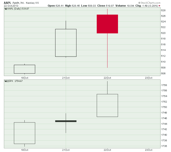
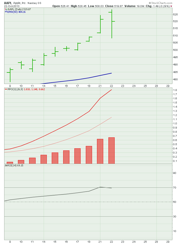
Now I would like to drill into the SPURS. If you are outperforming the $SPX, you are outperforming the average performance of the 500 stocks in the $SPX. So there are roughly 250 stocks doing better than average and 250 lagging. What if there was a way to identify not only if you were outperforming the average, but if this indicator gave you standings like the football teams in the NFL? How about trying to rank them from best to worst? Would that be cool or what? Then you could keep track of the stocks in the top quadrant and focus your investing and trading on strong stocks. Well, we could do that on a daily basis, and just find which had the biggest percent up move. On the 21st of October AAPL was better than the $SPX, but not on the 22nd of October.
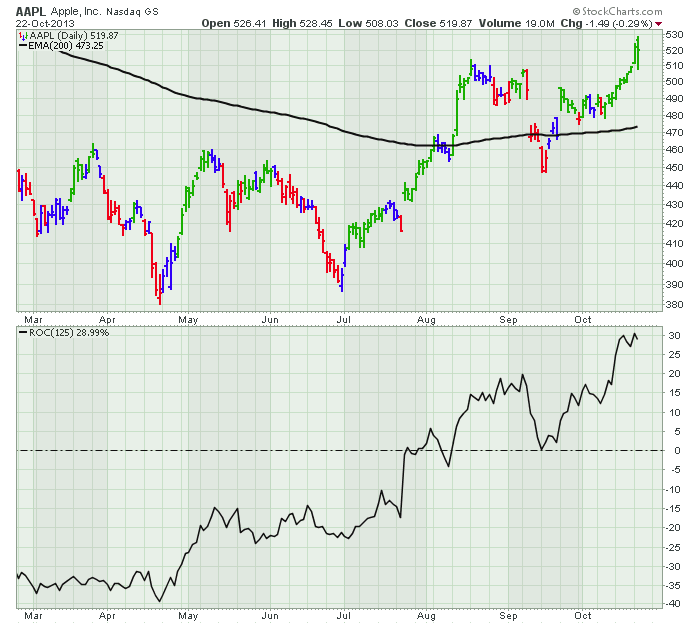
That is pretty straight forward but not really giving us any value. It might be a weak stock which had a one day bounce. So we need to add some additional parameters. One of the most obvious would be: Is it above the long term moving average?
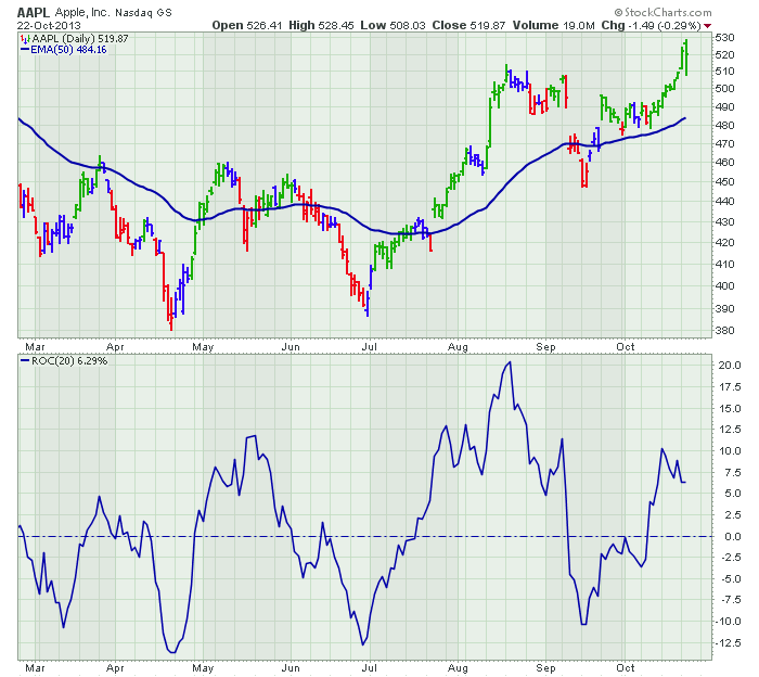
Well, that would help, but we need to measure how much above or below the average it is to help decide which stocks are stronger. Next, if we wait for the long term indicator to be the sole determinant, it is probably too late. Maybe Rate of Change? So we need some near term calculations to be included. Then we need to spend some time figuring out what the mix might be. We need some serious thinking on this.
An accountant would use price earnings, or book to sales ratios. But we are technicians. We are looking for when investors are putting their money to work, not when the company with a low stock price is so cheap. That accounting methodology would have investors piling into Enron in its final slide. Technicians knew almost 11 months before the first sell recommendation from a fundamental analyst. That sell recommendation was also only one month before Enron was bankrupt. So we want to use technical tools only, not accounting tools.
Well, StockCharts put their knowledge of the formulaes with John Murphy's knowledge of the markets and have built a proprietary index. They named it the Schnell's Canadian Technician Ranking. Just kidding, they named it the StockCharts Technical Ranking. The SCTR.
So that is how it was derived.
Lets look at the components and the calculations. This is right from ChartSchool. At StockCharts we are not expecting investors to use black box formulas for investing. Here is the link. ChartSchool SCTR. You don't have to get real wrapped up in the calculation. The most important thing for me is the 60% long term, 30% medium term, 10% short term. I will demonstrate how responsive it is later on. You may be stunned at how timely the results can be!
Calculation
It takes two steps to calculate the StockCharts Technical Rank (SCTR). First, each stock is "scored" based on six different technical indicators. These six indicators can be subdivided into three groups: long-term, medium-term and short-term. The information below details these indicators, the relevant timeframe and the weightings.
Long-Term Indicators (weighting)
* Percent above/below 200-day EMA (30%)
* 125-Day Rate-of-Change (30%)
Medium-Term Indicators (weighting)
* Percent above/below 50-day EMA (15%)
* 20-day Rate-of-Change (15%)
Short-Term Indicators (weighting)
* 3-day slope of PPO-Histogram (5%)
* 14-day RSI (5%)
Except for the 3-day slope of the PPO-Histogram, the raw numbers are used to calculate the indicator score. For example, if a stock is 15% above its 200-day moving average, then this indicator will contribute 4.5 points to the total indicator score (15 x .30 = 4.5). If the 20-day Rate-of-Change is -7%, then this indicator will contribute a negative 1.05 points to the total indicator score (-7 x .15 = -1.05). A multiplier is used with the 3-day slope of the PPO-Histogram to arrive at a number between 0 and 100 for contribution to the indicator score.
After this first calculation round, we then rank these stocks by their indicator score. Keep in mind that these stocks are ranked solely within their group, such as the S&P 500. The stock with the highest score gets the highest technical rank (99.9), while the stock with the lowest score gets the lowest technical rank (1). The rankings are then filled in according to the indicator score. I like to think of it as a stock with a 90 % ranking value is better than 90% of the stocks.
So now we have the good Ol' relative strength problem above. We have a group of stocks ranked, but we need to know what group they are ranked against. Using a massive group doesn't really help. Putting 60000 symbols in StockCharts Library would give you a nice small sample of 15000 symbols in the top quartile. You get the idea. Messy. So we have broken it down into 5 select groups currently.
SCTR.SP5
SCTR.SP4
SCTR.SP6
SCTR.US.ETF
SCTR.TSX
Having smaller groups is really helpful as you will see later on in the series. The beauty of having the technicians and programmers design this tool, is the SCTR is set up with some beautiful methods for using it. For example, you can just ask for an SCTR line on your chart and it will plot it if the symbol is in one of the groups.
Now you understand what the SCTR is. It is a ranking of how technically strong the stocks are WITHIN their group. You cannot compare across groups. The small cap stock group might have much faster moving stocks than the SP 500 group, but in both groups you will have stocks at 75% of the group. Their charts may be different. SCTR is a measurement of relative strength based on technical parameters within a peer group.
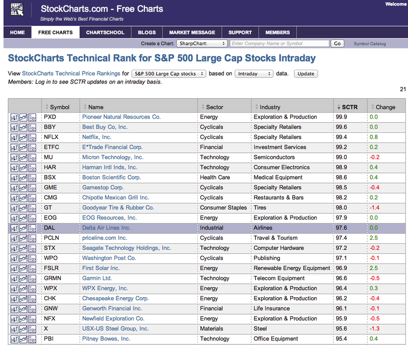
Hopefully, I have done a good job of identifying the many different ways of using the term relative strength. Now, you should understand what we are trying to accomplish by making the SCTR. Let me know if any of this needs clarifying. So I used AAPL today as the symbol to analyze. It would fall in the SCTR.SP5 list. So this SCTR calculation creates the list in the Introduction article.
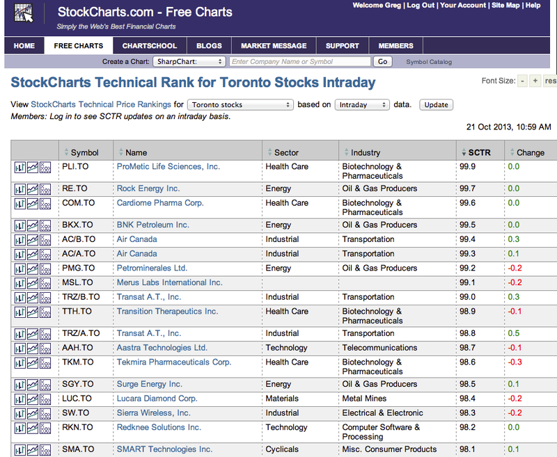
By changing the dropdown list at the top, you can select the $TSX or one of the other groups.
Here is the $TSX dropdown again.
Next, we will discuss how I have interpreted the SCTR line and where we start to see some interesting behaviour in the stocks.
Good Trading,
Greg Schnell, CMT

