This blog is a little long. But really the charts are big. In summary, look at where the price is currently on a lot of these charts. Lower right, middle right or top right. As well, I have drawn a support resistance line on the chart. Here is the global monthly view of the major markets.
So lets start with the $SPX RSI in the top panel. It is coming down out of overbought. Look to the left to see when the markets rolled over relative to the RSI coming out of overbought.
Moving down to the US indexes in the top four panels. They are clearly on a vertical track. No other charts on the page are high in the top right corner. So the US market is not getting global support even though all the markets moved above the 20 Month Moving Average (MMA) in November 2013.
Next is the $TSX. You can see it is stuck in a sideways range for the last year. If you can take a minute to just generally review the other charts, look closely at how many months before the top is formed back in 2000 and 2007. The $TSX needle in 2000 was basically Nortel at 33% of the index along with others like JDSU. You can see the Japanese Nikkei and the Aussie market both took almost a year to fall out of the range that marked the tops. This is important to understand. The Shanghai, the Hang Seng, and Russian markets all took at least 6 months to form tops in 2007. It is usually multiple months where the market can not break out to new highs. So the final high may be earlier or later in a trading range, but the market needs time to lose power if it is going to roll over. Currently, all the markets with the exception of the US markets have spent time trapped in a range. Russia has been declining for 6 months.
Here is the Europe view.
There are a couple of charts on this page up in the top right of the price panel. The English $FTSE has been trying to break above the 2000 and 2007 highs for 6 months. The $DAX has made marginal higher highs but no real break out with conviction. The French $CAC and the Spanish $IBEX have been travelling in a sideways range for a while now. The next three (Korean $KOSPI, $BSE India, and Brazil $BVSP) are all failing relative to the long term trend lines off the 2009 lows. The Italian $MIB is sideways for a while and stuck in the lower right corner. In general, the rest of the world has not been able to make new highs on this recent push by the US markets. So the rest of the world could start breaking down substantially if we can't get the uptrend to resume soon.
Lets go to weekly.
Here are the NA and Asia charts.
The Dow has recently broken the uptrend. The $TSX in Canada is still sideways and well below the 2011 highs. The $NIKK currently looks like the $GOLD chart at the top in 2011. I think the $NIKK looks lower, but that is what makes a market. The Aussie $AORD is breaking down with lower lows and so far a lower high since May 22 highs. America pushed through, but these other markets have not. Can it reverse? Sure, anything is possible. At least the Aussie chart is in the top right corner! The last three, the Shanghai, the Hong Kong and the Russian markets are all lower highs and lower lows this year.
Here is the Europe version.
You can see the $FTSE and German $DAX are having trouble breaking through the May highs. France was able to push through, but has since pulled back below the break out. The spanish $IBEX recently broke above a LL and LH downtrend starting in January but did not successfully stay above yet. The next 3 charts are making new lower highs and lower lows. Lastly, Italy's $MIB has been in a trading range for a year.
So in general all the world charts are struggling with patterns that would suggest they are getting weak trying to make new highs. A few charts have already cracked and broke lower. So things are iffy right here on the monthly and the weekly charts.
Lets zoom in with a few indicators on some of the more important charts.
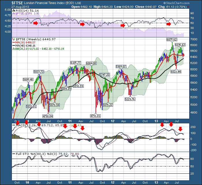
Here is the $FTSE
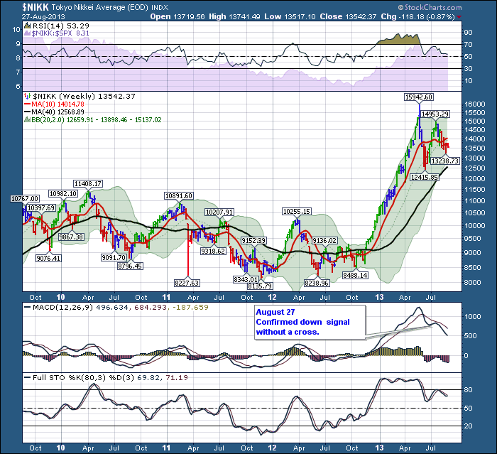
On the $FTSE, it seems to be losing power here according to the MACD. The RSI has made three lower highs and looks to be losing support as it has not been able to get above the 60 level on the recent high. That is not good on a weekly chart. Again, its a lower high than May 22. Here is the $NIKK. Also a lower high, but still a higher low. I have trouble investing there, thinking it will make a higher moon shot than the one it just completed.
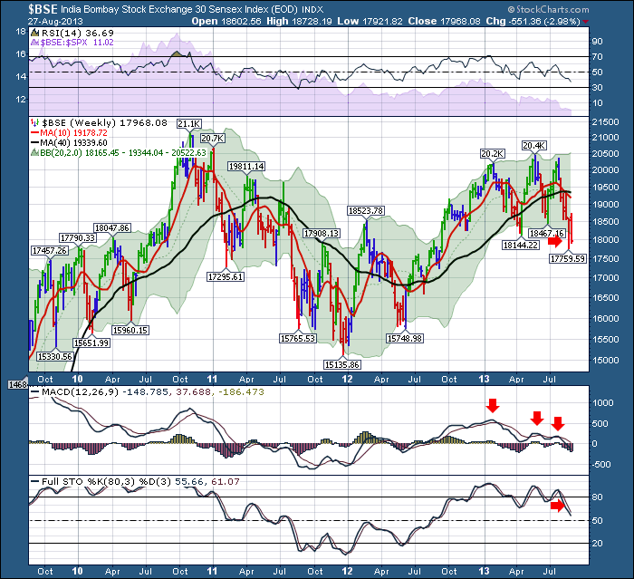
The $BSE in India. Representing one of the largest global growth countries with over a billion people. Three pushes to a new high but could not take out the 2010 - 2011 highs. Notice how weak the $BSE was in 2011. It was already below its 40 Week MA before the rest of world topped. We find it there again now after testing the support of the 40 WMA twice before this current push down.
A lot of the world charts are showing significant weakness on the MACD momentum signal. I would encourage you to go look at the trends on all of these. I could make the ultimate long blog, but if you rotate through the charts on your own to look at the MACD and RSI on the international indexes, they are all weak.
I have one more chart that makes me worry just a little bit more.
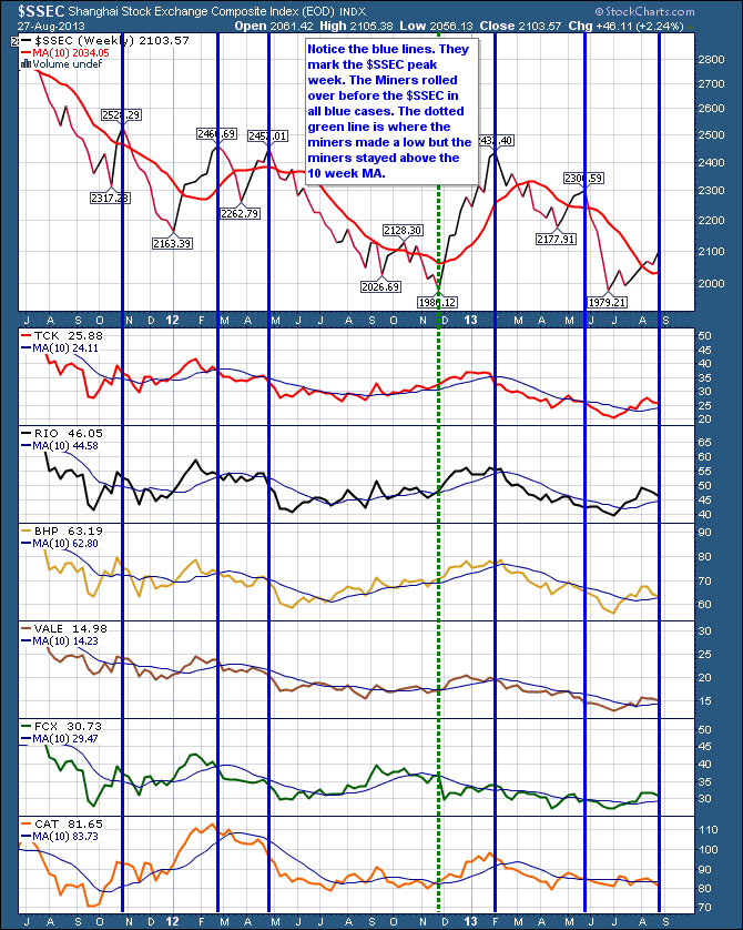
On this chart of the Shanghai, and the global miners, you can see the miners started their moves down before the $SSEC. This is indicated by the blue vertical lines. The miners had lower closes in the weeks before the $SSEC topped which is marked by the blue lines. If both China and India (shown further above) are in downtrends, and the rest of world can't follow the US lead to higher highs, it might be time to be careful on the metals miners especially. Not necessarily the precious metals miners, but the other miners.
However, a couple of signals are near their short term reversal points usually. Especially some of the breadth indicators for the broader market. As well, month end paycheque contributions usually start new buyers showing up on the first of the month. We will see if we get a short term bounce here into a lower high in the USA in September. The second bright spot is a lot of the commodities have finally started to rally. Unfortunately the Industrials seem to be getting weaker. It is not uncommon for commodities to rally into a final high. Remember 2007. The commodities kept rallying into 2008.
Anyway, I am very careful here. This market is at a definite toggle point. Staying on the right side here will be crucial.
If you found this informative, feel free to share your views with me and forward it with friends. If you disagree, feel free to send your comments as to what I might have overlooked. That is what makes a market. I would like to hear your comments. Can the global governments/ central banks change the charts ? It doesn't look like the markets individually have the strength, so they may have to.
Lastly, SCU 101 and SCU 102 classes are booking up for New York, Dallas and Vancouver. I will be at all three. I'd look forward to meeting you at one of them! Click here for access. At the meetings, we usually do a current market review.
Good Trading,
Greg Schnell, CMT.


