Lets look at 3 charts:
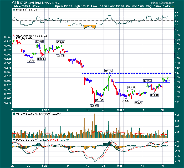
Here is Gold. We will use GLD as I can get 60 minute data to compare to the GDX 60 minute chart below. Notice how it has broken above 11 day highs. Back in January February it was not able to break out above the $163.04. GLD has broken through the first level of resistance and a break above the $156.80 level would indicate a much more important break.
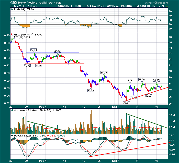
Here is GDX which is an ETF that tracks a group of Gold Miners.
Look at the differences between the Late January - early February period and compare that to now. Both periods are about 3 weeks. Notice the rising lows currently. There is a much larger interest level showing up on this chart. Look at the volume now compared to then. Note that this is a 60 minute chart, so this is huge volume every hour. The RSI has made higher highs than previously, but has not broken out. In my methodology, I would like to buy if it can break through the ceiling of $38.20. I don't want to own it if it can not. Secondly, my stop will be just under the red line if I am wrong.
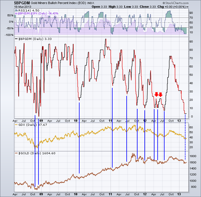
Here is the $BPGDM
You can see that the bullish percent level is at 5 year lows. Eventually this turns. You can choose to use the Bullish Percent, The GDX or the Price of Gold which has already started to move higher. I am more interested when the stocks confirm the move. The $BPGDM updates at the end of the day (EOD) which is indicated on the top frame of the chart beside the ticker. So you would enter on the following day if this could turn up.
The bottom chart has all 3 together except we can use the $GOLD chart as the data is for daily.
If you are interested in trading $GOLD, now is a very interesting time.
Good Trading,
Greg Schnell, CMT


