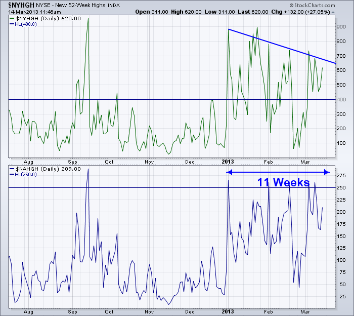
Here is the chart of the Nasdaq and NYSE New 52 Week Highs.
Since January 1, we have had a surge of new highs. I have marked up the charts with a couple of pieces of information.
1) The Horizontal lines at 400 and 250 are interesting levels on a long term basis.
2) We have been at or above these levels for 11 weeks.
3) The number of new highs as the market goes higher has been declining from the 900 level to the 600 level recently on the NYSE.
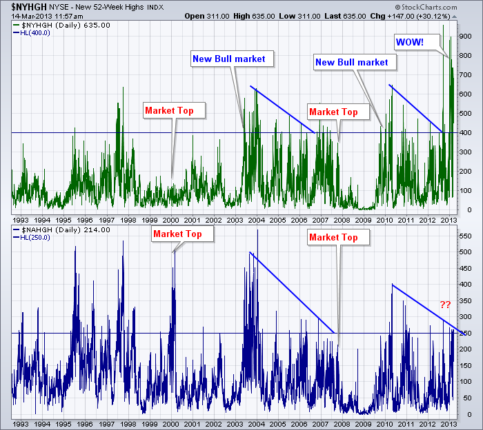
Now lets look at a long term picture. You can see why I placed the lines at 400 and 250.
OK. So with this perspective, you can see that we are absolutely off the scale on the NYSE and clearly at the significant level on the Nasdaq.
I notice a couple of things, as the rally has progressed over 4 years, the peaks have been declining. Until now. So, When I marked up the charts with the market tops on it (we are looking for a top not a bottom as you can see the valleys in the information marks major new lows) it wasn't clear.
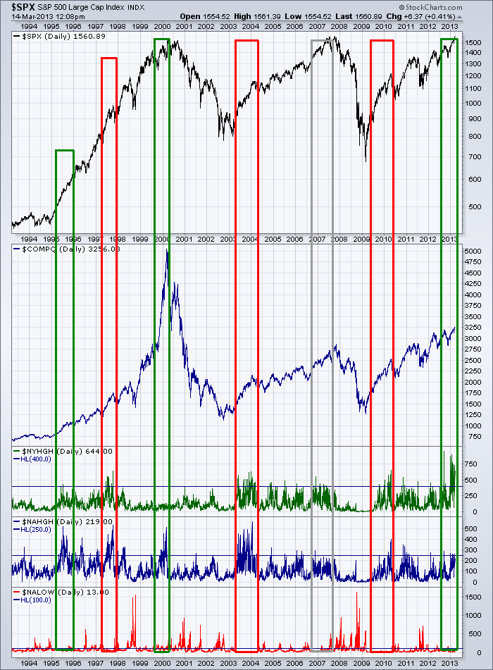
Now I'll post a chart with the stock markets on them for you to discover your opinion.
We have only had 6 periods of sustained pressure above the lines of 400 and 250. It is very rare to stay up here for 3 months when you are not coming out of a market bottom.
Now the art comes to you to figure it out.
1995, 2003 and 2009 were market lows.
2000 and 2007 are market tops. The Nasdaq was double the extreme level at this time but the NYSE was not anywhere close.
1997 marked a run up, a pullback of significant amounts and then onto higher highs in the big internet bubble.
So what are you to do now? We have euphoric levels for a sustained length of time, but it is not near market lows. Is it a blow off top like 2000 or just a continuation into another bubble market top a few years out like 1997?
That is what we'll have to figure out, but it would appear that the sentiment of being very optimistic is clearly here.
Good Trading,
Greg Schnell, CMT.


